ROLE: Founder & Designer / DISCIPLINES: Brand Strategy · Brand Identity · Logo Design · Art Direction · Print Design
Delicious Design for Small Businesses
I originally created Sweet Stuff Studios specifically for photographers, building on the community I had become part of through Reiley Photography. The idea included “ready-made” designs photographers could customize themselves, which led to the Sweet Stuff name and the tagline “Delicious Designs for Photographers.” But as the business grew largely through referrals, so did the audience, eventually bringing me clients from other industries across the U.S. and as far away as Canada, England and Australia.
I wanted the studio itself to feel creative, approachable and a little playful, while still demonstrating the level of design clients could expect from the work. I developed the identity and website around that idea, working with a professional copywriter to give the brand an equally distinctive voice.
Goals
- Create a distinctive identity for a design studio focused on small creative businesses.
- Build a brand that felt professional without taking itself too seriously.
- Showcase a range of design services beyond logo design.
- Create a website that could attract clients through both referrals and the photography community.
Goals
- Create a distinctive identity for a design studio focused on small creative businesses.
- Build a brand that felt professional without taking itself too seriously.
- Showcase a range of design services beyond logo design.
- Create a website that could attract clients through both referrals and the photography community.
Logo
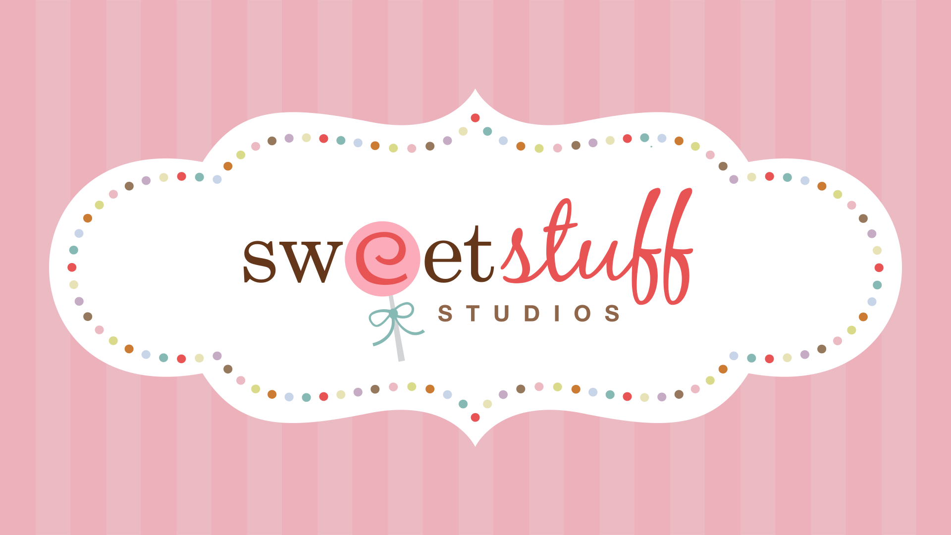
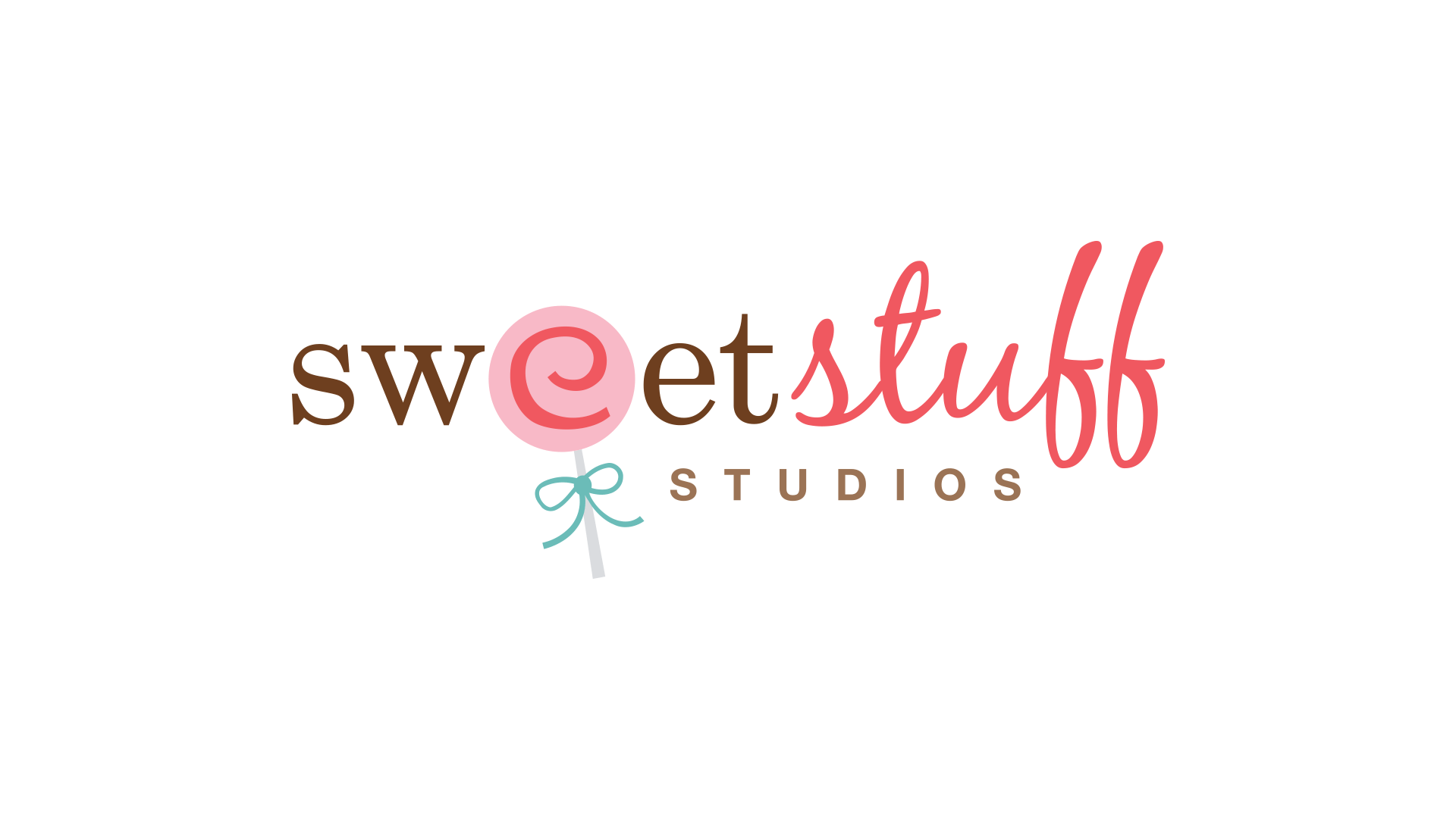
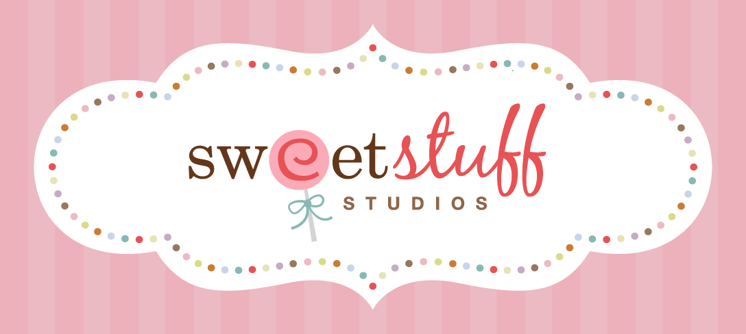
The Sweet Stuff Studios identity leaned into the name without becoming too literal. The logo combined an ornate frame, soft pink palette and playful typography to give the brand a handmade, slightly confectionery quality. It was intentionally more decorative than most of my client work, helping the studio establish its own personality while leaving room for very different client brands to take center stage.
Business Cards
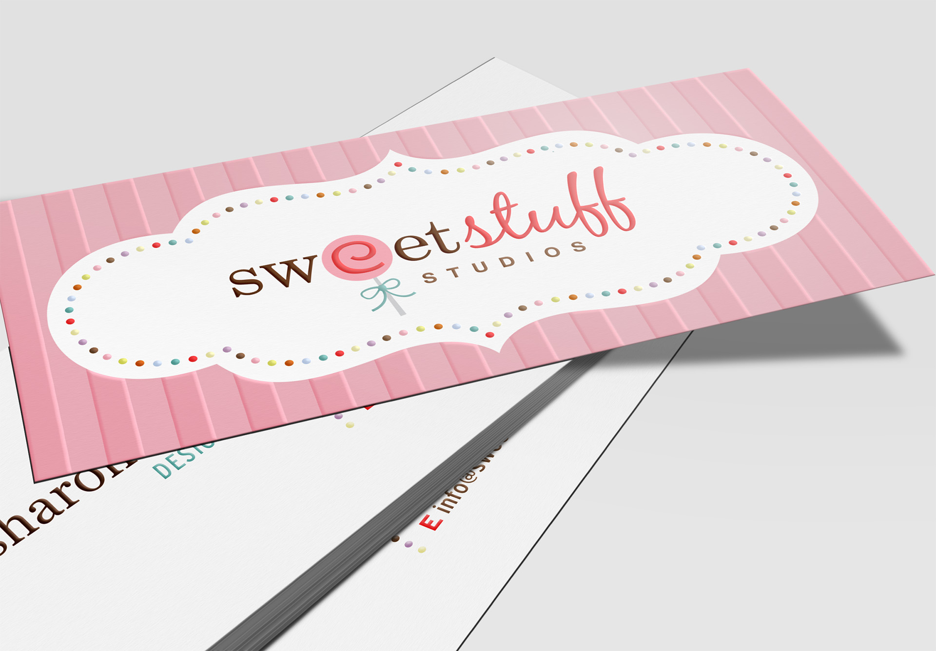
At 3.5 × 1.5 inches, the business cards were narrower than a standard card, giving them a distinctive shape. I used spot varnish on the front to define the vertical stripes, dotted border and logo, adding a subtle tactile quality to the design.
Featured Clients
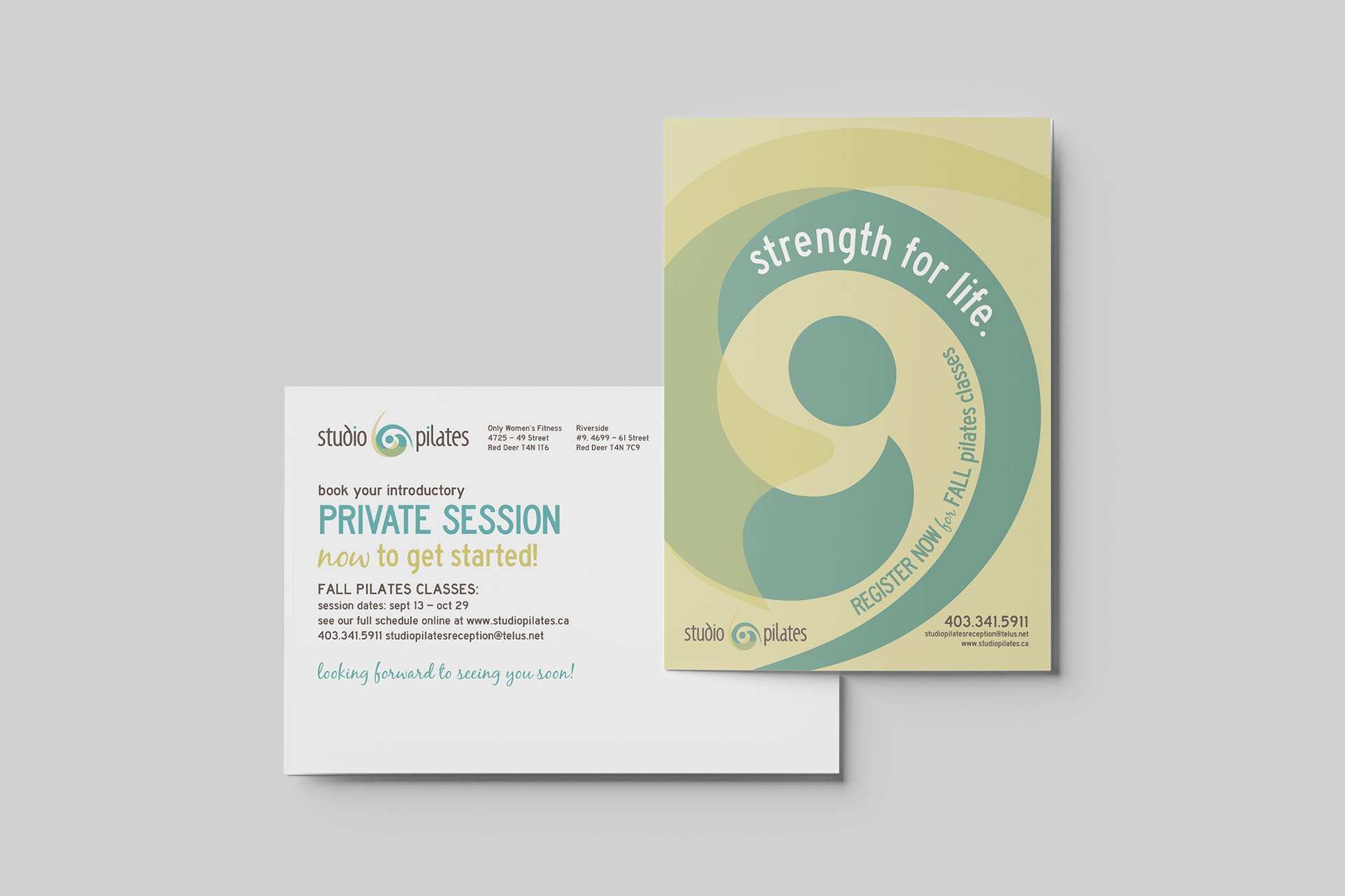
Studio Pilates
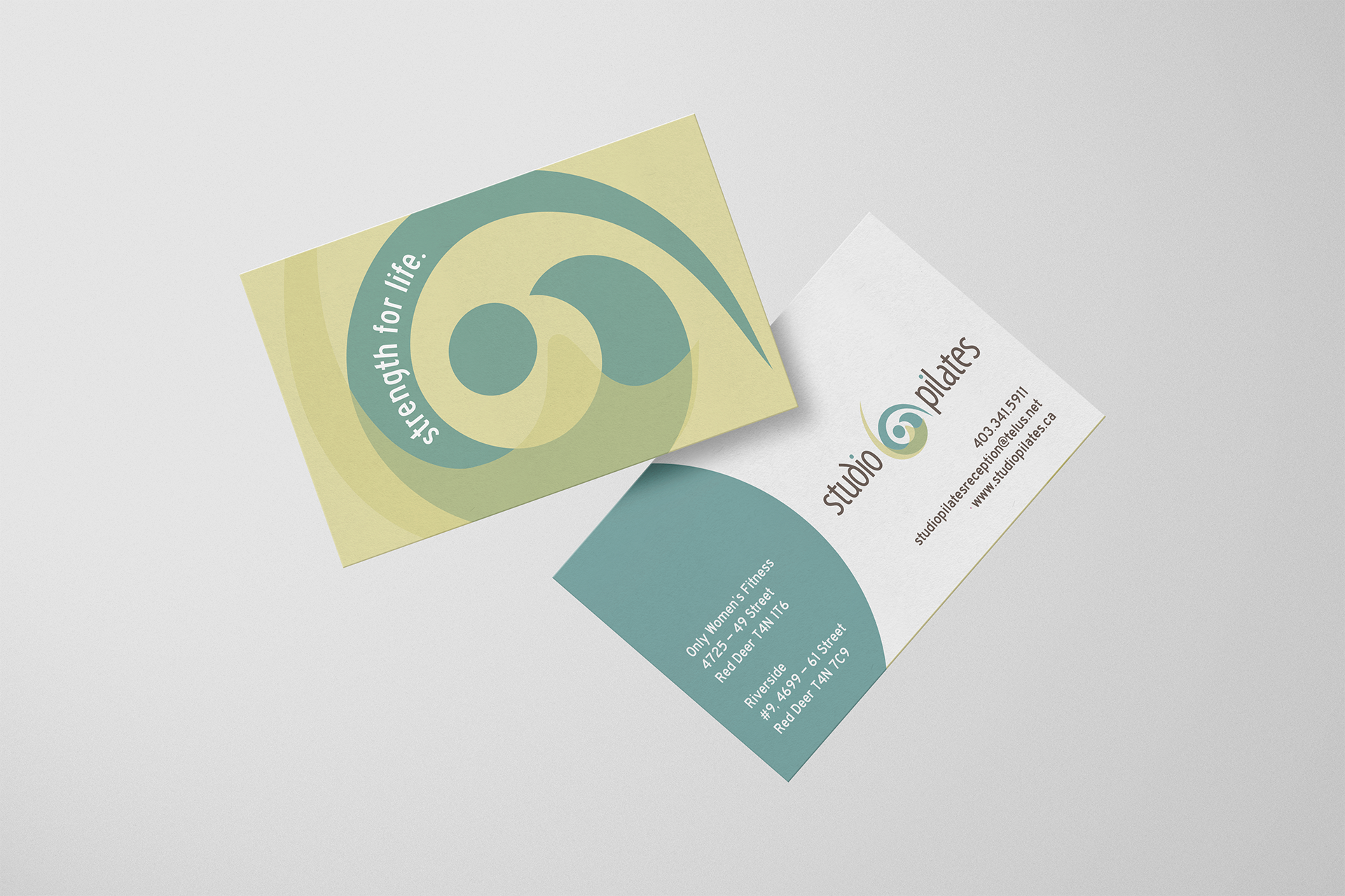
Studio Pilates needed an identity that felt contemporary and approachable rather than clinical or overly athletic. I developed the logo and extended the visual system across business cards and supporting materials.

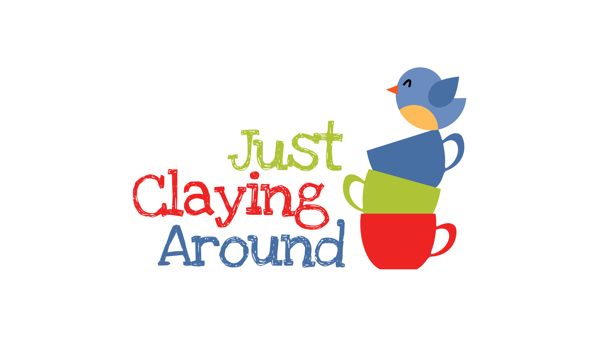
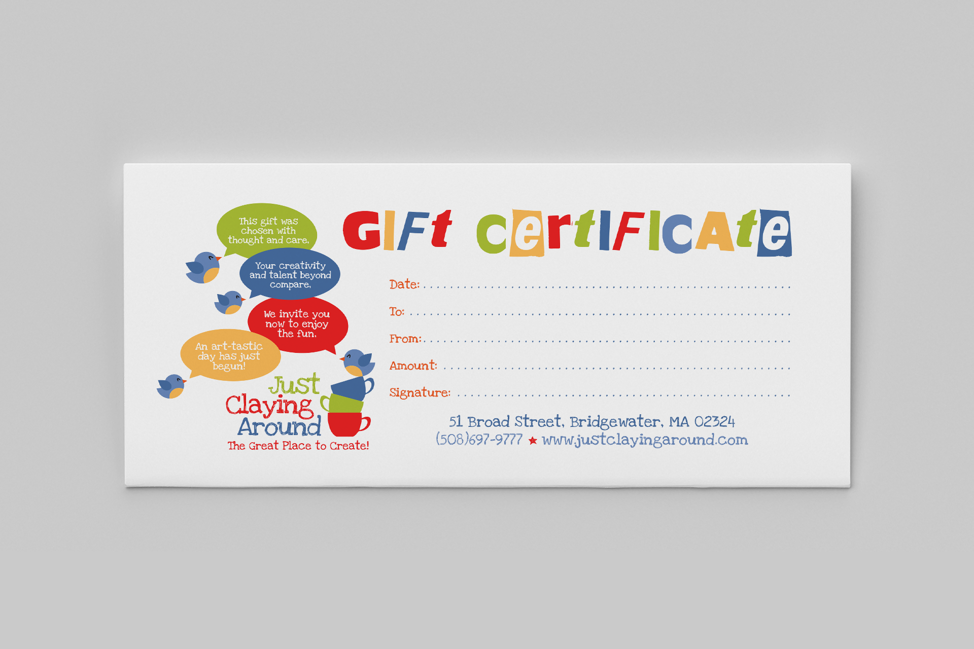
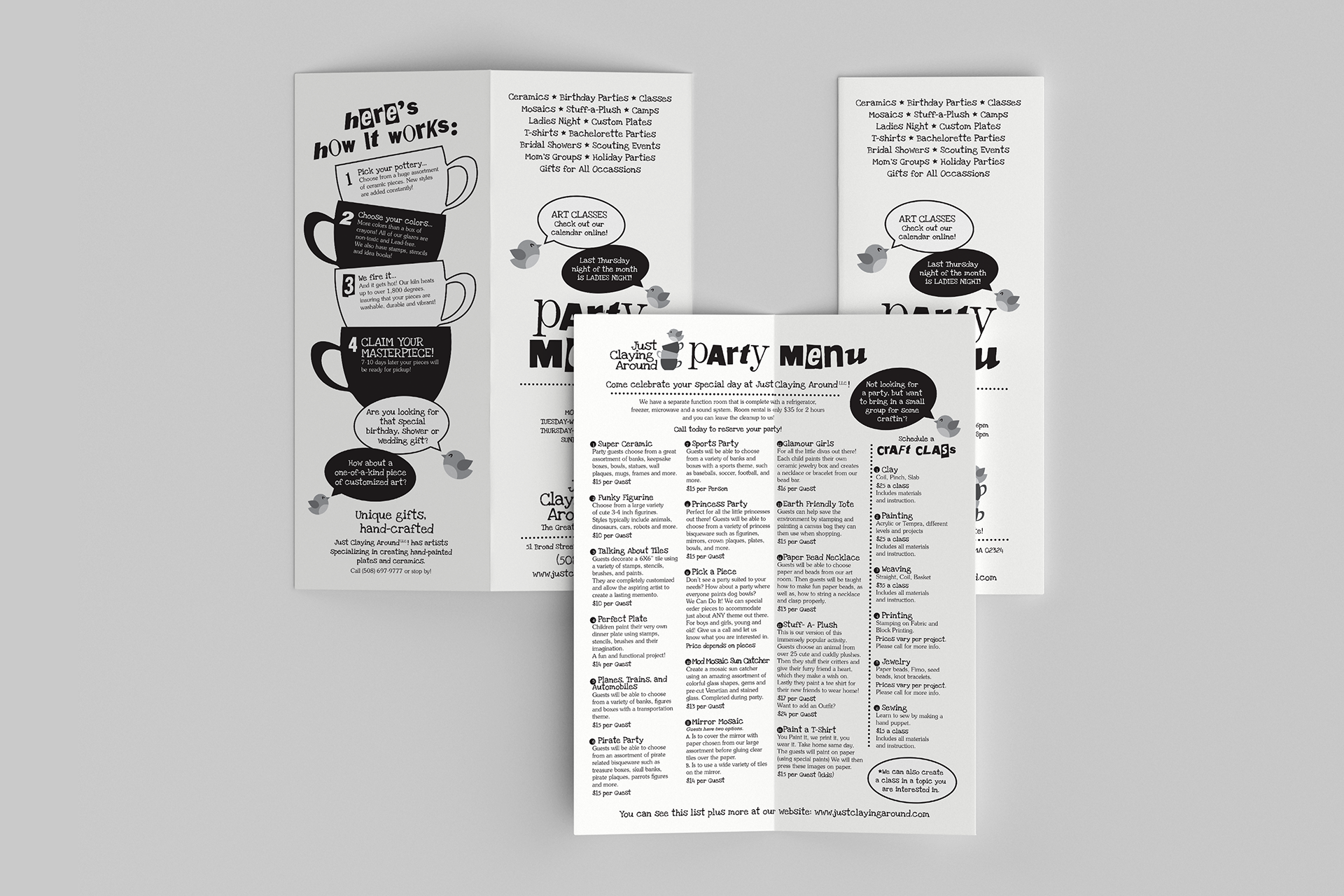
Just Claying Around
For this paint-your-own pottery studio, the identity could be much more playful. I created a colorful illustrated logo and carried that personality into gift certificates, printed materials and other customer-facing pieces.
emilie inc.
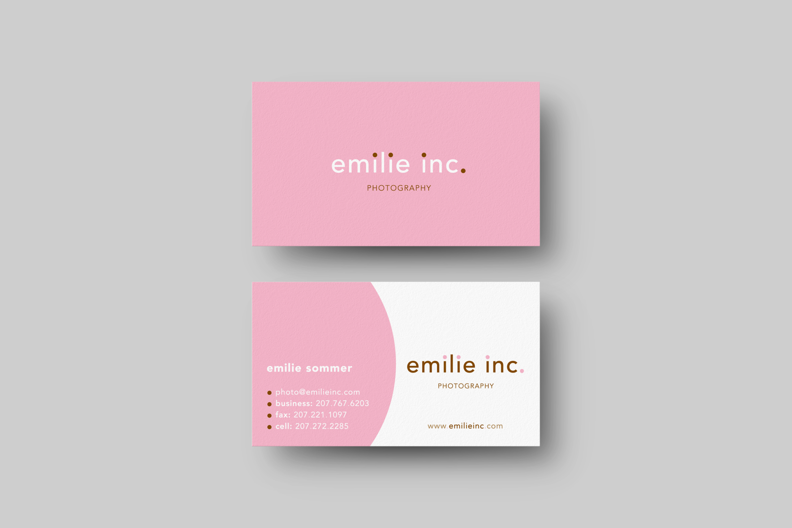
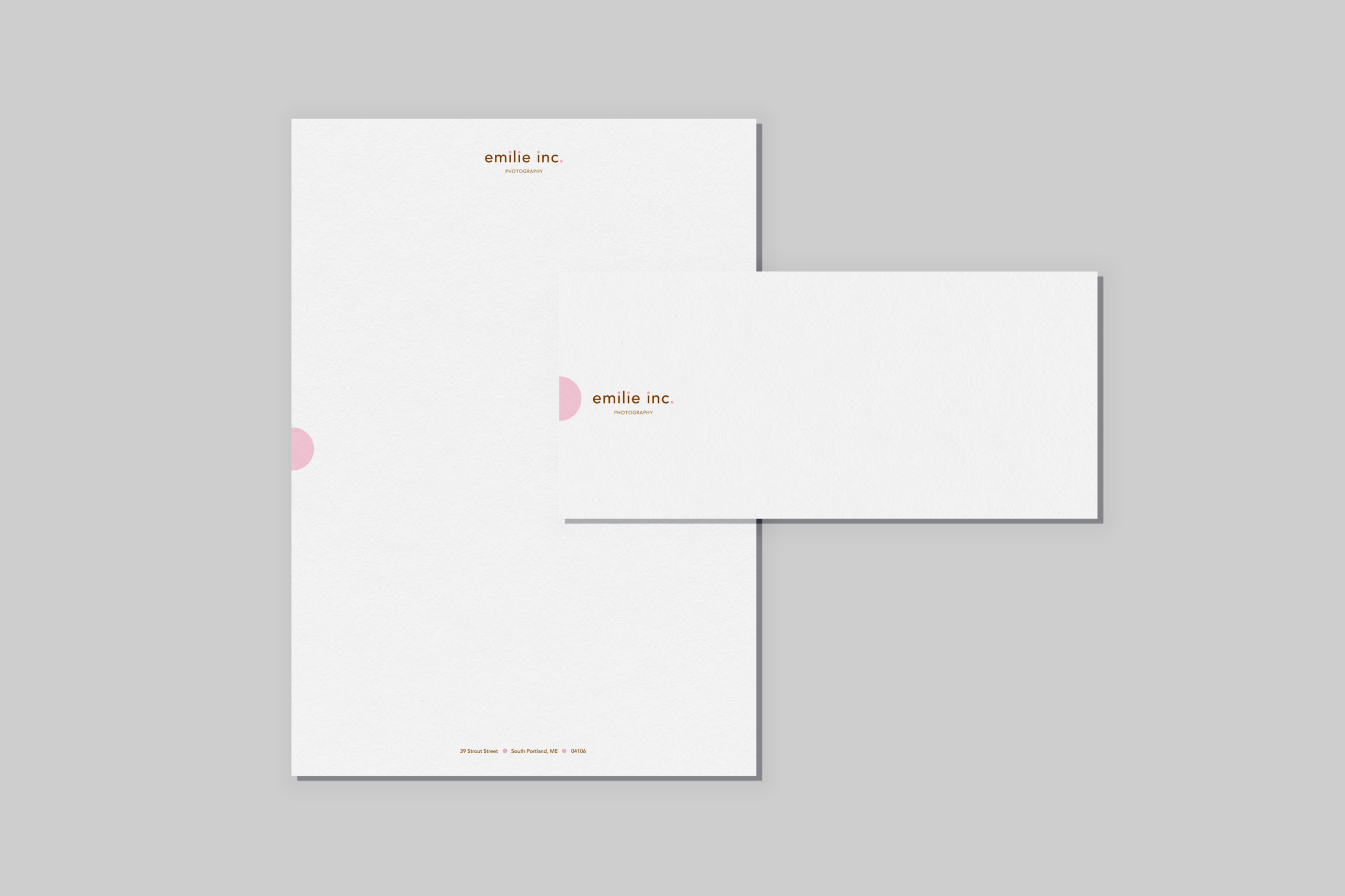
For wedding photography studio emilie inc., I created a simple typographic identity and a suite of understated stationery that reflected the brand’s clean, sophisticated photography.
Enchanted Wedding Cakes
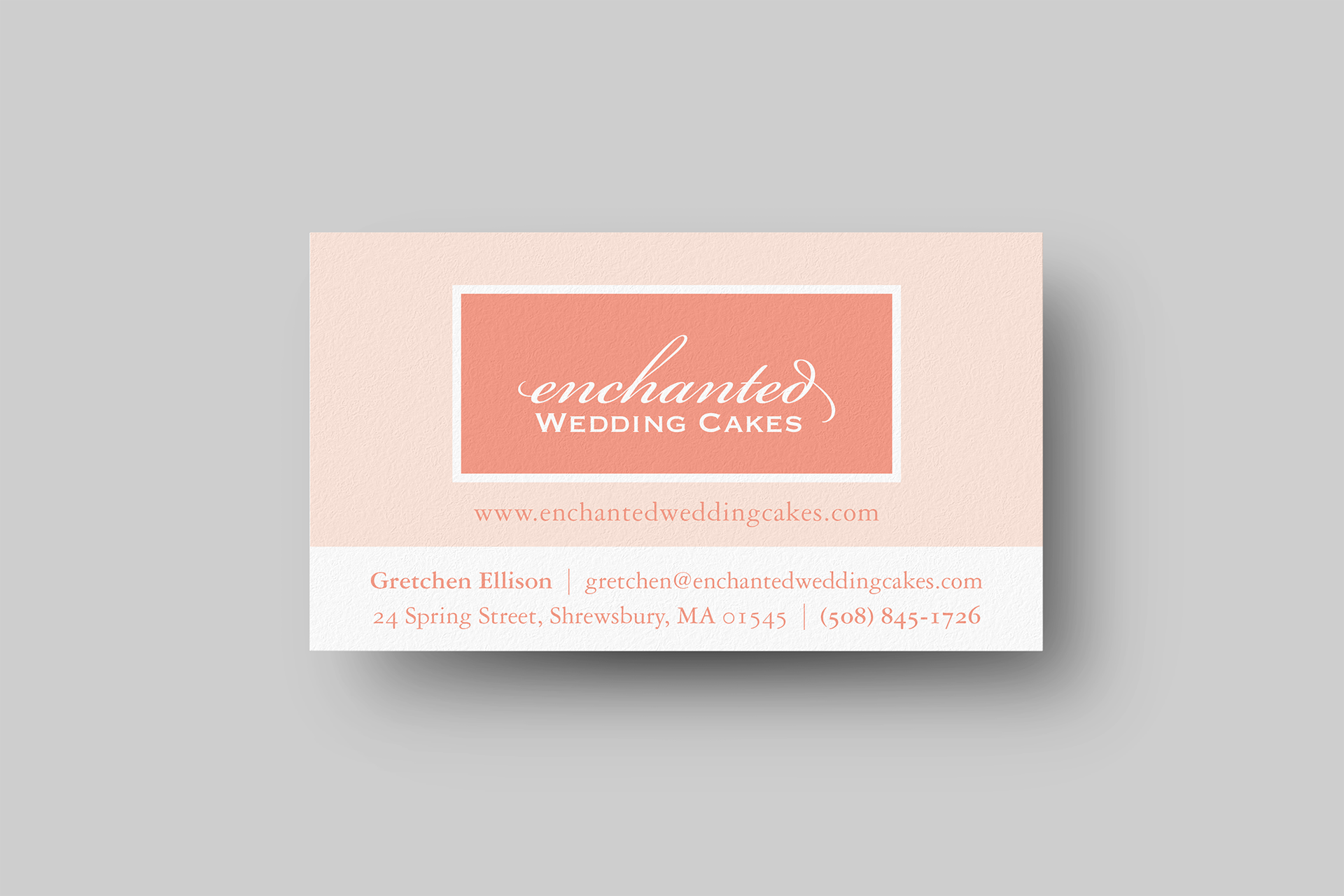
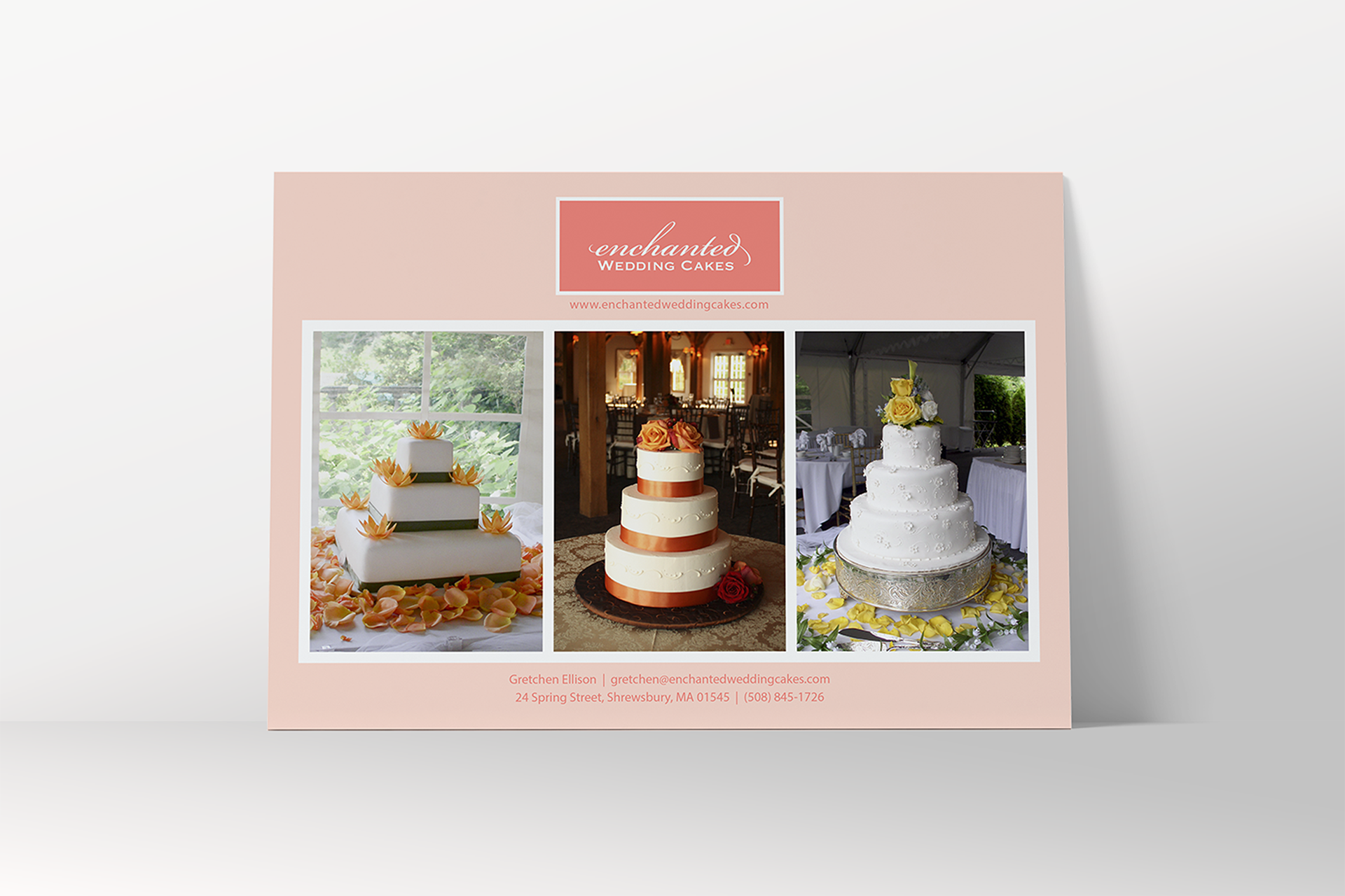
The identity for Enchanted Wedding Cakes paired an elegant wordmark with a soft, romantic palette that could extend naturally across packaging and printed materials. The logo was recognized with a 2005 American Graphic Design Award.
Selected Marks
The clients I worked with ranged from photographers and wedding professionals to fitness studios and other small businesses. These are a few more of the identities I created along the way.