ROLE: Owner & Designer / DISCIPLINES: Brand Strategy · Brand Identity · Logo Design · Art Direction · Print Design
A New Identity for a Growing Business
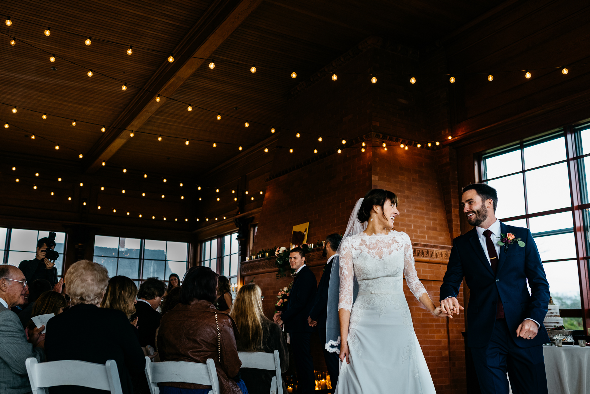
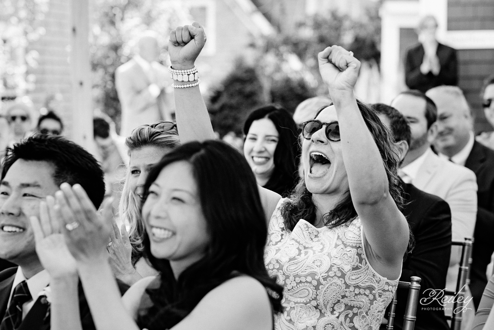
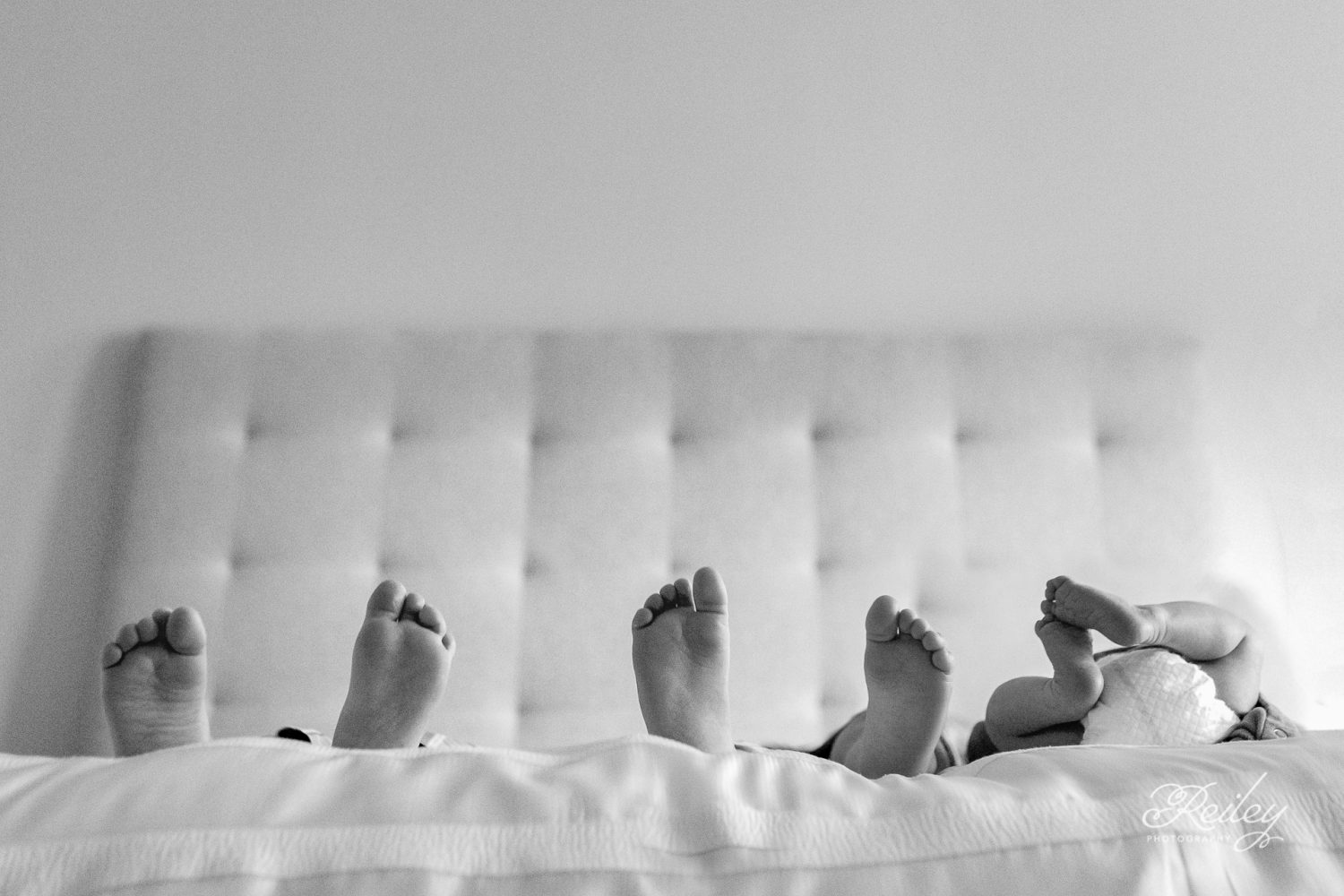
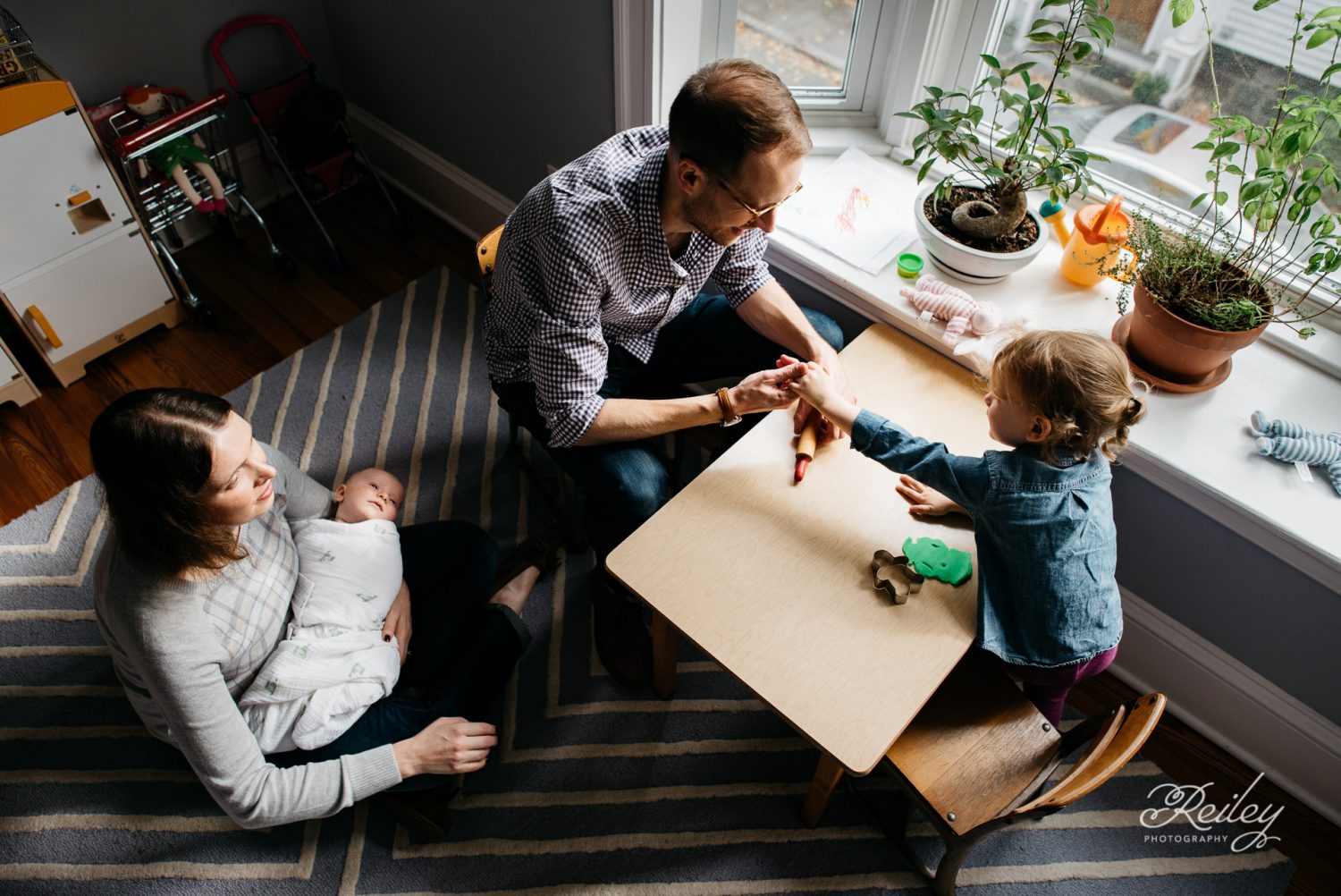
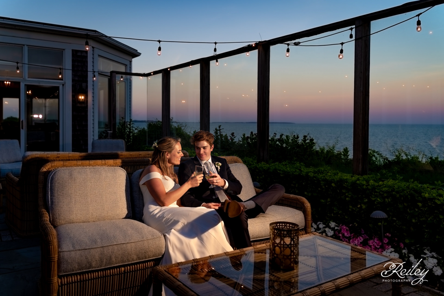
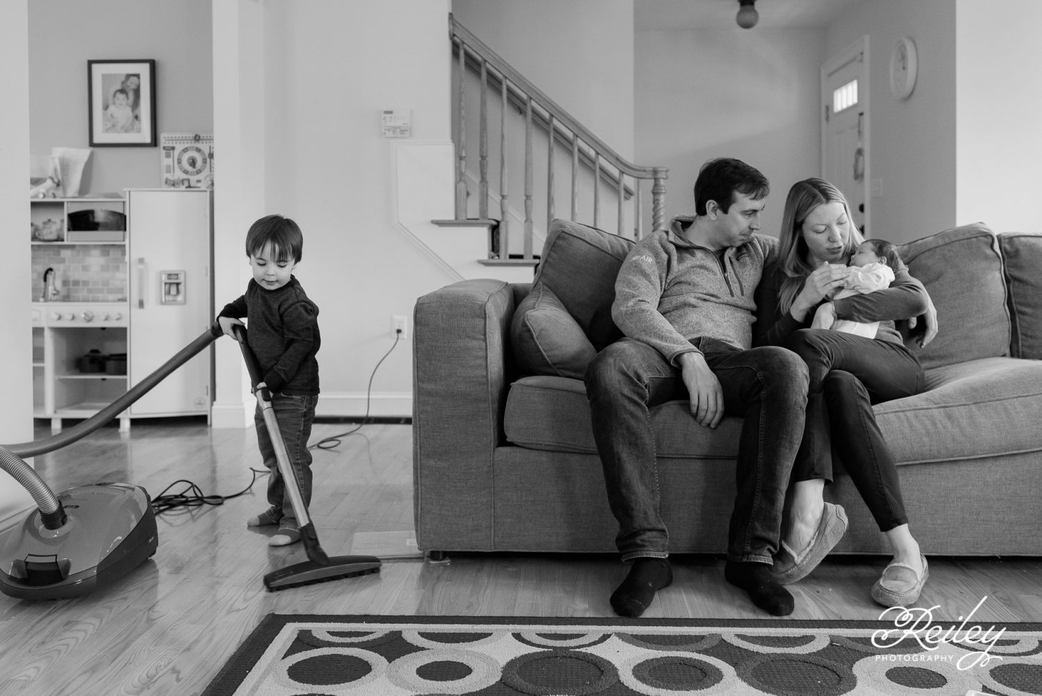
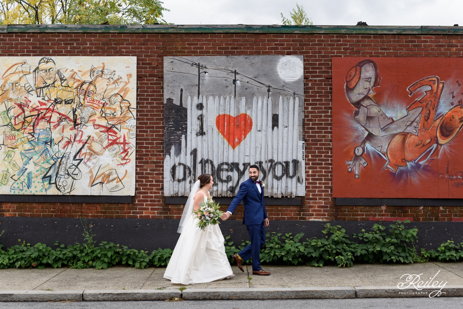
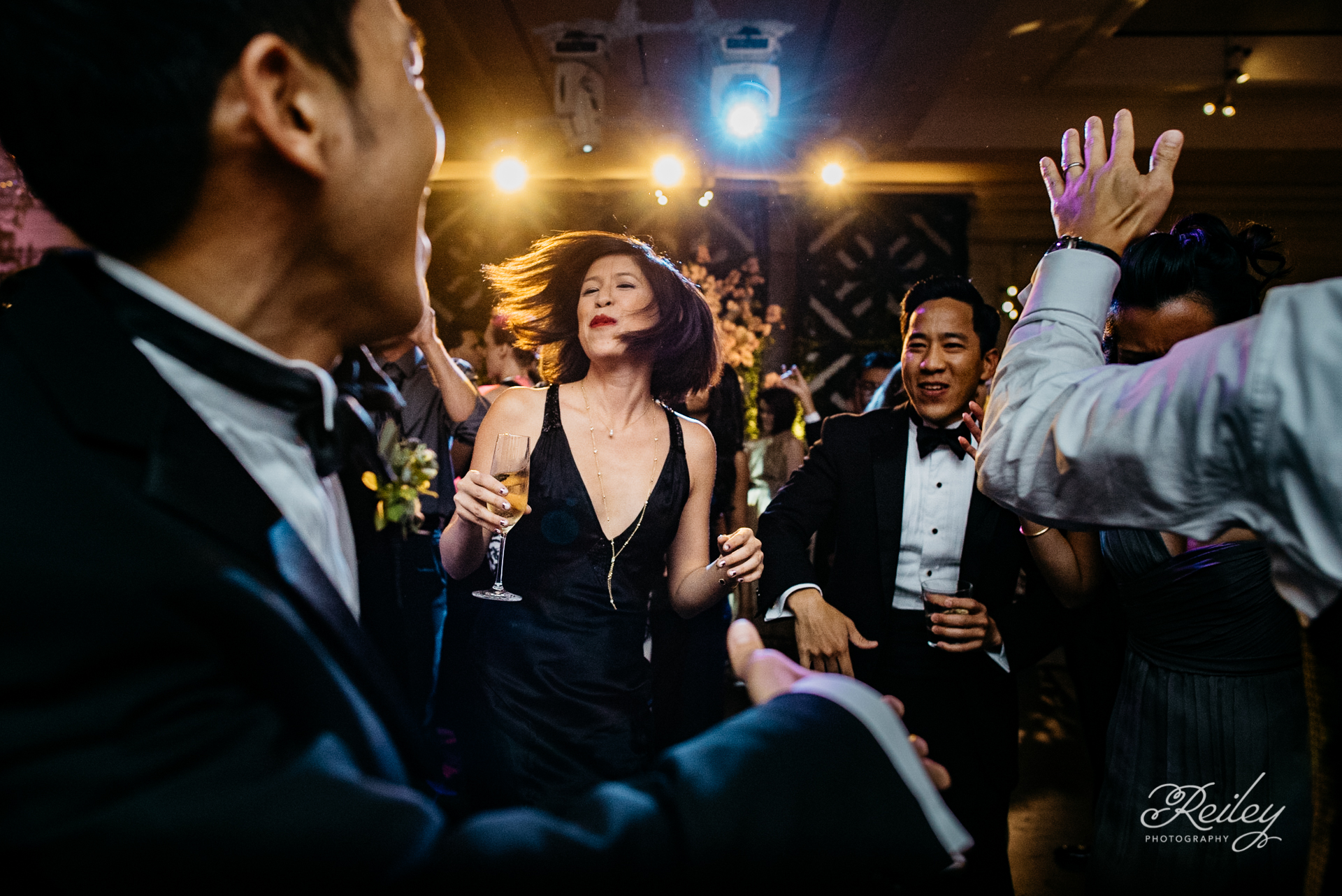
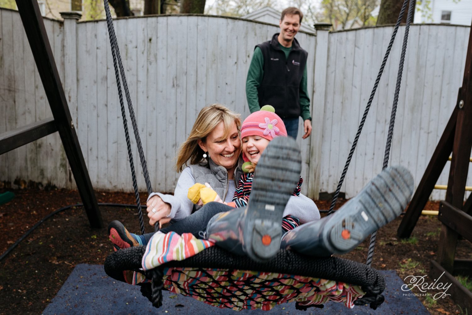
When I first created the Reiley Photography identity, it was all about celebrating the joy of everyday moments with families. As my work evolved and I began photographing weddings, I realized the brand needed to evolve with me. The original identity meant a lot to me, and I didn’t want to lose that connection as the brand changed. I wanted the new identity to reflect where my photography was going without losing what I loved about the original.
Goals
- Create a more sophisticated identity that works equally well for weddings and families.
- Keep a sense of continuity with the original Reiley Photography brand.
- Develop a flexible visual system for consistent use across print and digital materials.
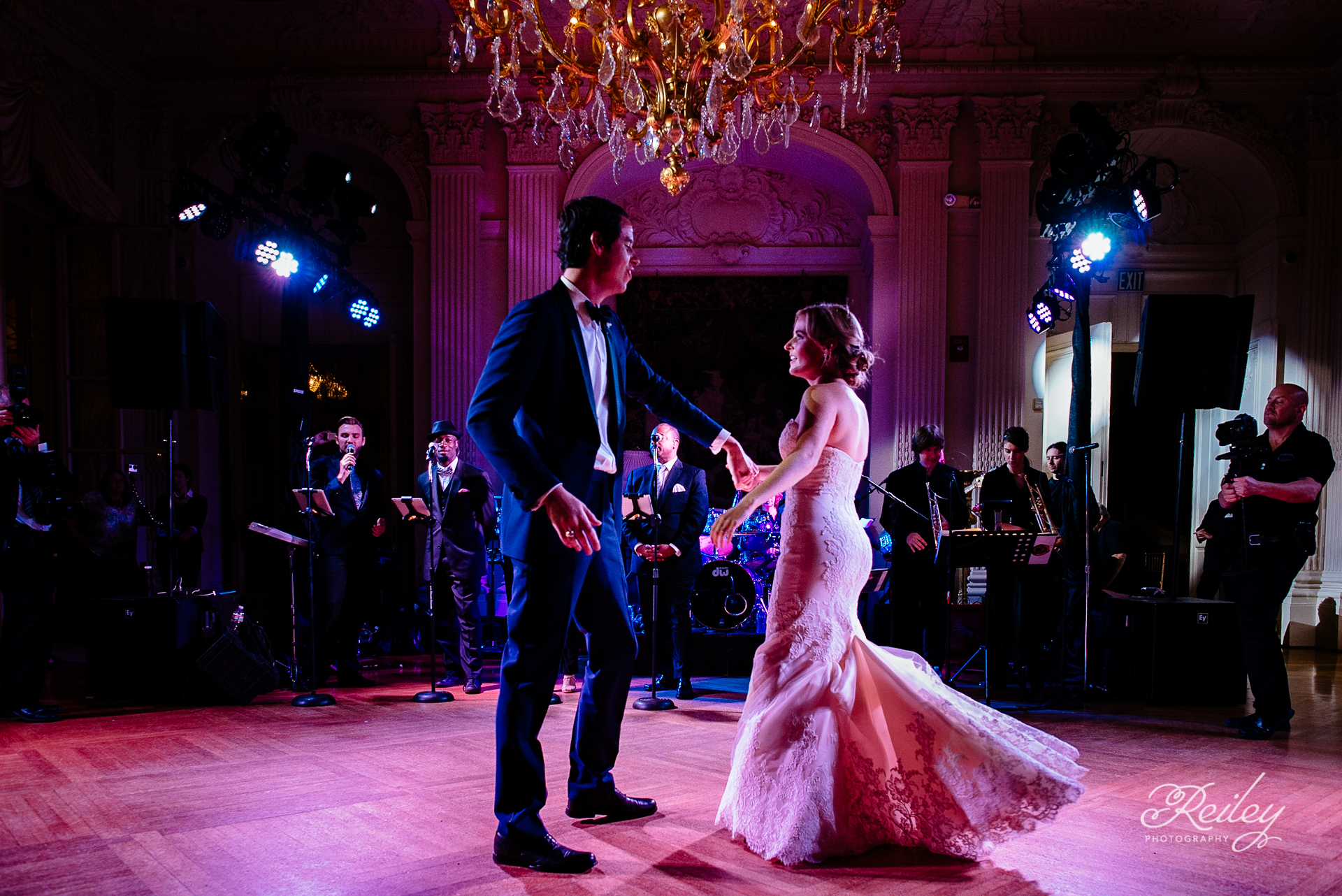
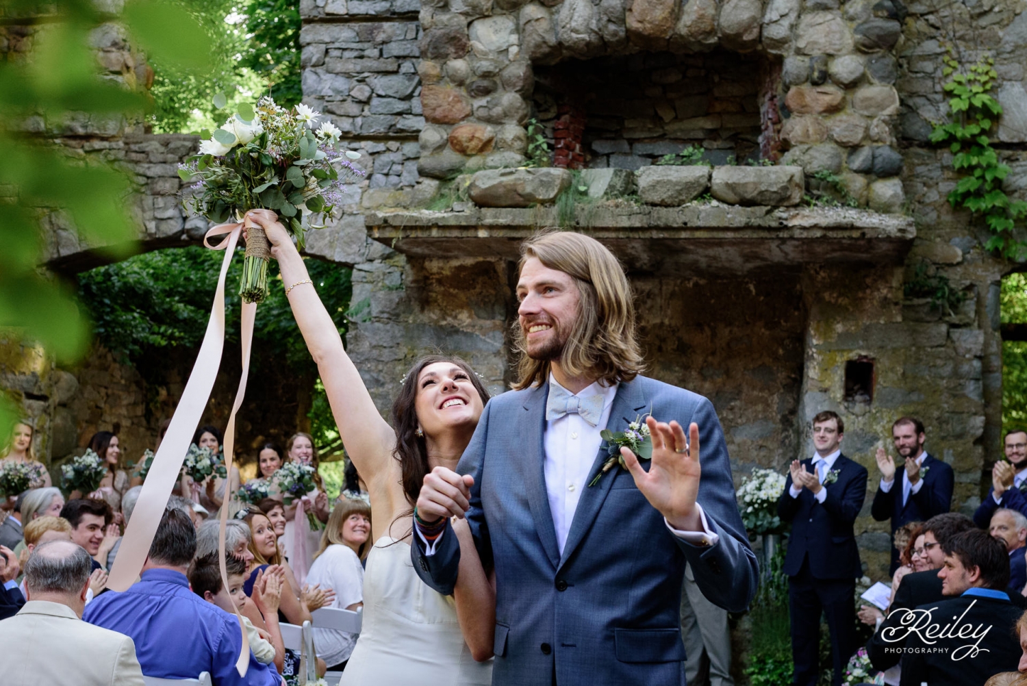
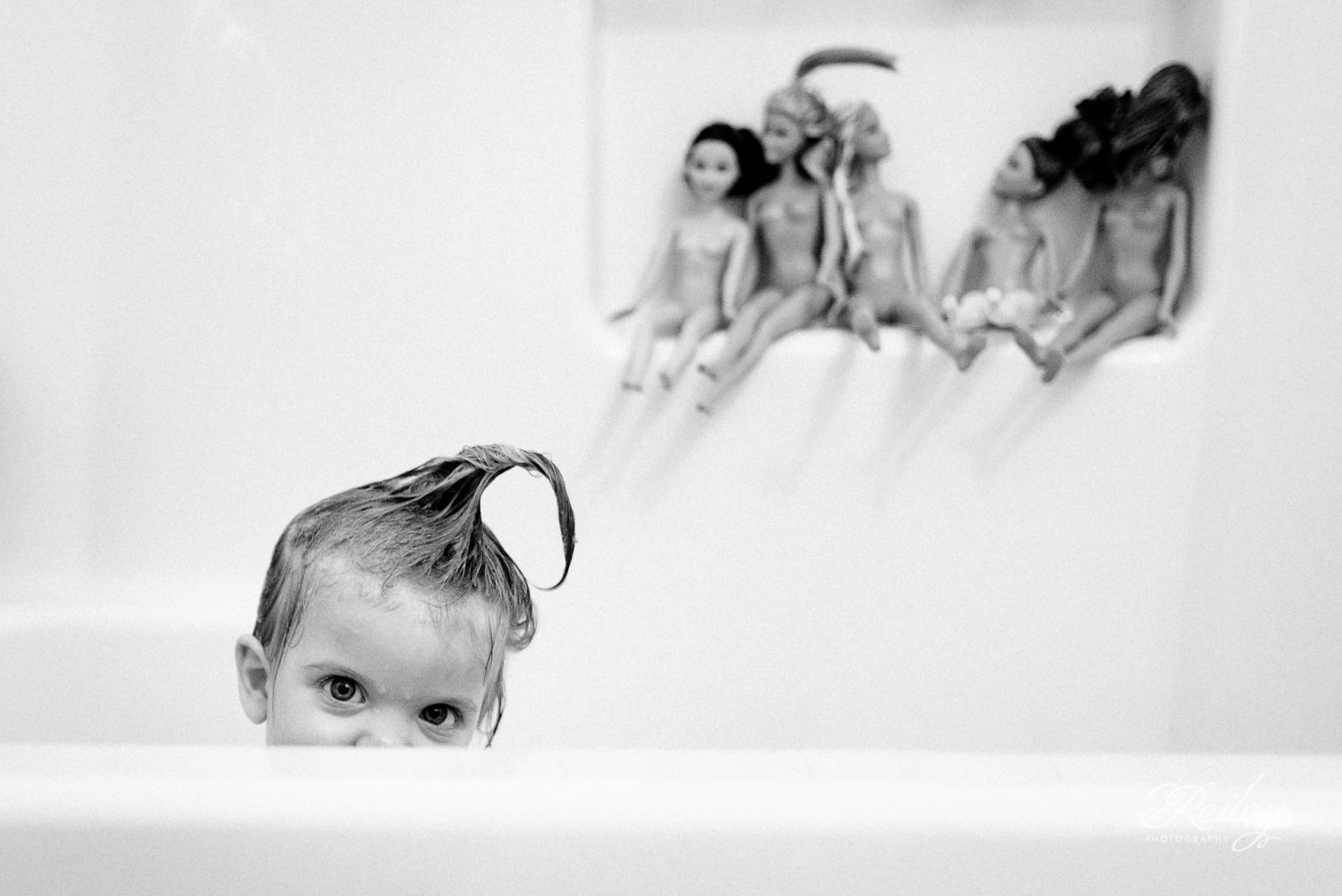
- Reflect the personal, documentary style of the photography without being overly formal.
Goals
- Create a more sophisticated identity that works equally well for weddings and families.
- Keep a sense of continuity with the original Reiley Photography brand.
- Develop a flexible visual system for consistent use across print and digital materials.
- Reflect the personal, documentary style of the photography without being overly formal.
Logo
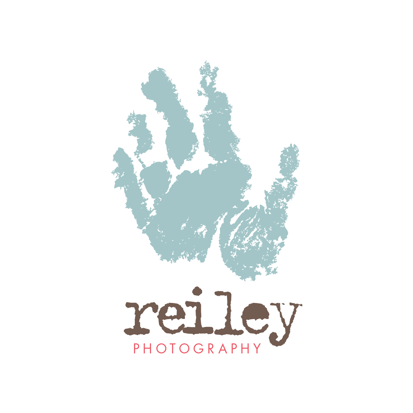
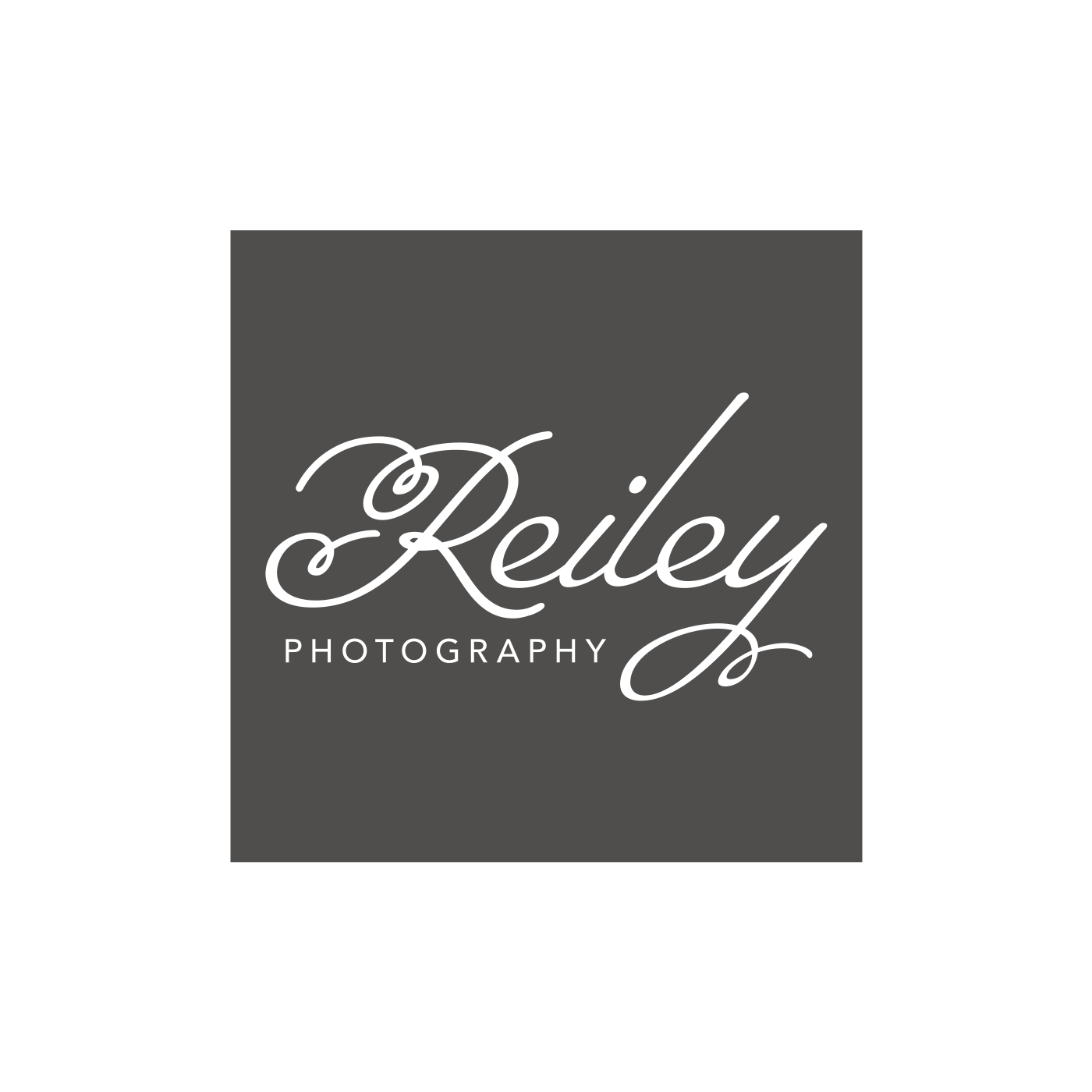
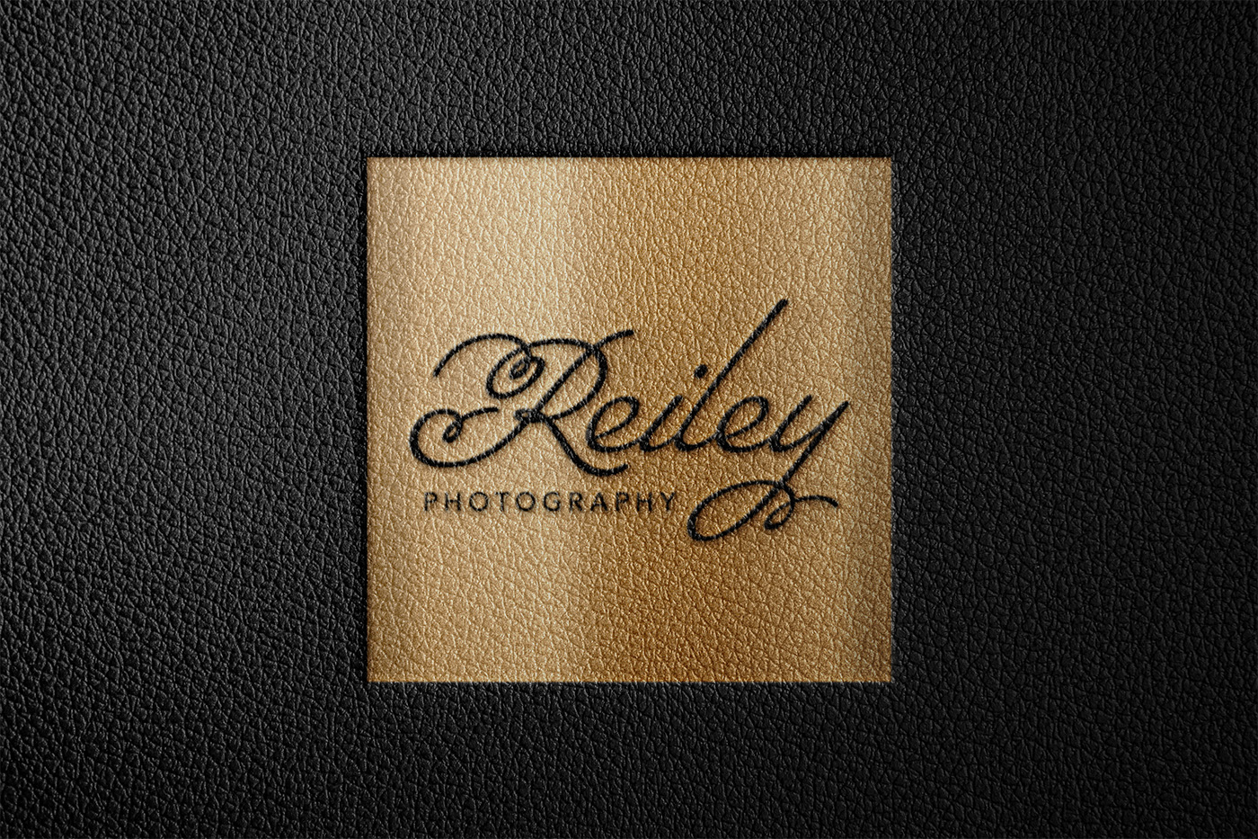
I wanted the new logo to feel more timeless and sophisticated while still fitting the personality of Reiley Photography. As my work expanded into weddings, I simplified the design and let the typography become the main focus, creating an identity that felt more refined while still welcoming families.
Original identity, 2006 → Brand refresh, 2011
Icon
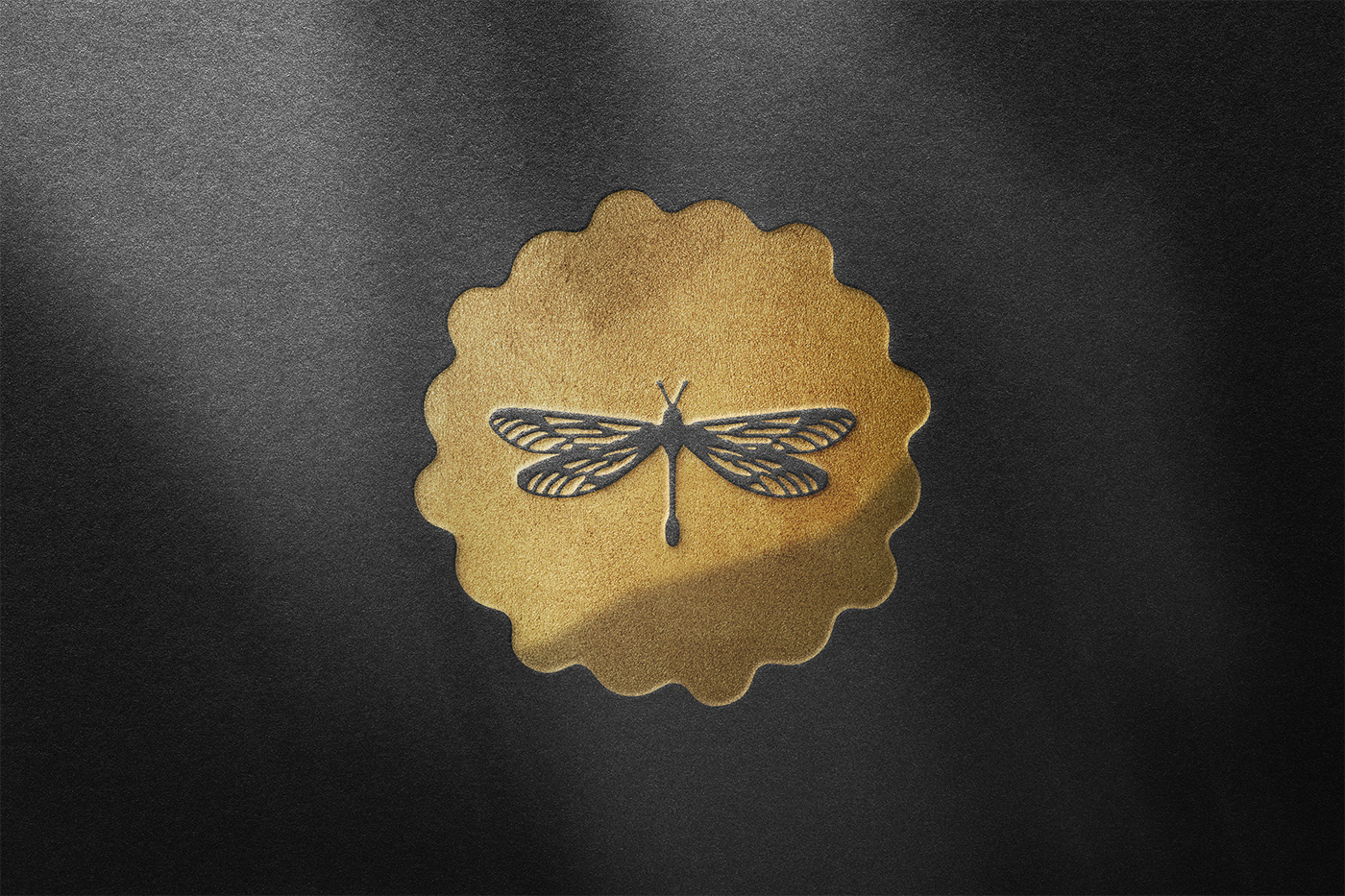
My son’s handprint had been a meaningful part of the original identity, and I struggled with letting it go. The dragonfly was also personal to me but gave the brand a symbol that could work just as naturally for weddings as it did for families.

Typography
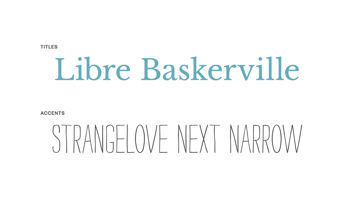
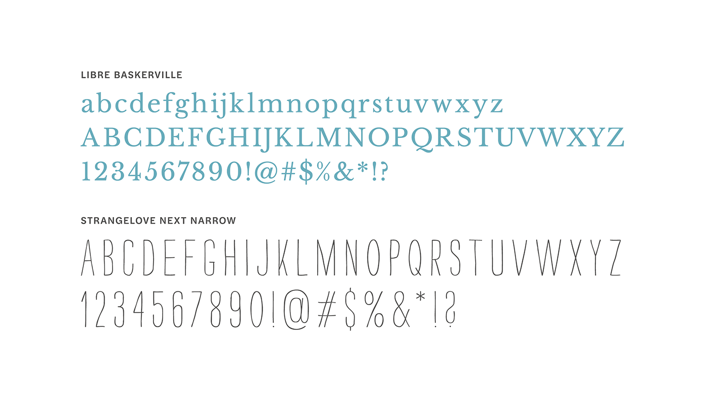
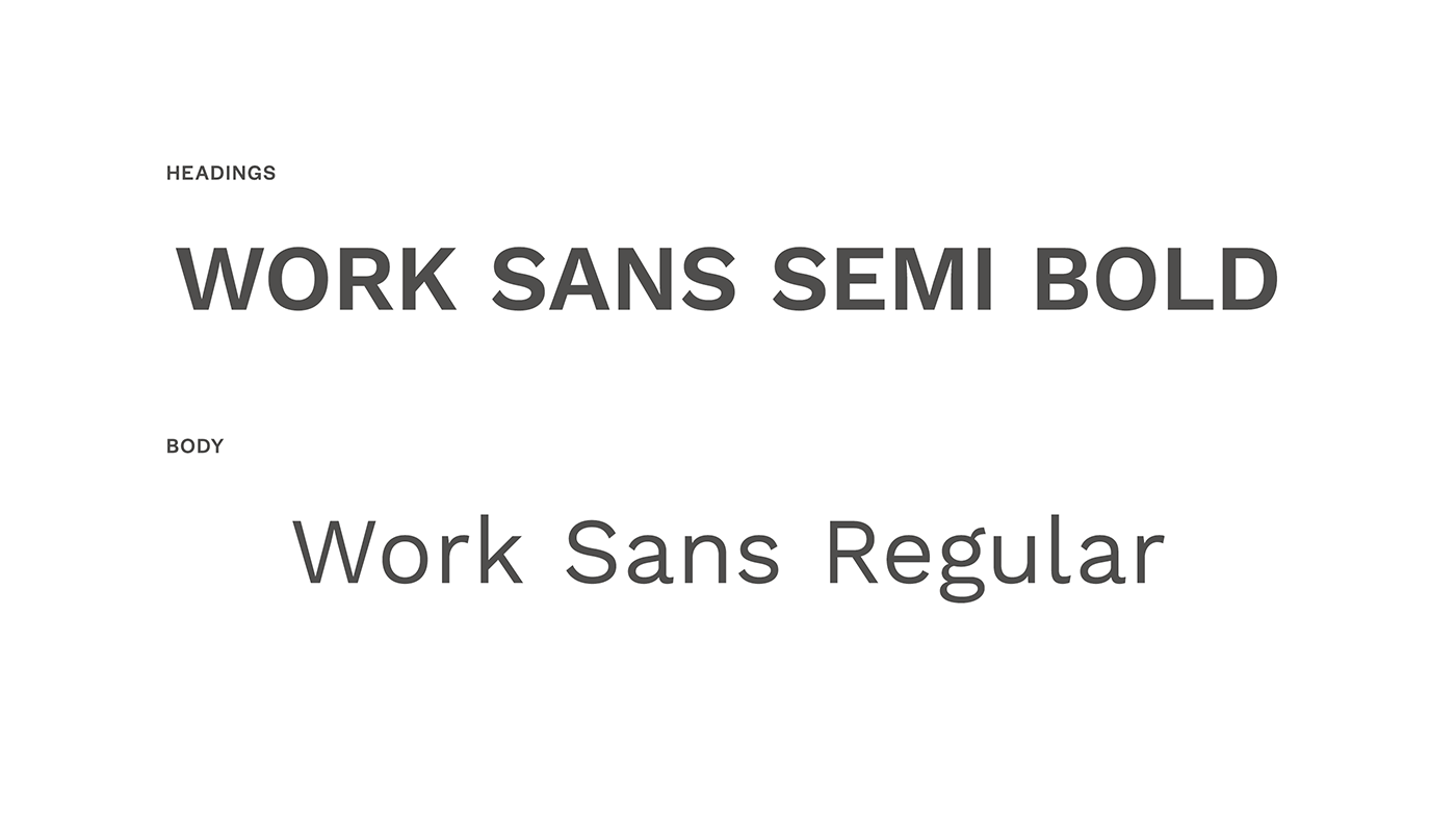
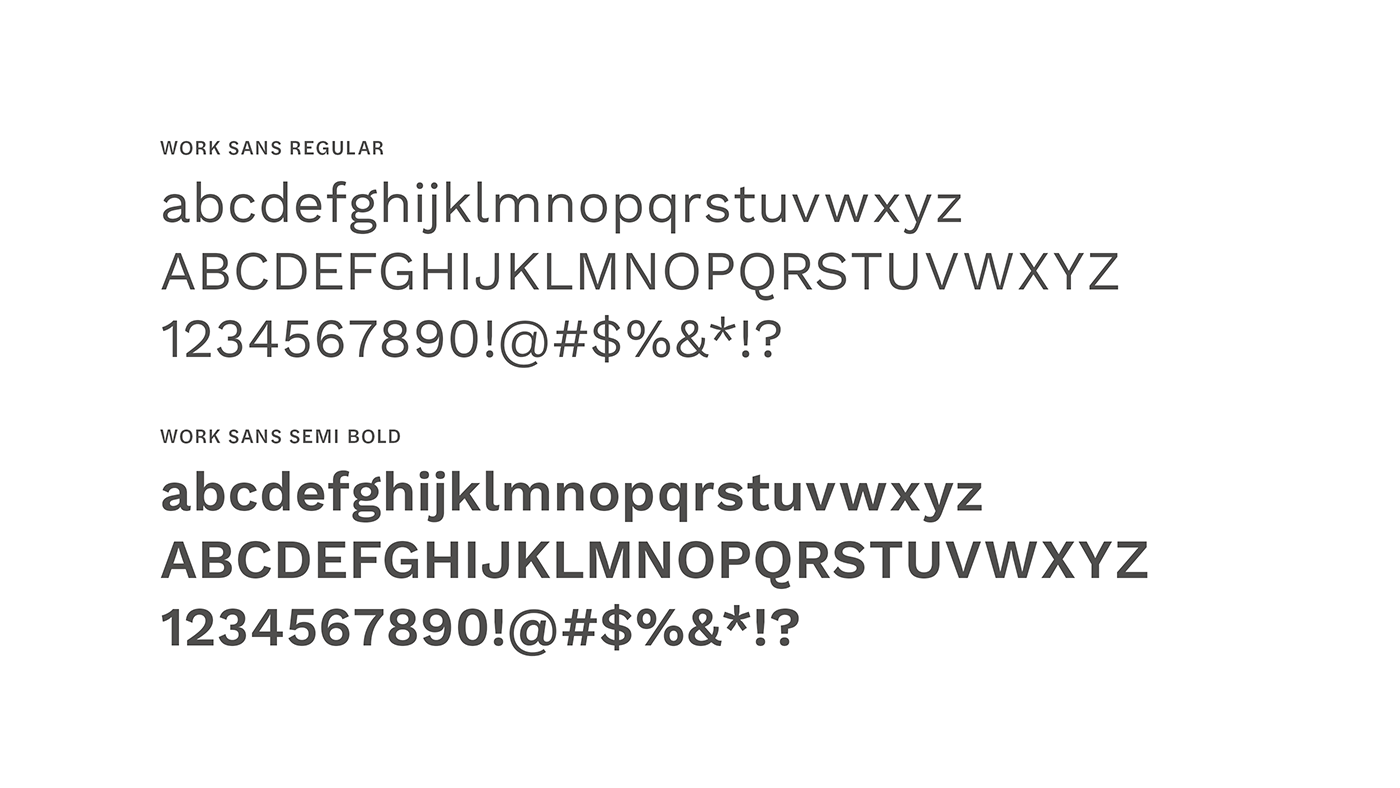
I used classic serif typefaces for headlines and callouts, paired with a clean sans serif for body copy. A handwritten typeface added a more casual, personal element and kept the identity from feeling too formal.
Color Palette
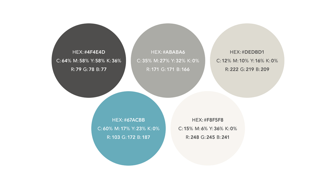
I kept the signature blue from the original Reiley Photography identity as a small connection to the brand’s history. I paired it with soft gray and beige tones to create a quieter palette that let the photography remain the focus.
Business Cards
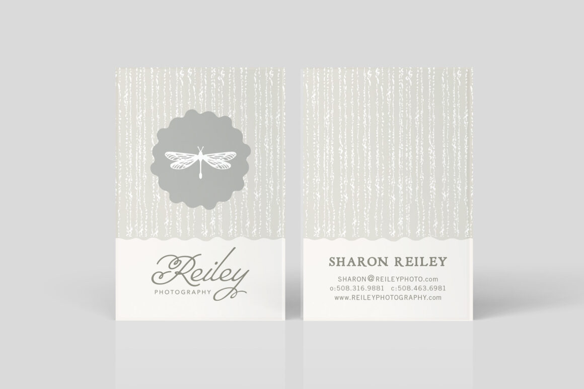
The business cards helped bridge the layered, handcrafted feel of the original identity with the more elegant direction of the new brand. I combined delicate textures, soft neutral tones, and the dragonfly icon with refined typography to create something personal without becoming overly playful.
Note Cards
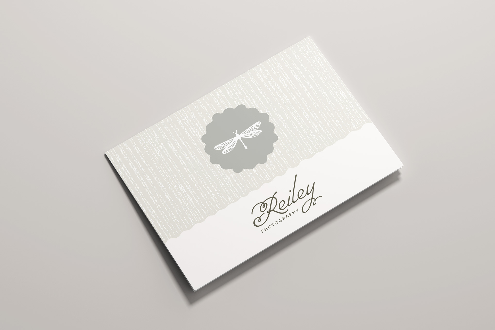
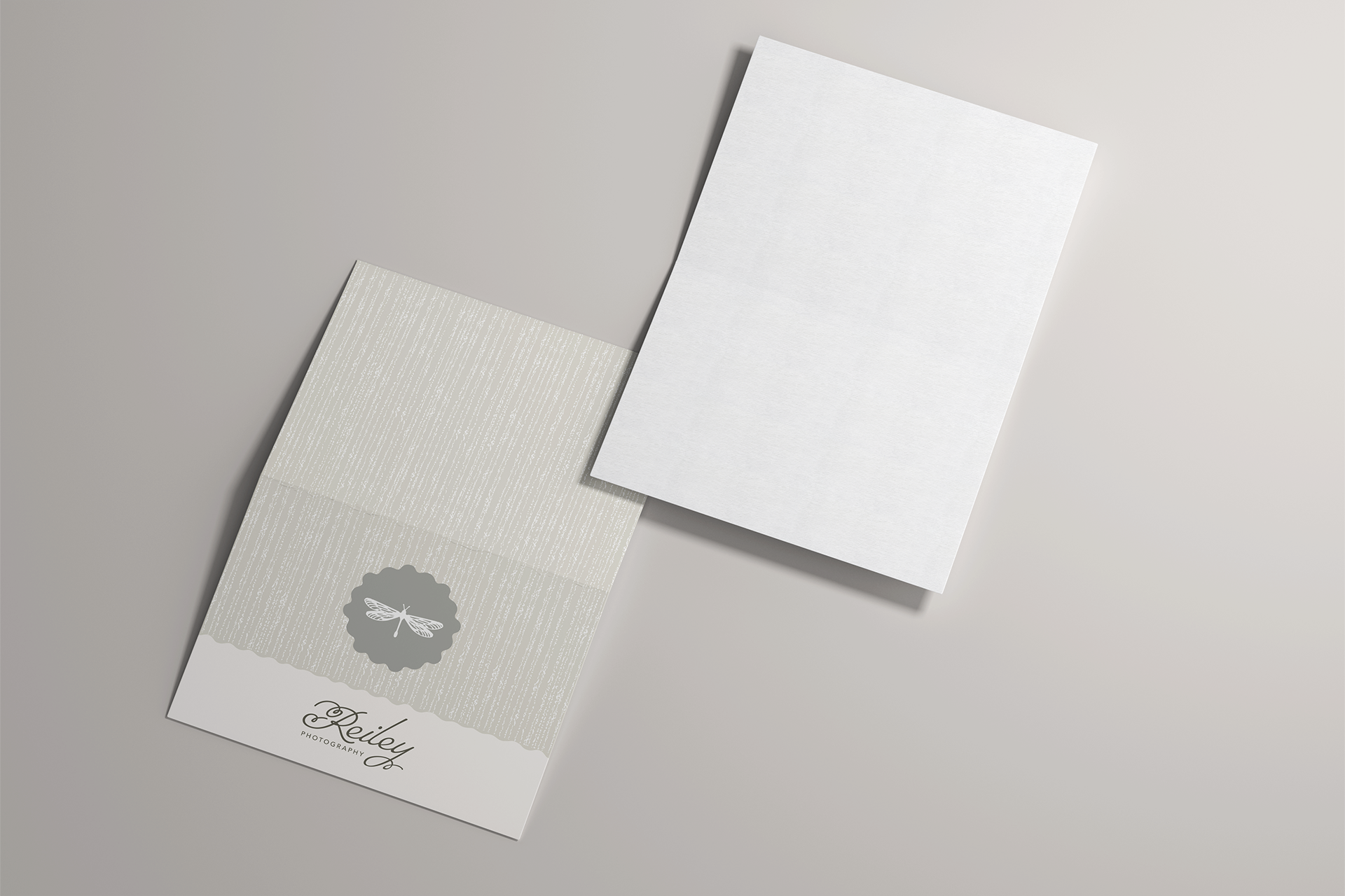
I designed the note cards to be versatile pieces that could be used for any occasion, with plenty of room inside for a handwritten note. The textured background and dragonfly icon carried the new identity into client correspondence while keeping the design personal and warm.
Gift Certificates
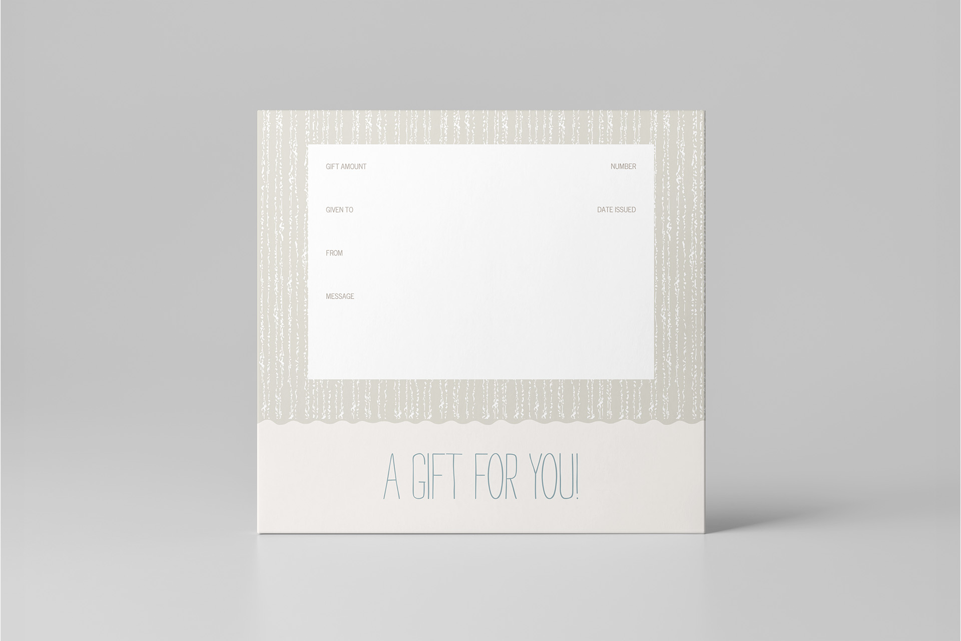
I designed the gift certificates as 5×5 cards with space for a handwritten message, making the experience of giving photography more personal.
Digital Image Packaging
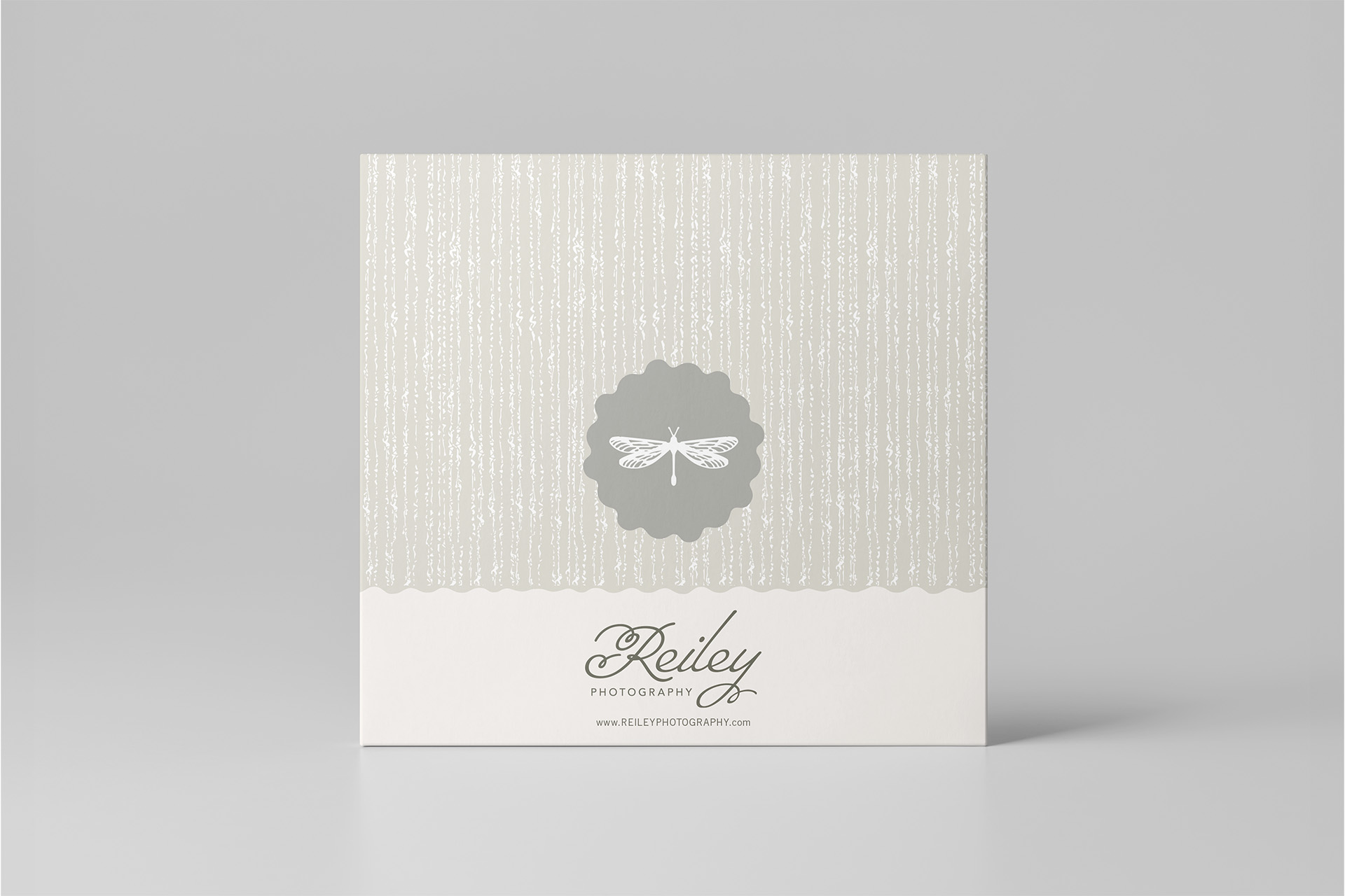
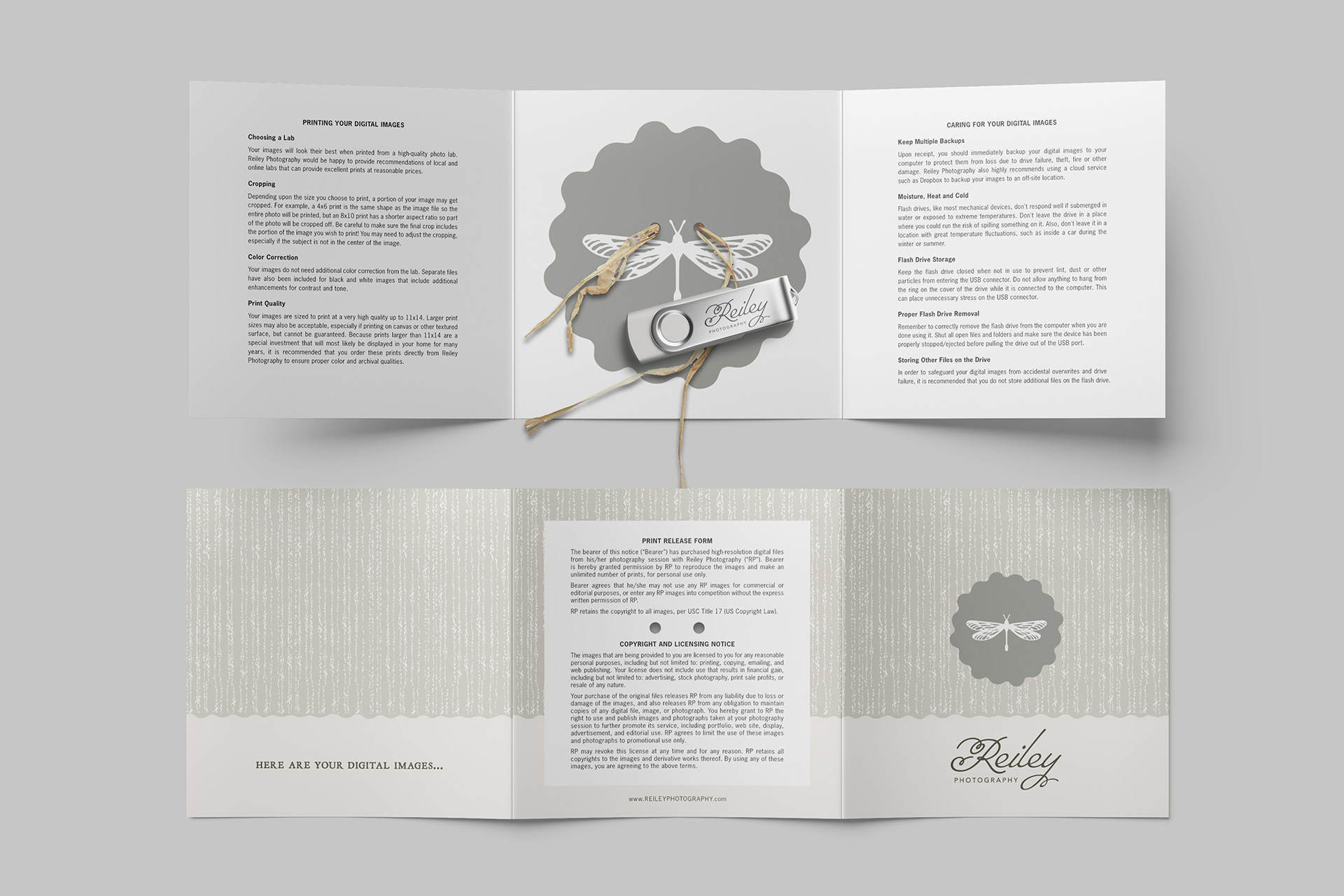
As digital image delivery became a larger part of the business, I wanted the presentation to feel just as thoughtful as receiving prints or an album. I designed branded packaging to give clients a more personal way to receive and keep their photographs.
Outcome
The new identity allowed Reiley Photography to grow with me as my work expanded into weddings. It felt natural for both wedding and family clients while still holding onto the personality and meaning that had always been part of the brand. The system gave me a flexible foundation that I could continue building on for years.
Outcome
The new identity allowed Reiley Photography to grow with me as my work expanded into weddings. It felt natural for both wedding and family clients while still holding onto the personality and meaning that had always been part of the brand. The system gave me a flexible foundation that I could continue building on for years.