ROLE: Designer / DISCIPLINES: Brand Strategy · Brand Identity · Logo Design · Art Direction · Print Design
A Brand Identity Designed to Spark Joy
Fotoskribe was founded by photographer and entrepreneur Rachel Conley to help photographers keep up with blogging without having to do all of the writing themselves. When Rachel approached me about creating an identity for Fotoskribe, she had already chosen the name but wanted a new brand to replace her original business, The Photographer’s Blogger.
Rachel wanted Fotoskribe to feel clean and modern, but also bright, friendly, and fun. Blogging was something many photographers saw as another task on an already long to-do list, so the new identity needed to make the experience feel easier and more enjoyable.
Goals
- Create a distinctive identity for the new Fotoskribe brand.
- Make the service feel simple, friendly, and easy to understand.
- Bring a sense of fun to a task many photographers found overwhelming.
- Create a flexible visual system that could grow with the business.
Goals
- Create a distinctive identity for the new Fotoskribe brand.
- Make the service feel simple, friendly, and easy to understand.
- Bring a sense of fun to a task many photographers found overwhelming.
- Create a flexible visual system that could grow with the business.
Logo
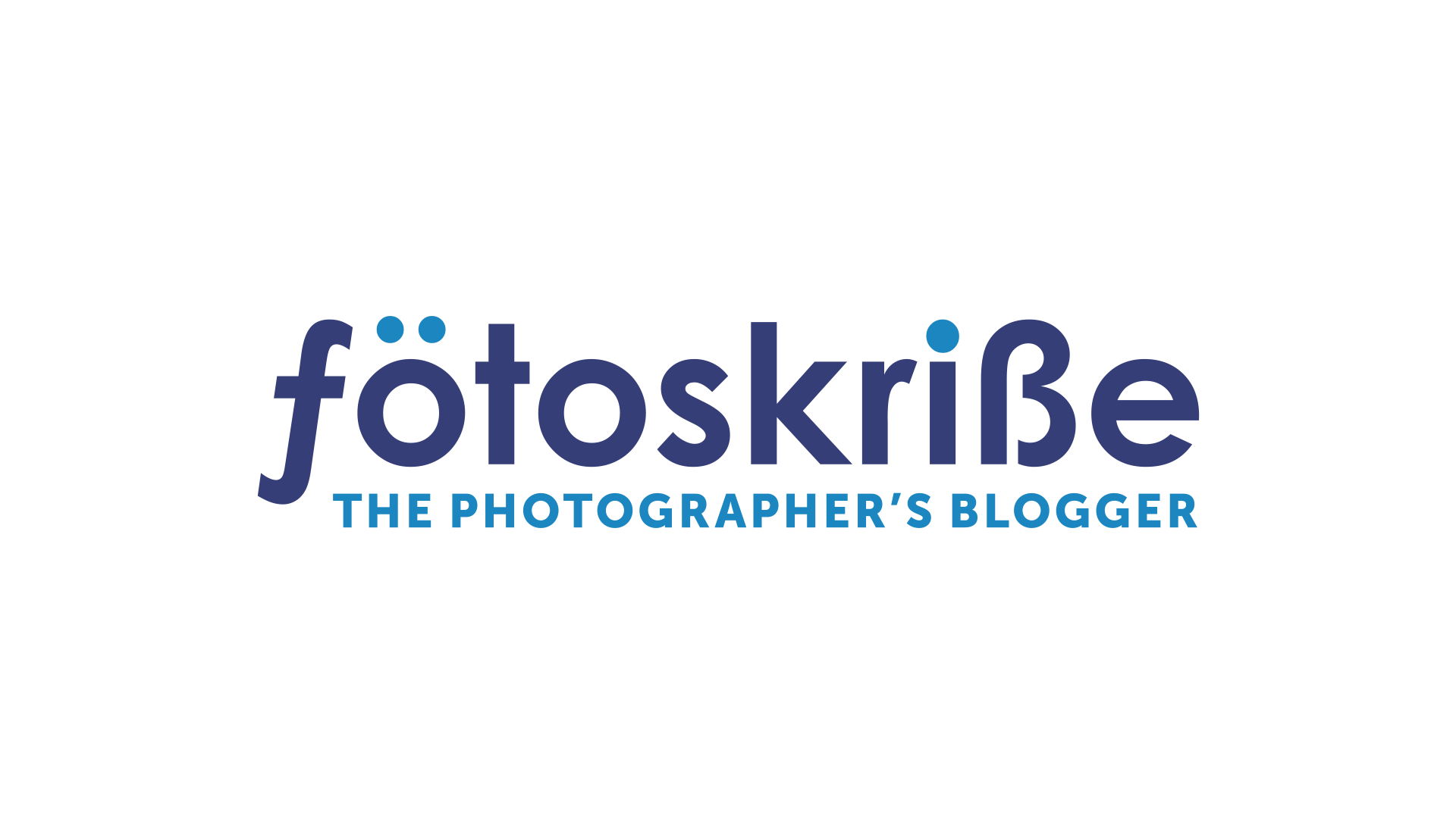
I designed the Fotoskribe monogram by combining an italic f, inspired by the notation for a camera’s f-stop, with a B shaped to reference Scandinavian letterforms. The two letters connect photography and blogging while giving a subtle nod to Rachel’s Scandinavian heritage and love of Scandinavian design.
The clean, geometric mark gave the identity a modern foundation for the more playful elements of the brand.
BEFORE: The Photographer’s Blogger → AFTER: Fotoskribe

Typography
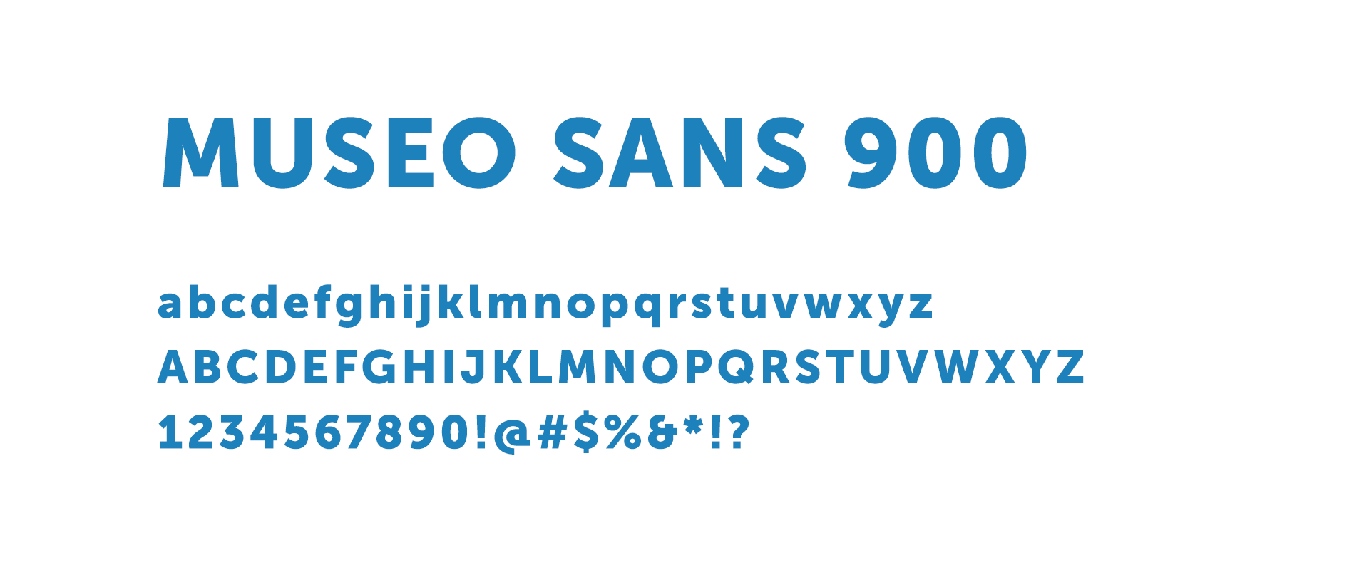
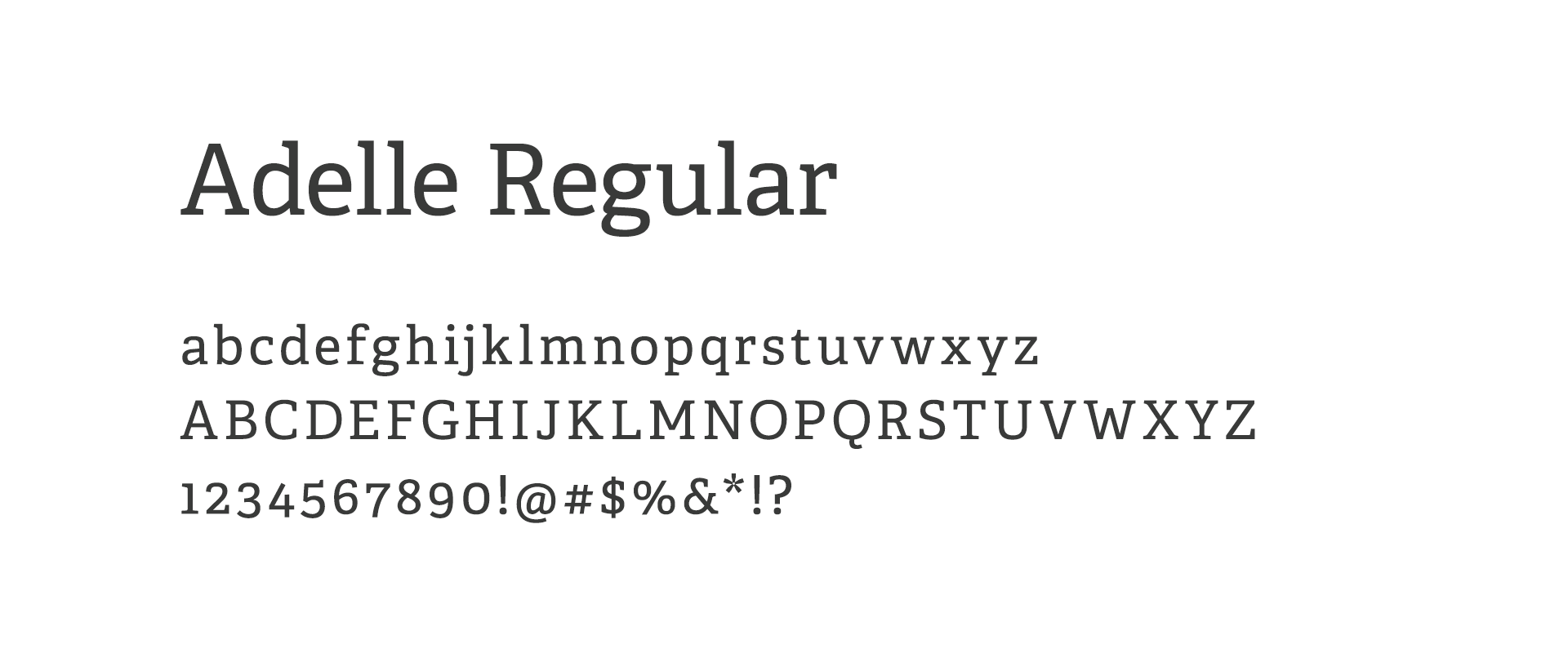
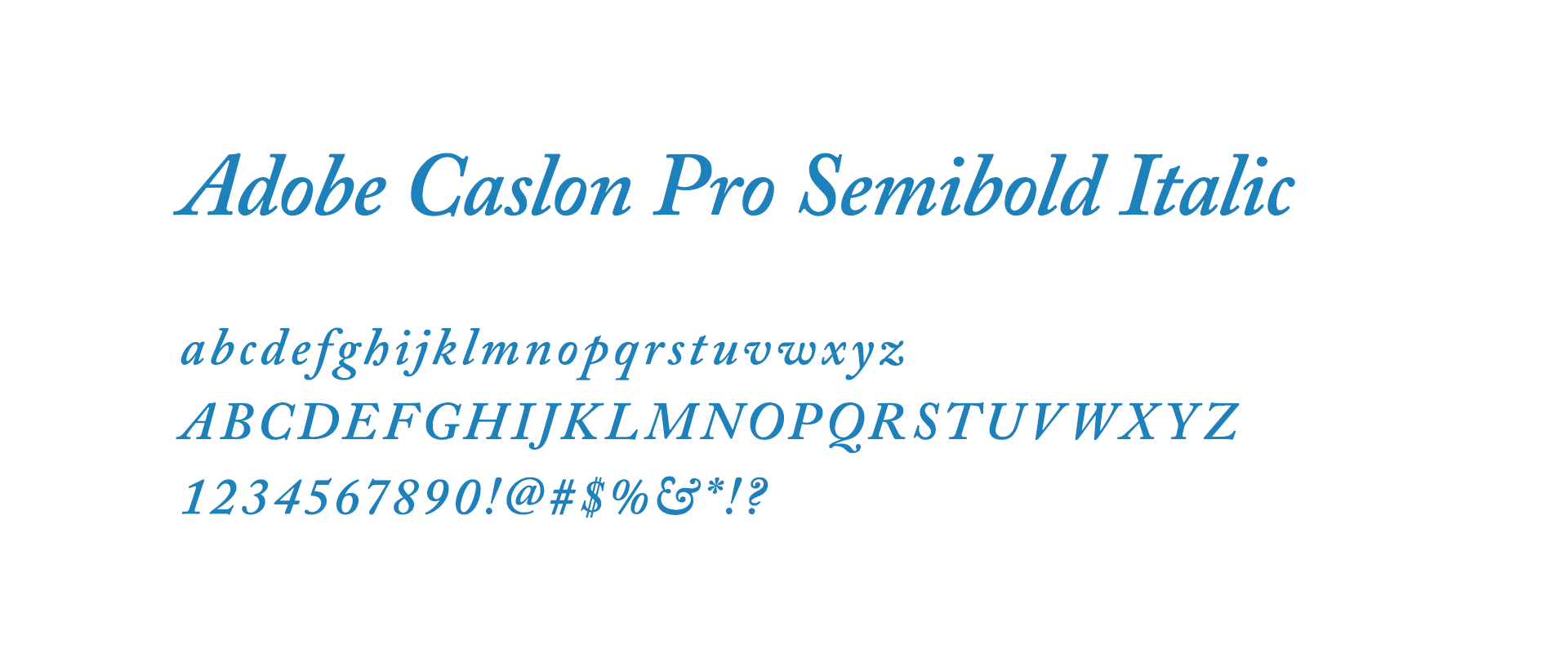
I used bold Museo Sans for headlines, paired with Adelle for body copy to keep the typography friendly and easy to read. Adobe Caslon Pro Semibold Italic added an editorial contrast for decorative accents, connecting the identity back to Fotoskribe’s focus on writing and blogging.
Color Palette & Custom Patterns
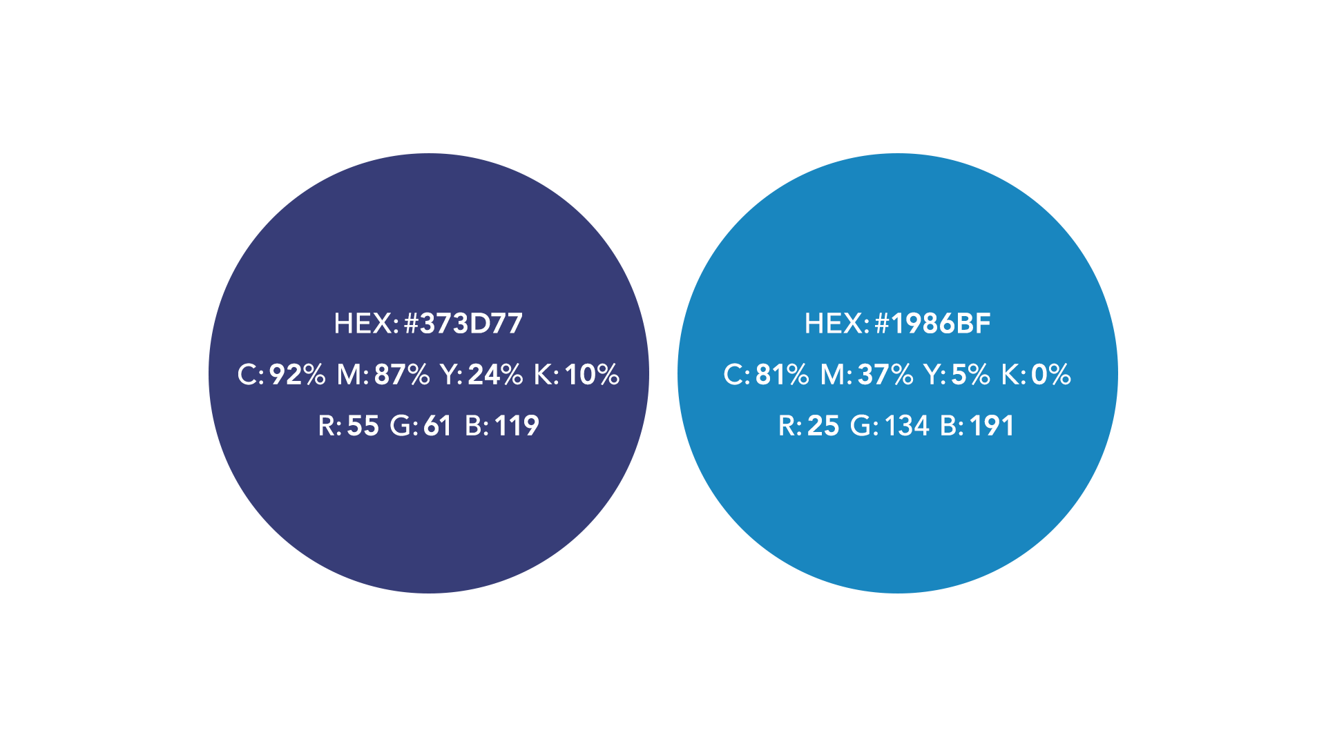
I drew inspiration from architectural blueprints and the idea of having a plan to follow. Fotoskribe gave photographers a structured way to approach blogging, using prompts they could fill in after a session or wedding to make the writing process easier and more efficient.
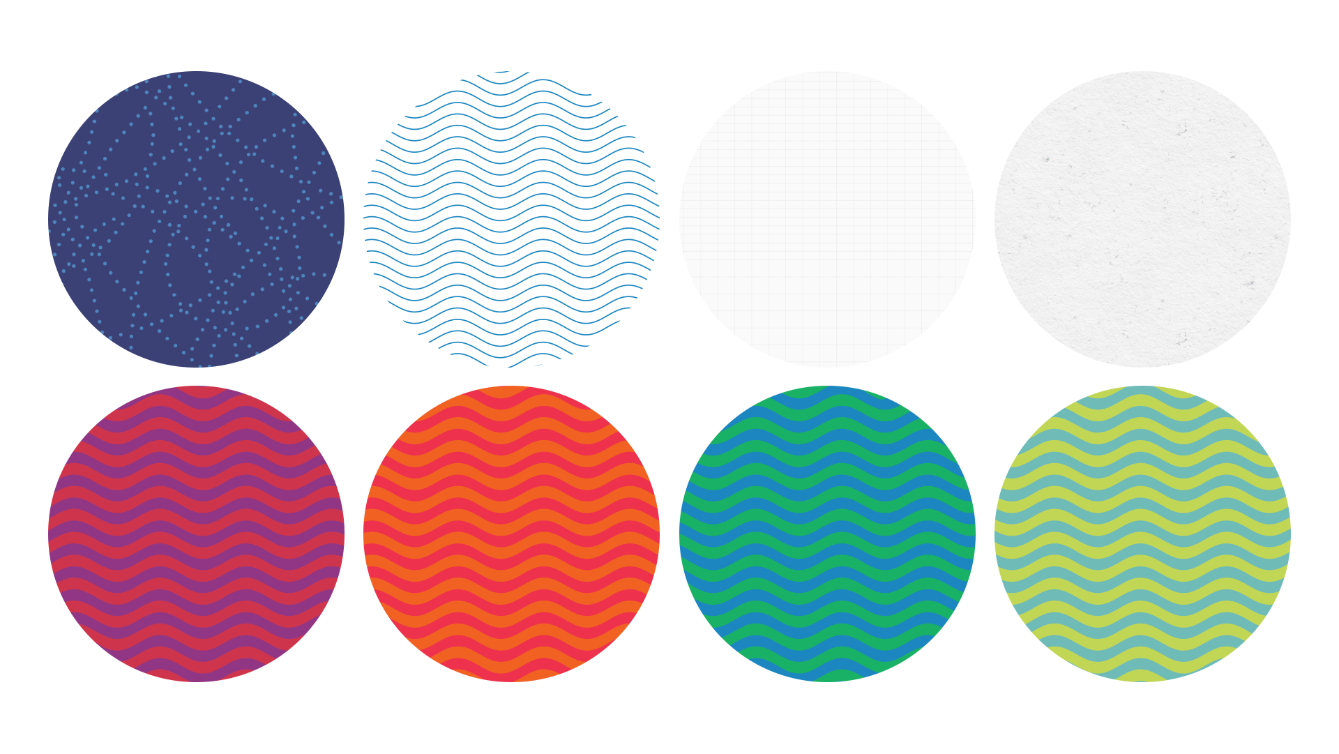
That idea inspired the deep blue at the center of the palette, along with the subtle grid backgrounds and dotted-line patterns used throughout the identity. I balanced that structure with brighter colors and playful patterns inspired by Scandinavian folk design, reflecting Rachel’s love of Scandinavian design while helping blogging feel more fun and effortless.
Business Cards & Stationery
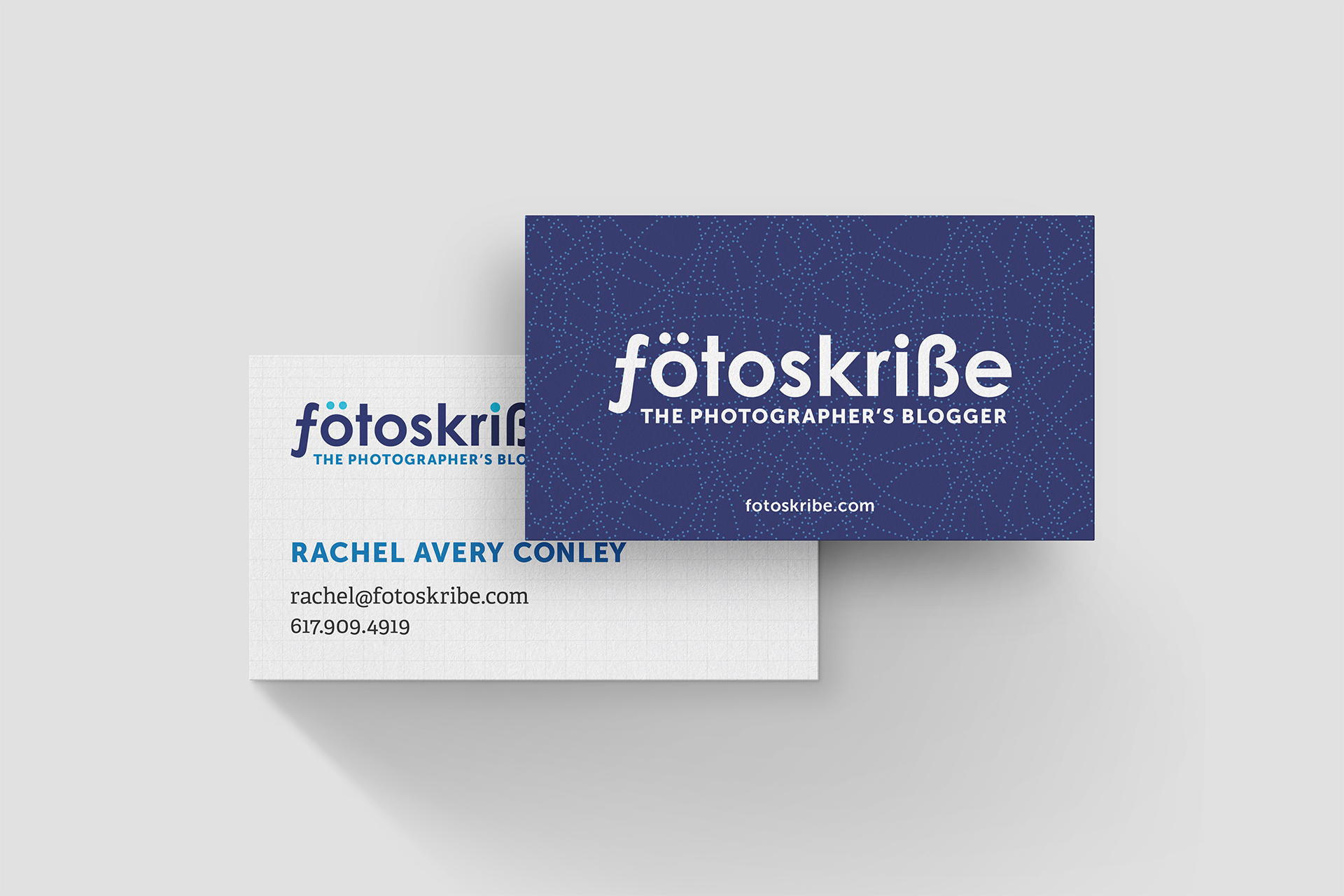
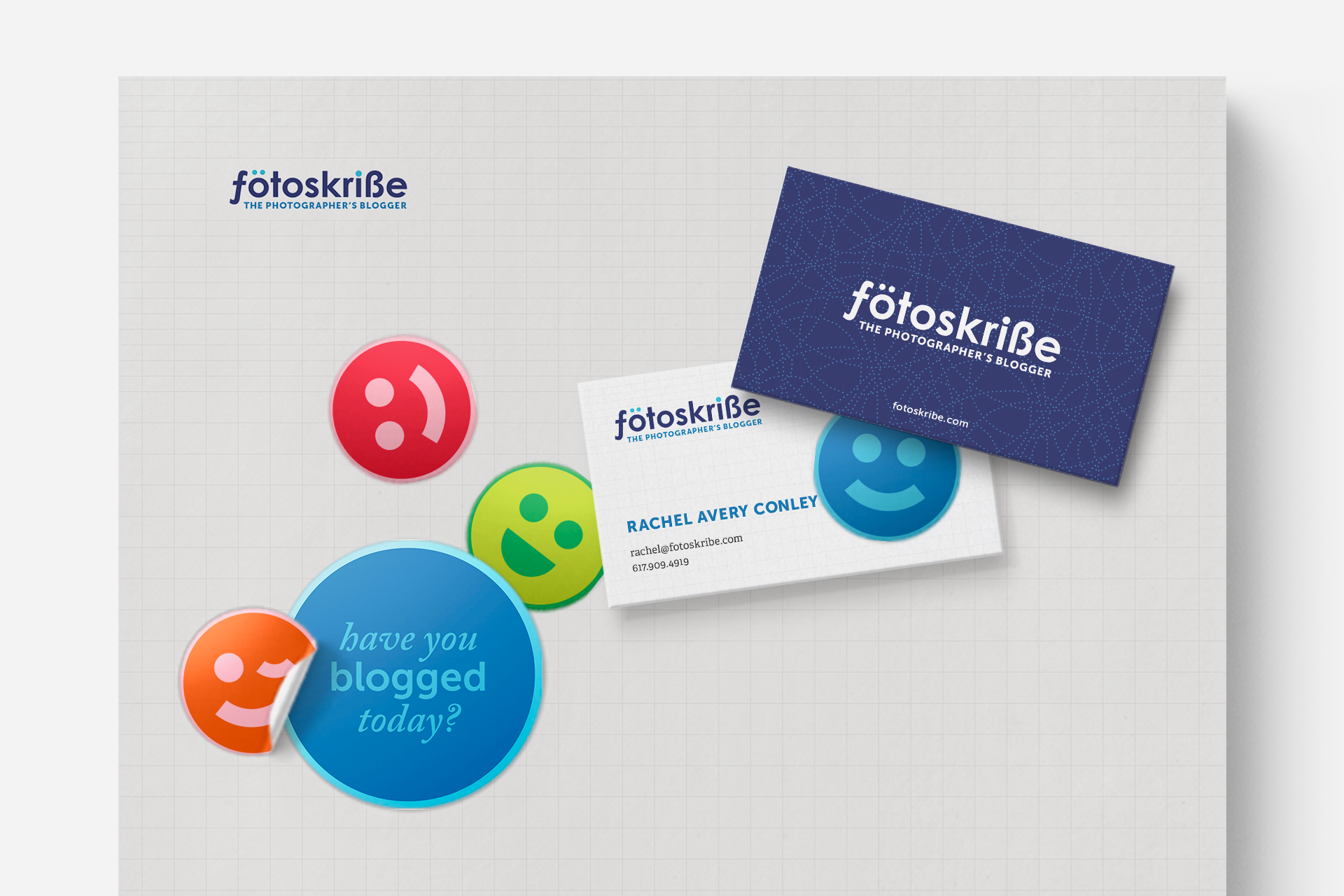
I carried the blueprint concept into the business cards and stationery through grid backgrounds, dotted lines, and diagram-inspired details. The structured layouts reinforced the idea of giving photographers a clear plan to follow, while still feeling distinctly Fotoskribe.
Fun Brand Touches
I created a collection of colorful emoji faces as a playful extension of the brand. They could be used on stickers, pins, and other small reminders that encouraged photographers to keep up with their blogging while making the task feel a little more fun.



Outcome
The new identity gave Fotoskribe a distinctive personality that reflected both the structure of the service and Rachel’s vision for making blogging feel easier and more enjoyable. The flexible system worked across everything from the website and stationery to stickers and pins, giving the growing brand plenty of room to evolve.
Outcome
The new identity gave Fotoskribe a distinctive personality that reflected both the structure of the service and Rachel’s vision for making blogging feel easier and more enjoyable. The flexible system worked across everything from the website and stationery to stickers and pins, giving the growing brand plenty of room to evolve.