ROLE: Founder & Designer / DISCIPLINES: Brand Strategy · Brand Identity · Logo Design · Art Direction
Photography for the Greater Good.
GoodPhotos.org is a project I conceived from a simple idea: finding ways for photographers to use their skills to do good. I envisioned a collective that could bring photographers together around opportunities to contribute their time and talent where professional photography could have a meaningful impact. I developed the concept and brand identity to be broad enough to encompass many kinds of photography and many ways of giving back.
Goals
- Create opportunities for photographers to use their skills to do good.
- Showcase the work and impact of participating photographers.
- Appeal to photographers across a range of specialties.
- Build a flexible brand that could grow along with the idea.
Goals
- Create opportunities for photographers to use their skills to do good.
- Showcase the work and impact of participating photographers.
- Appeal to photographers across a range of specialties.
- Build a flexible brand that could grow along with the idea.
Logo
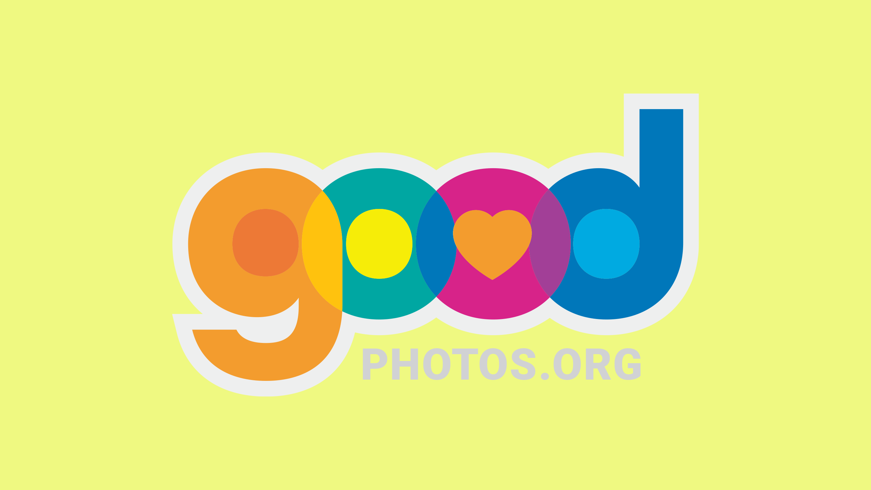
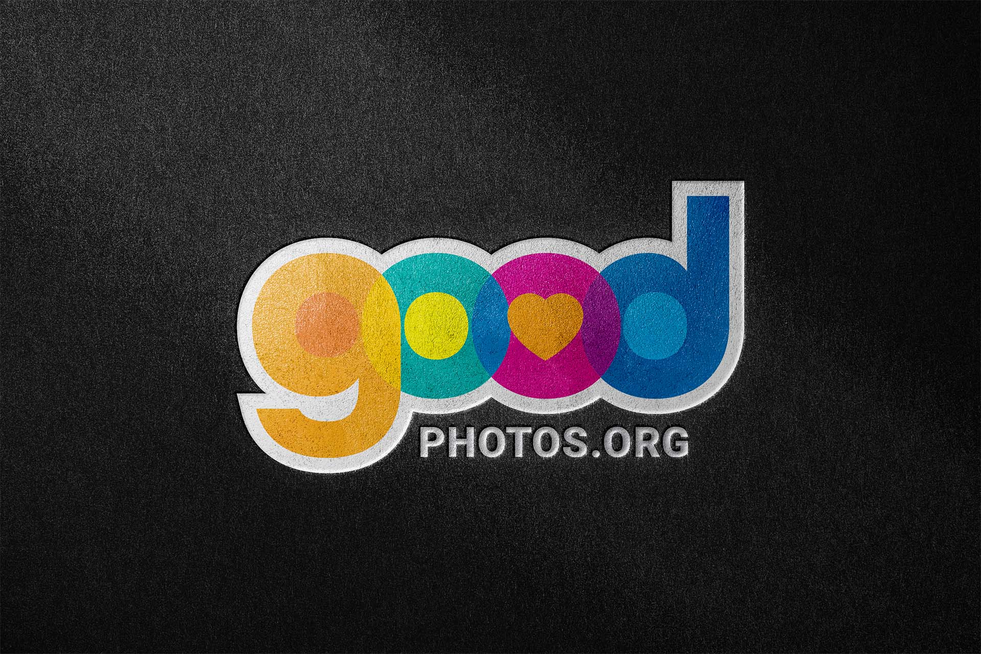
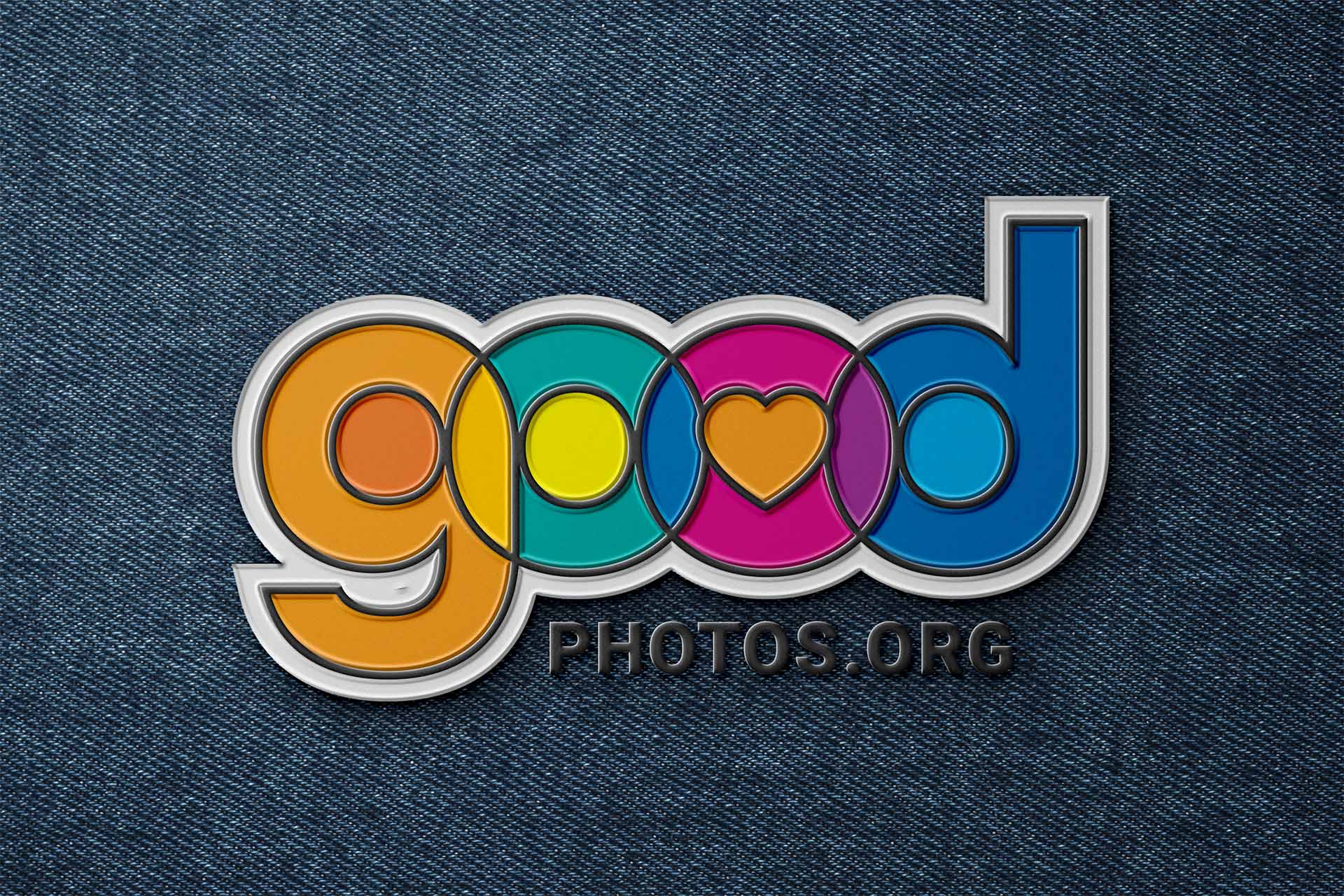
I drew inspiration from colorful lighting gels used in photography, overlapping the letterforms to mimic the way colored light interacts. A heart at the center connects the mark to the idea of doing good.
I also designed the logo to work as a watermark on photography, adding a subtle translucent border around the letterforms to keep it recognizable against different images and backgrounds.

Typography
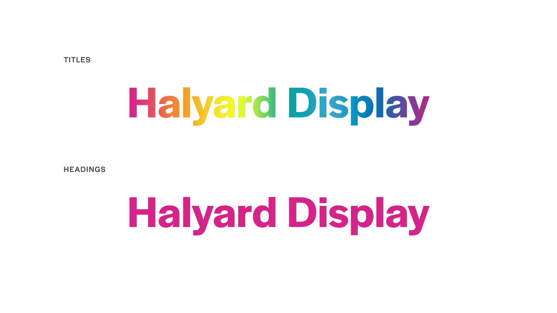
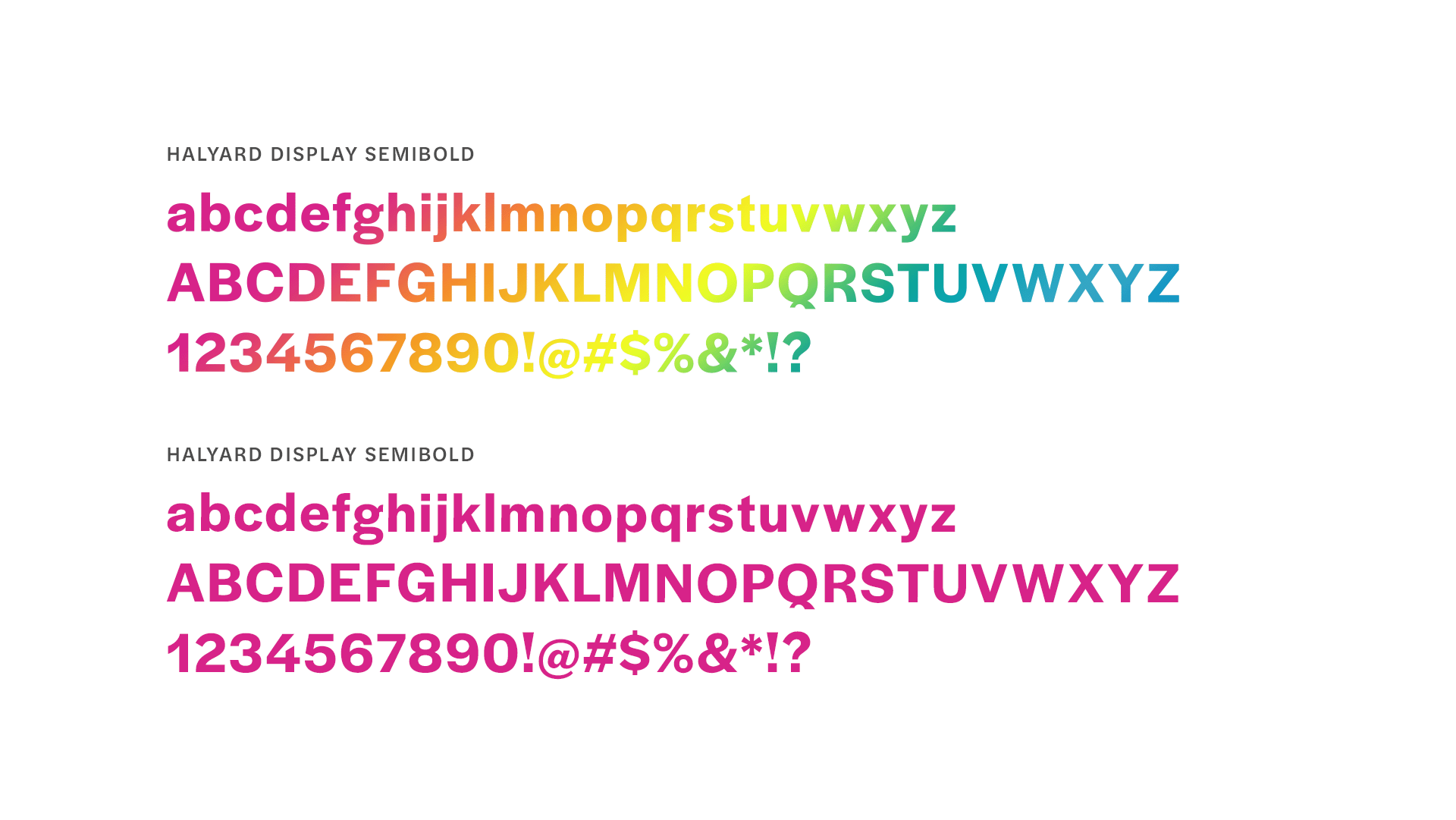
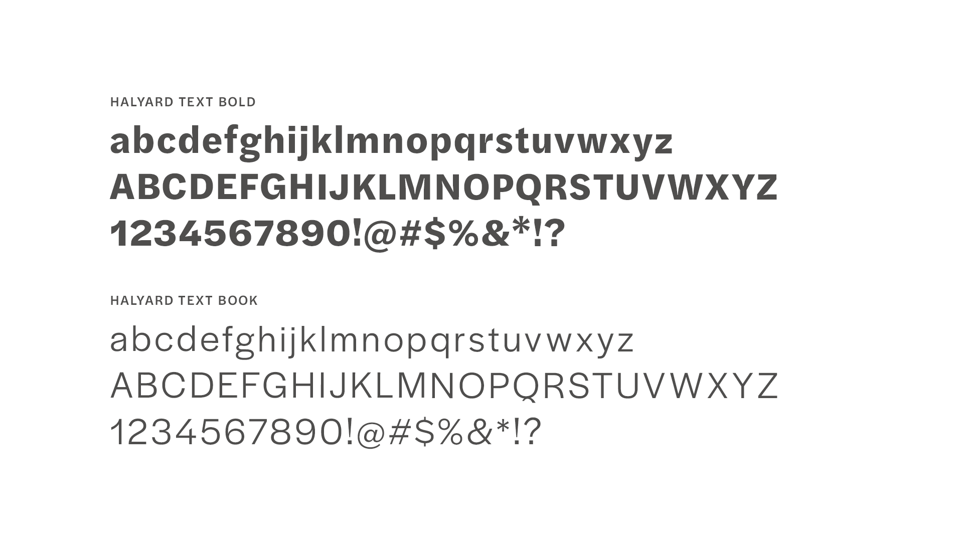
I used Halyard Display for titles and headings, creating a spectrum of color across the letterforms that connects the typography back to the logo. The color makes the brand distinctive without relying on additional graphics that could compete with the photography. Halyard Text keeps supporting copy simple and easy to read.

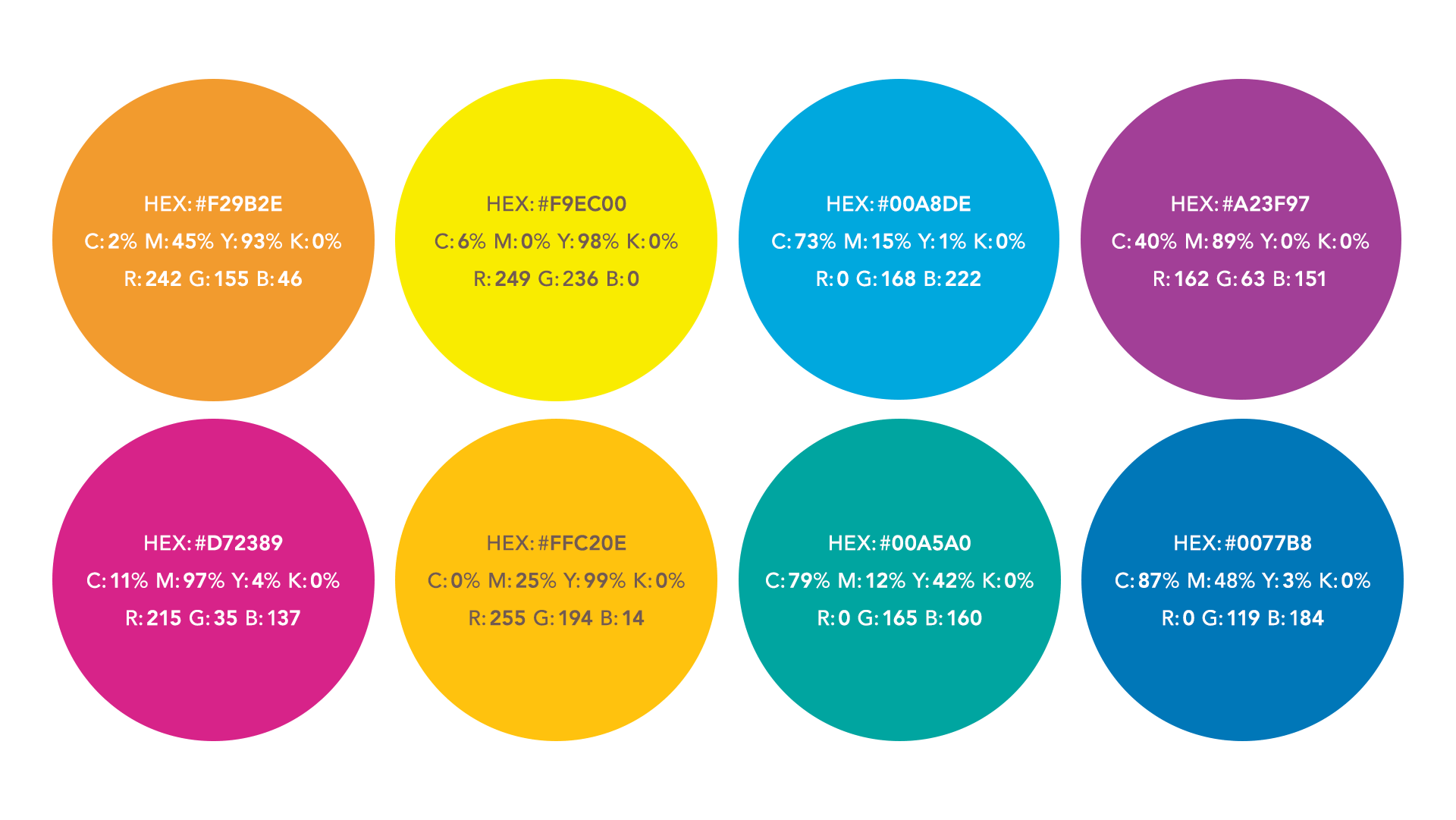
Color Palette
I built the color palette around the bright cyan, magenta, and yellow of the logo, expanding it into a broader spectrum that could be used together or individually. I wanted the colors to feel bright and unexpected for a nonprofit-style organization.