ROLE: Owner & Designer / DISCIPLINES: Brand Strategy · Brand Identity · Logo Design · Art Direction · Print Design
Photography for children. Fun for everyone.
Reiley Photography was founded in 2006 as a lifestyle portrait business specializing in newborns, babies, and families. The business grew from my love of photographing the joy, connection, and beauty of everyday family life.
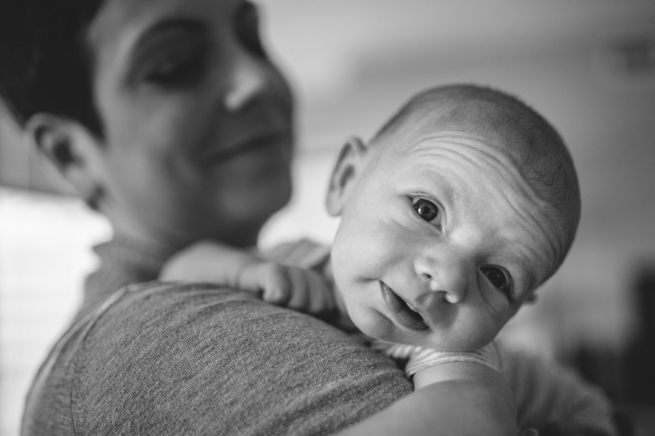
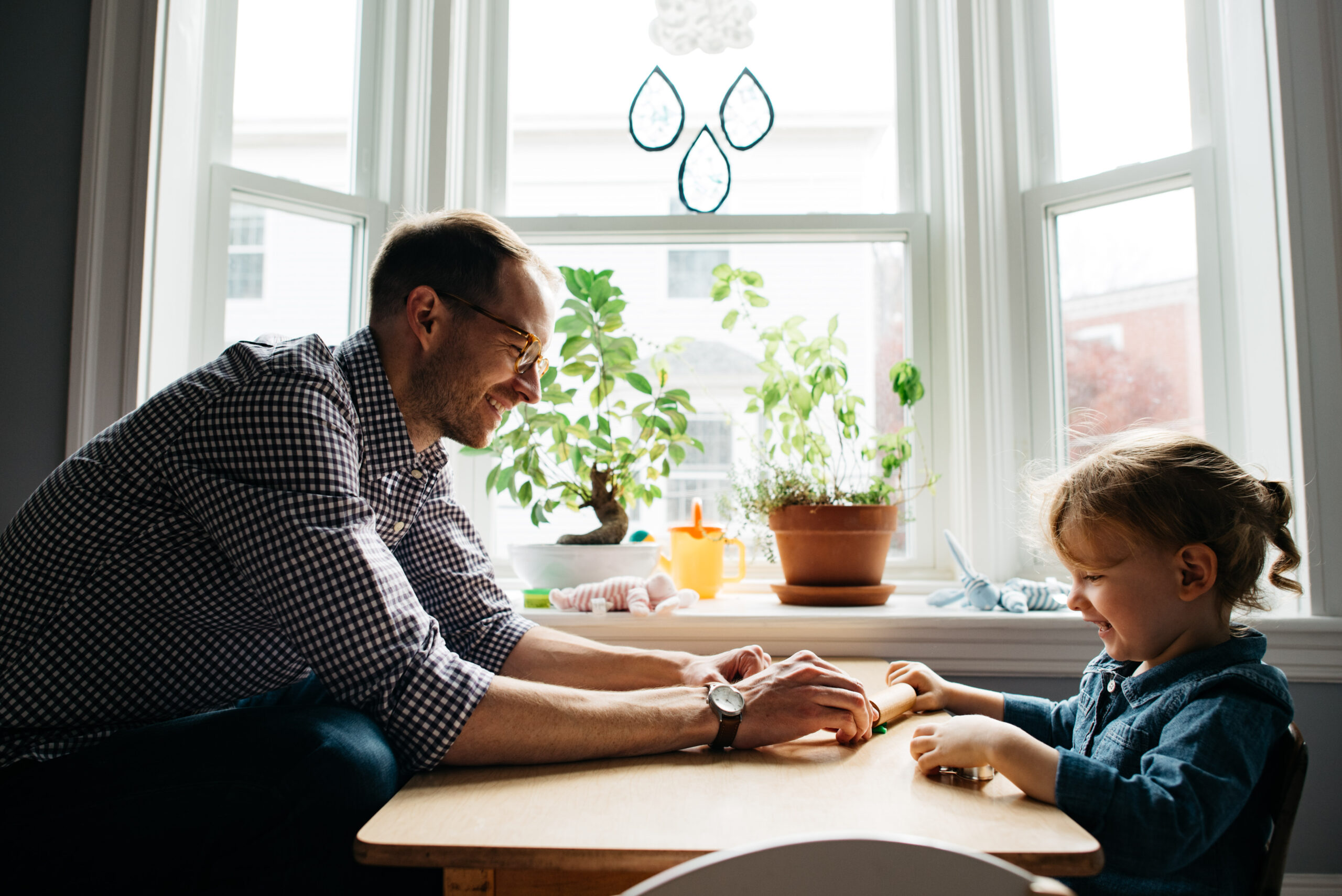
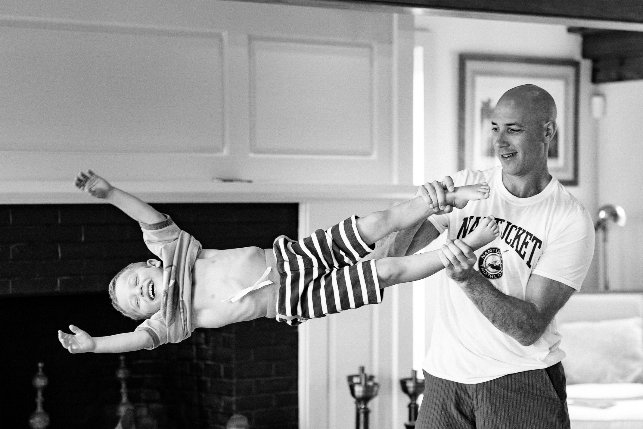
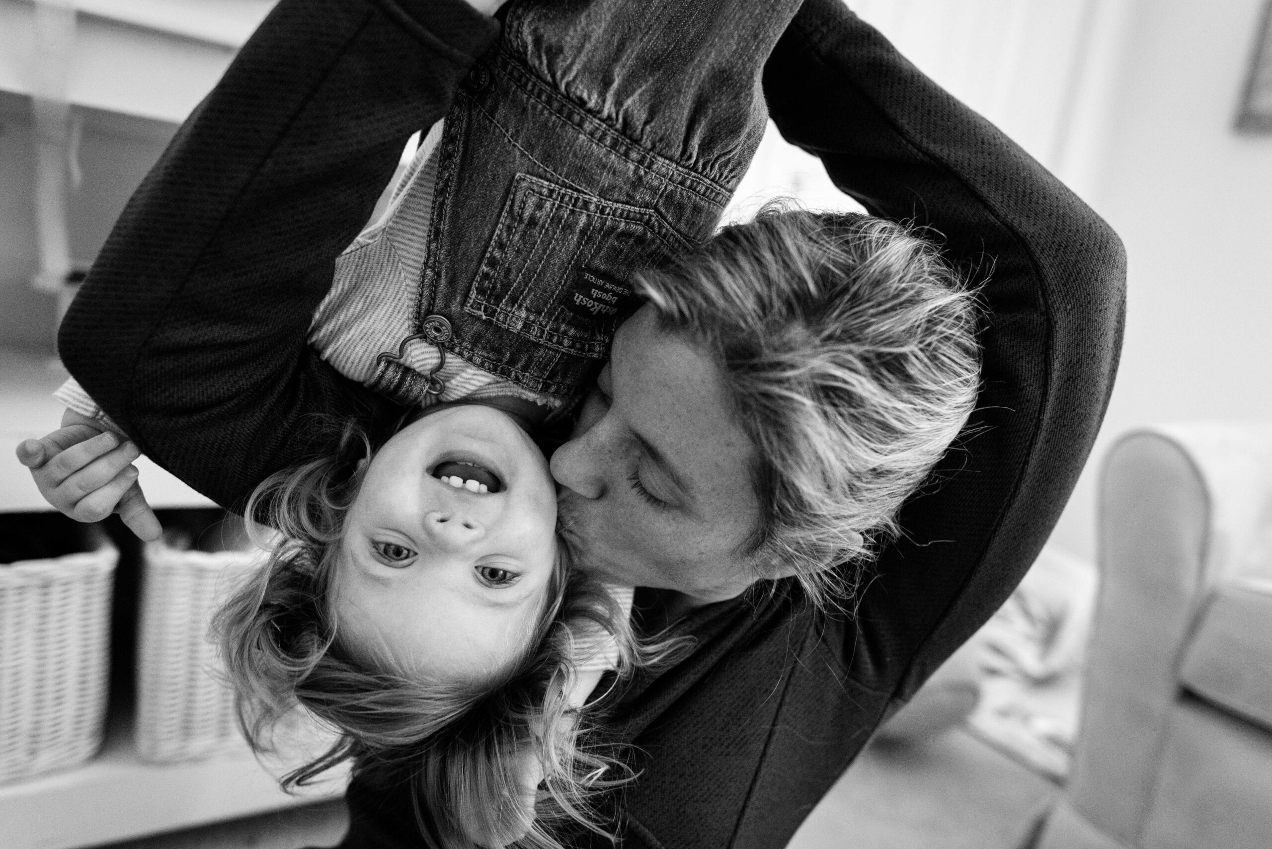
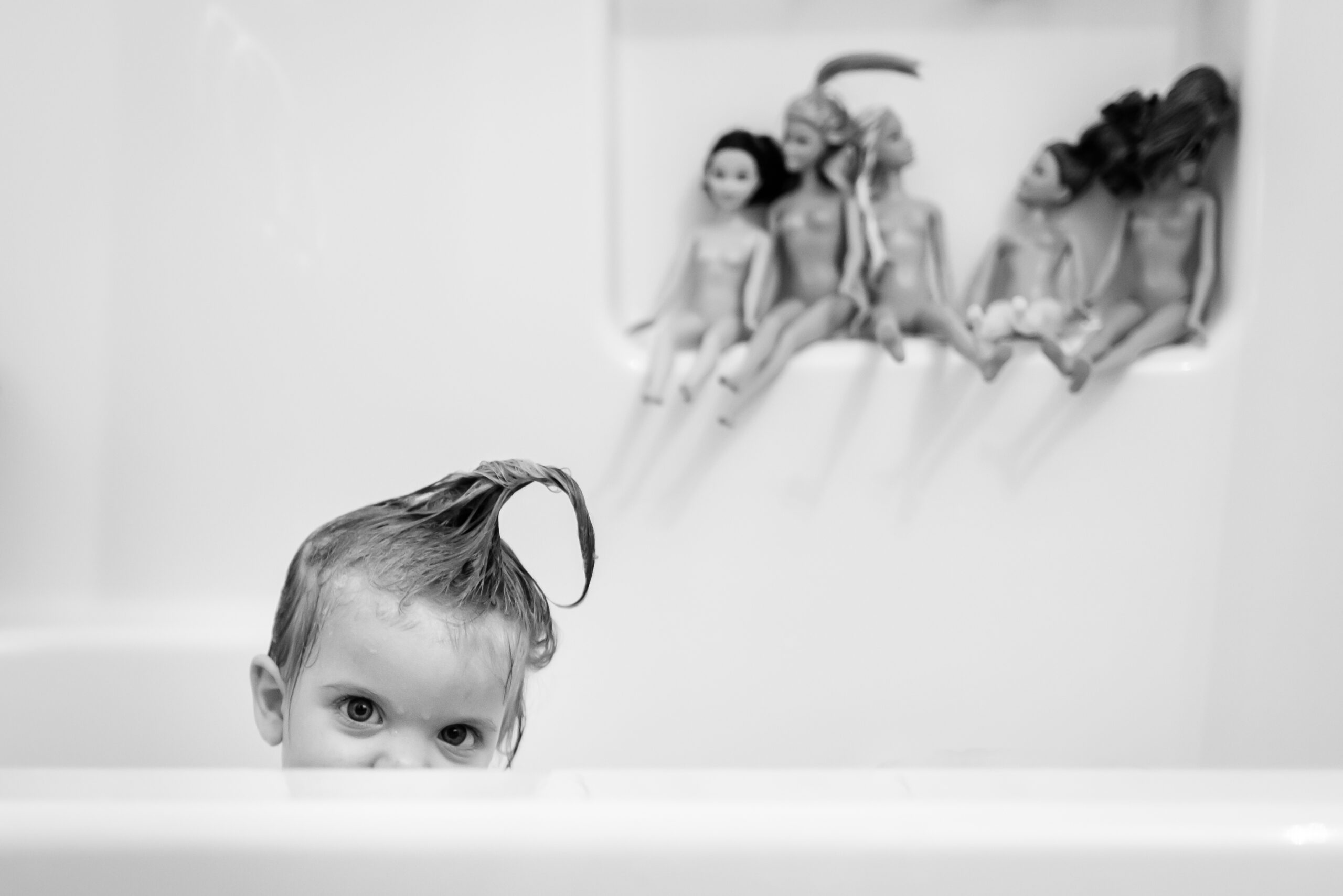
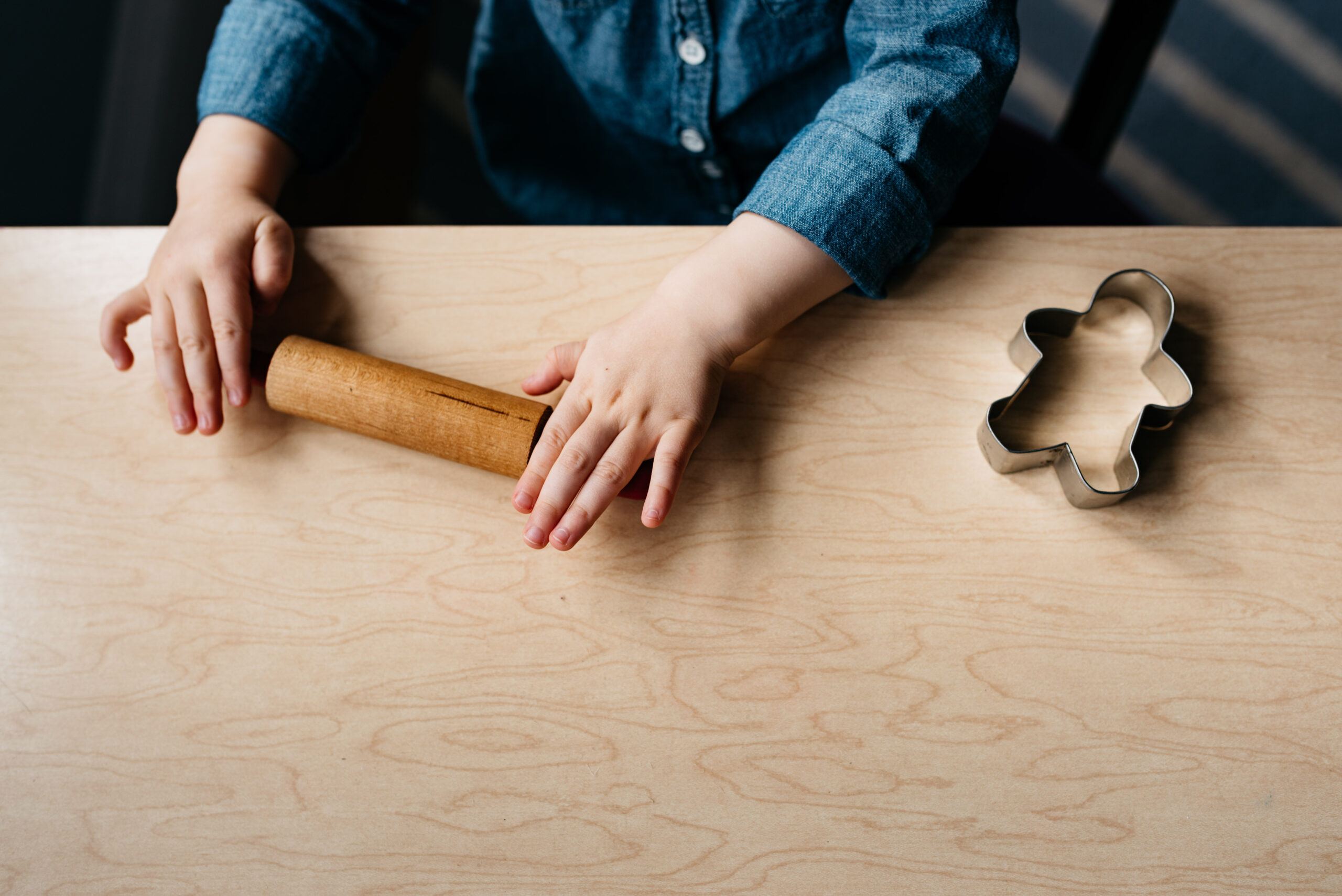
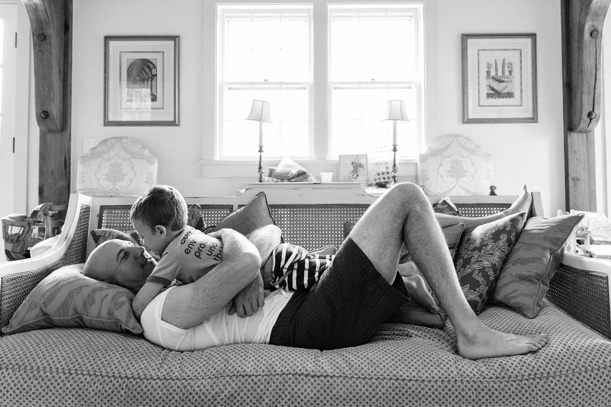
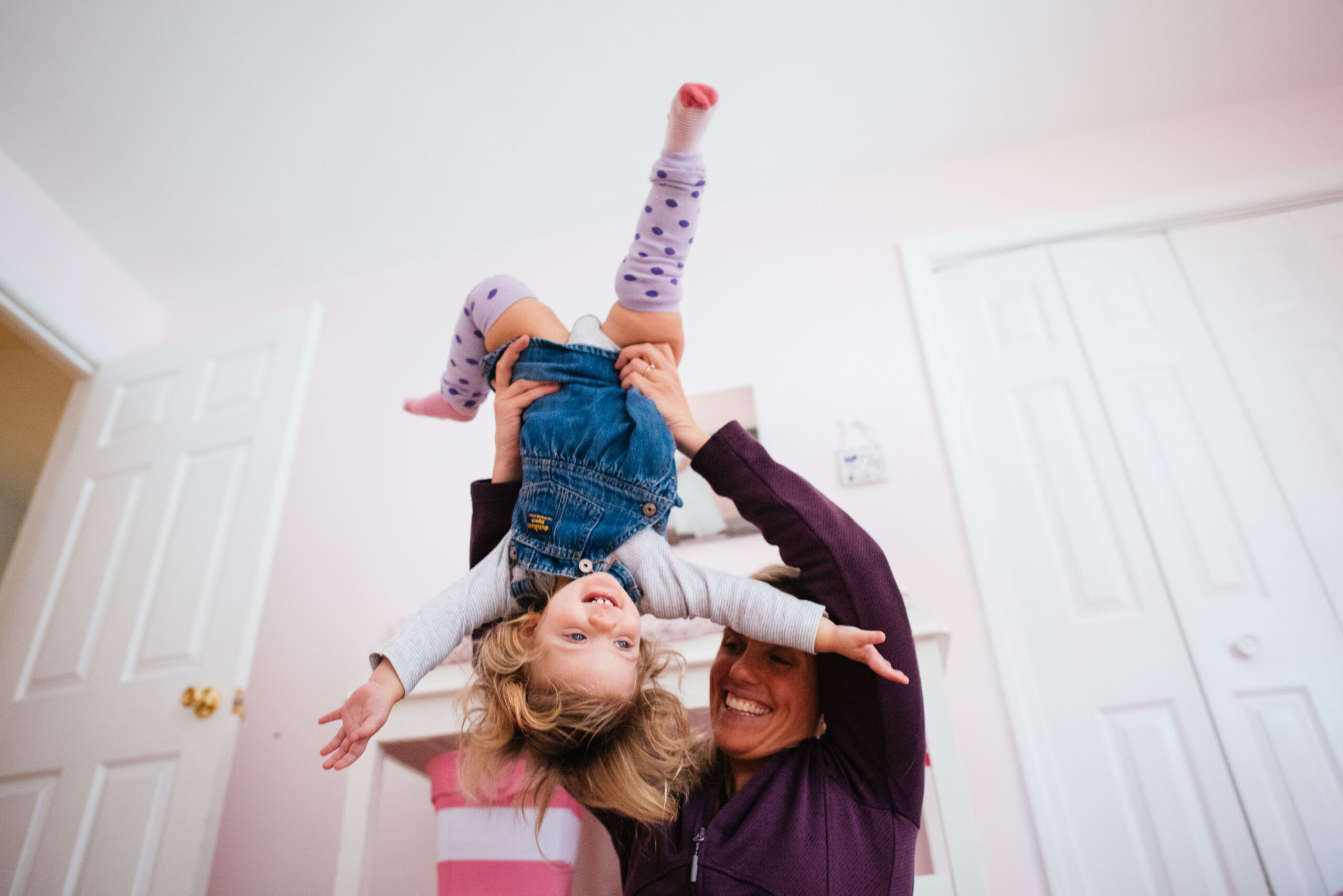
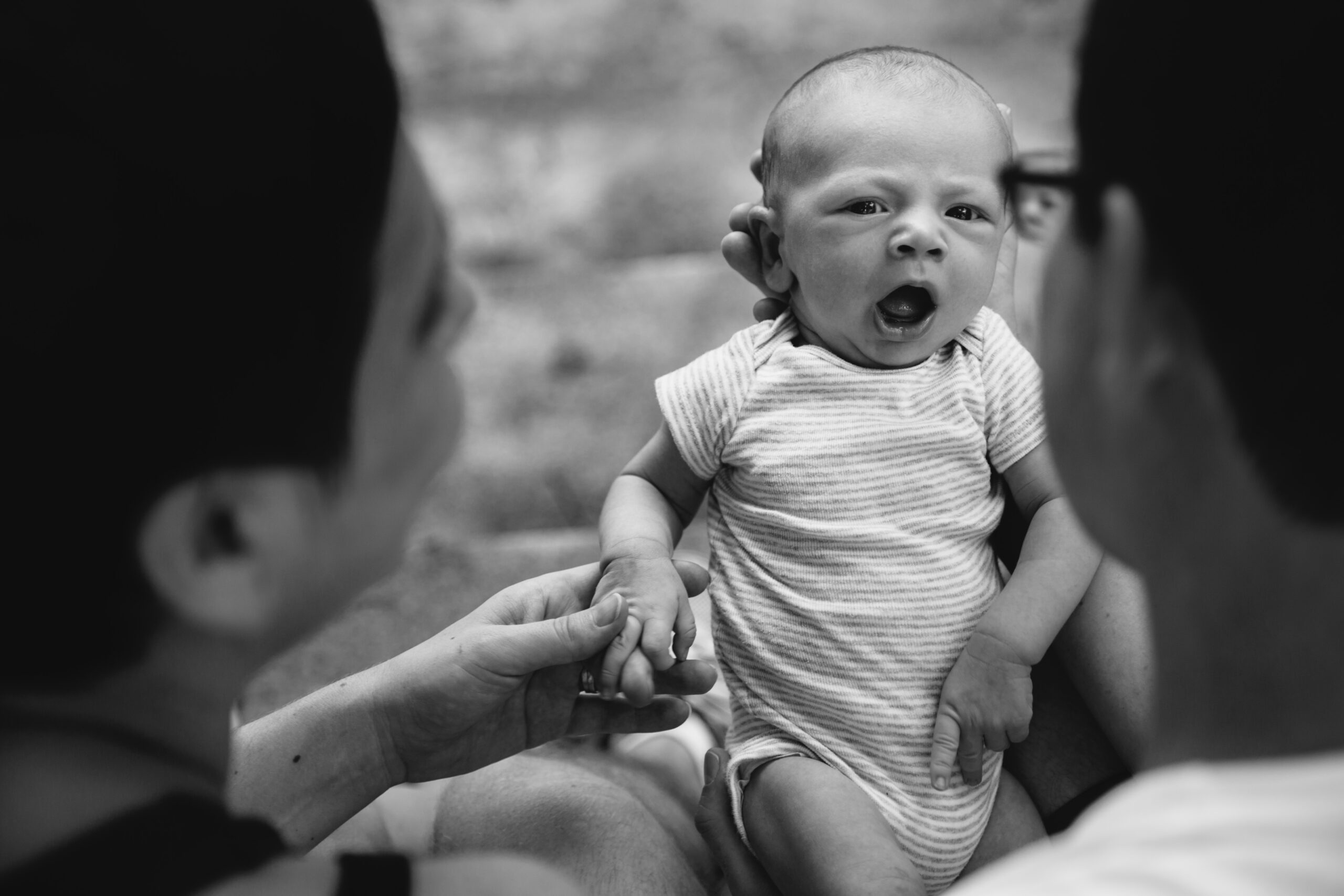
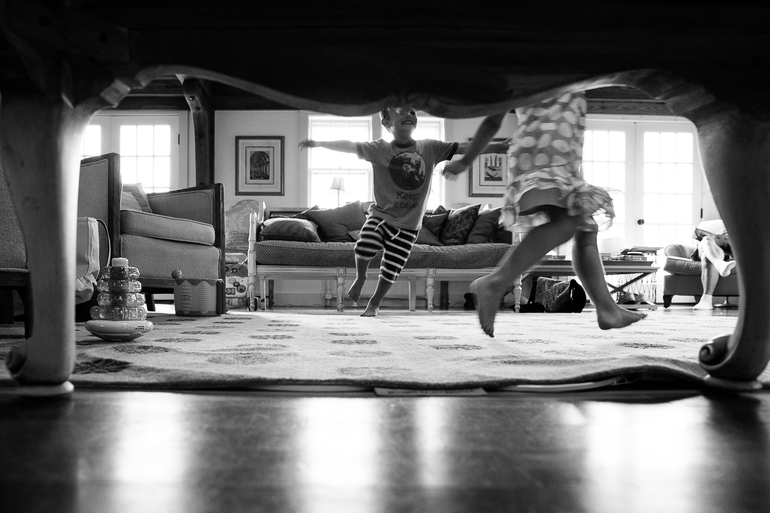
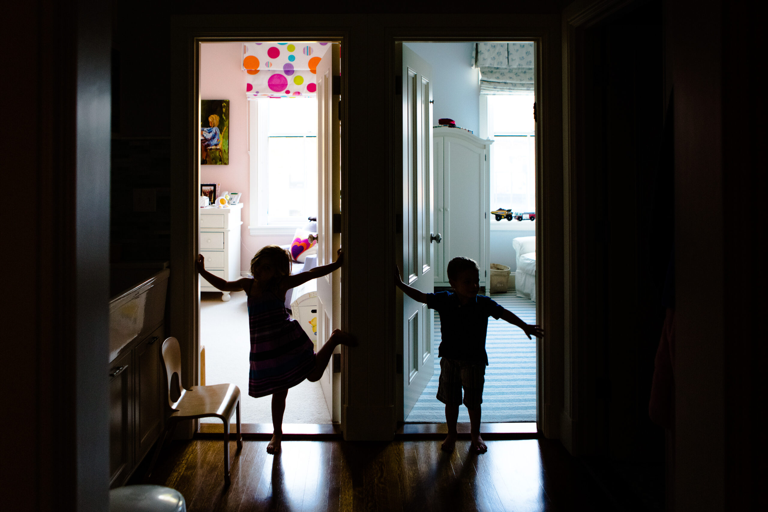
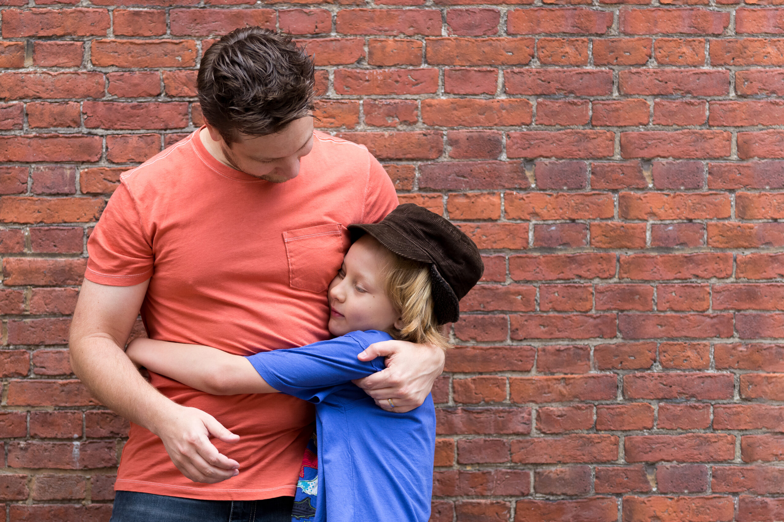
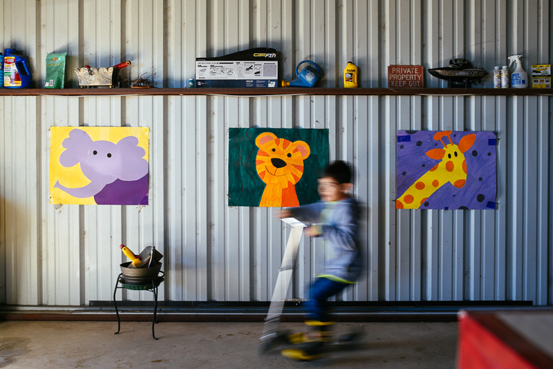
The candid, playful style of the photography shaped the identity from the start, creating a brand that felt as personal and approachable as the images themselves.
Goals
- Create a distinctive identity rooted in the personal story behind the brand.
- Connect with families drawn to natural, candid photography.
- Extend the photography experience beyond the session itself through tangible products.
- Create a welcoming brand experience that feels playful and approachable.
Goals
- Create a distinctive identity rooted in the personal story behind the brand.
- Connect with families drawn to natural, candid photography.
- Extend the photography experience beyond the session itself through tangible products.
- Create a welcoming brand experience that feels playful and approachable.
Logo
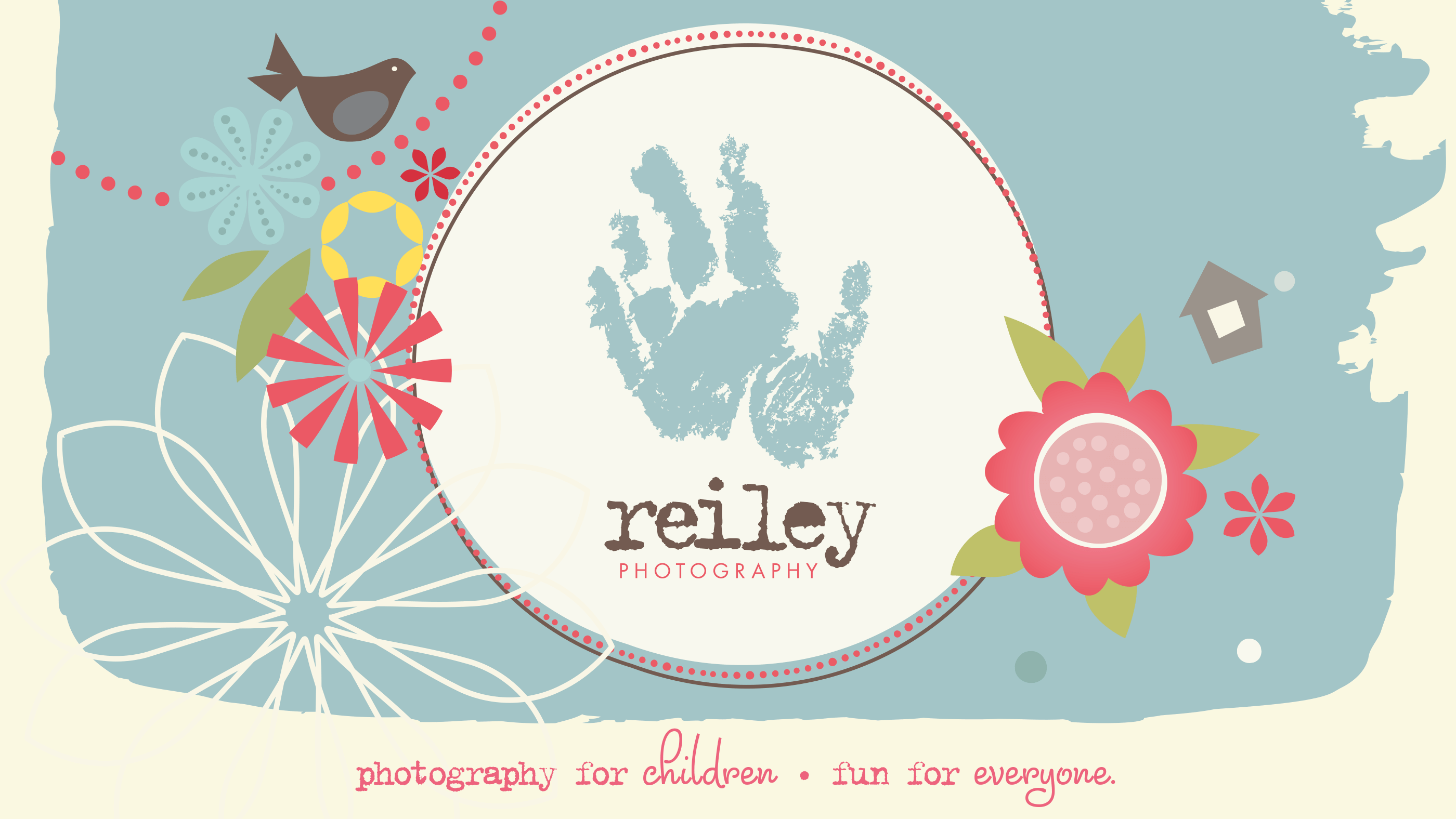
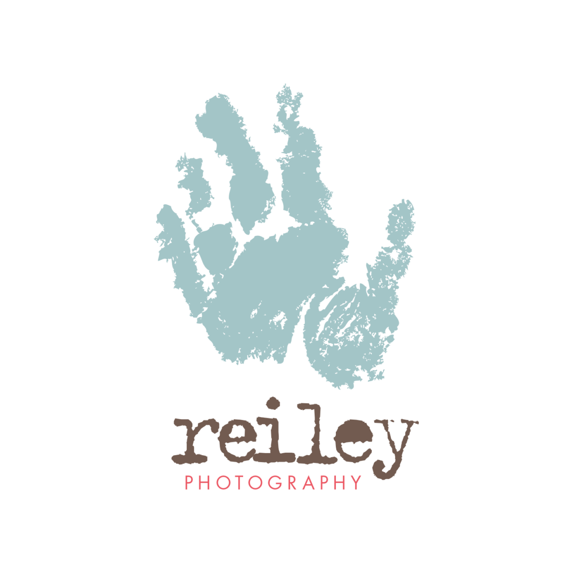
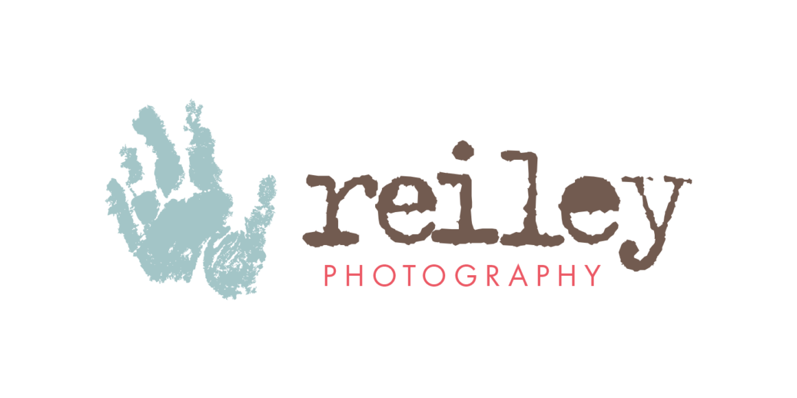
The Reiley Photography logo incorporates my son Owen’s actual handprint, giving the identity a personal connection to my family. I chose typewriter-style lettering for its stamped appearance, echoing the impression of a baby’s hand pressed into ink.
Typography
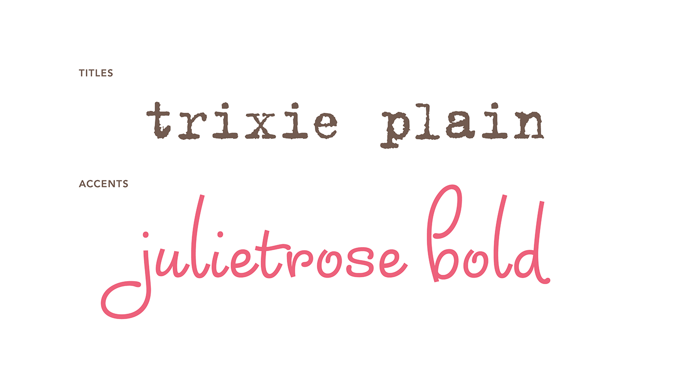
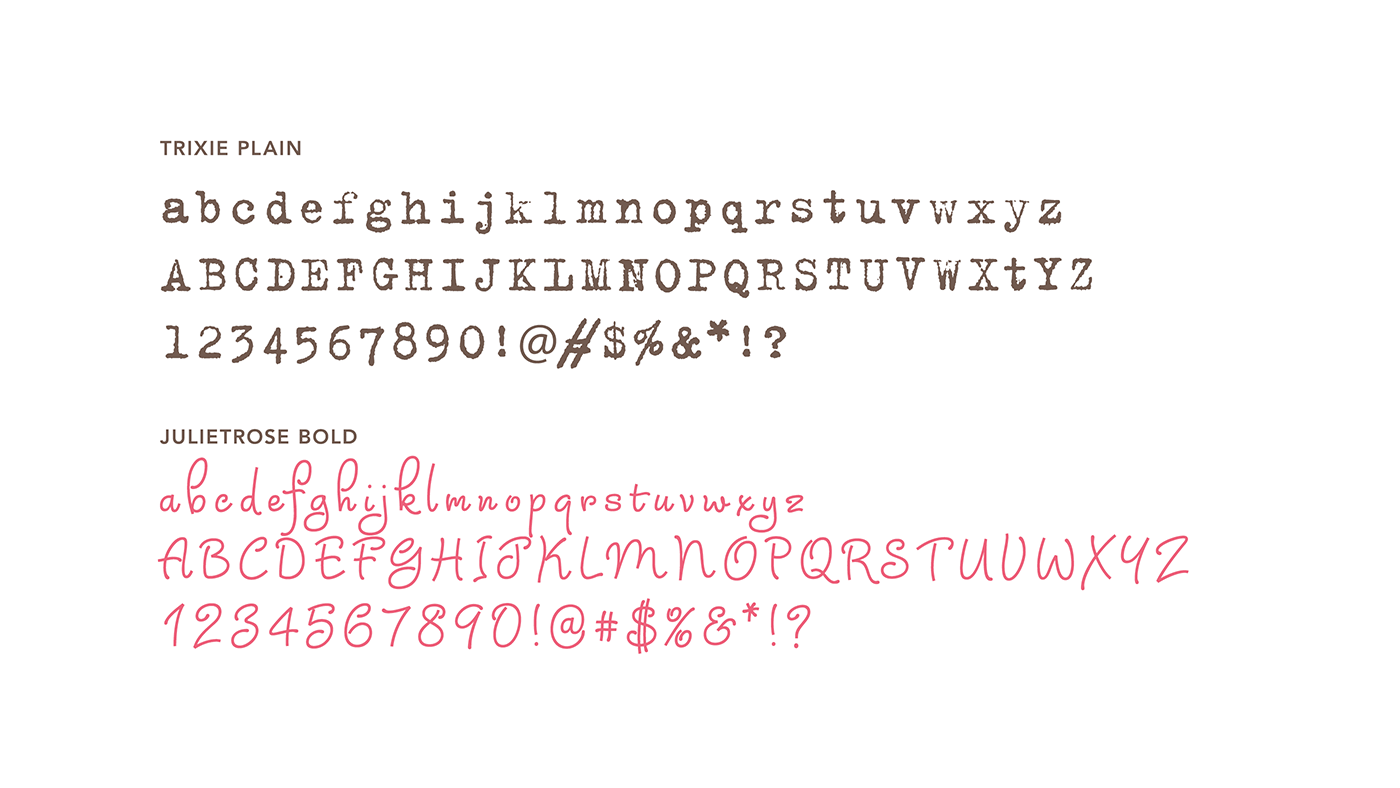
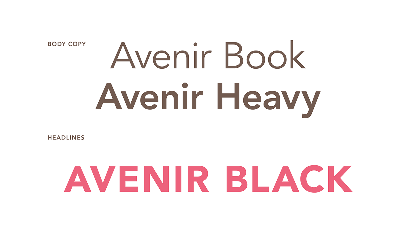
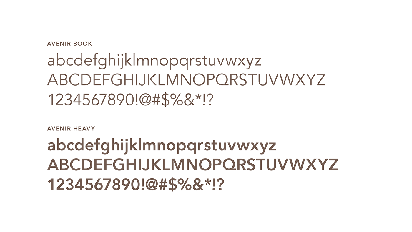
I carried the typewriter-style lettering throughout the identity to create a casual, playful feel. Simple supporting typefaces added contrast and kept the focus on the photography.
Color Palette
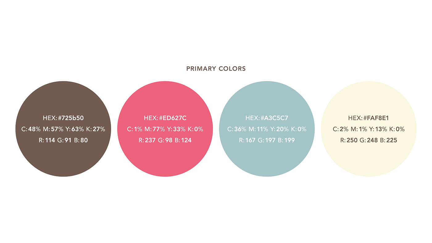
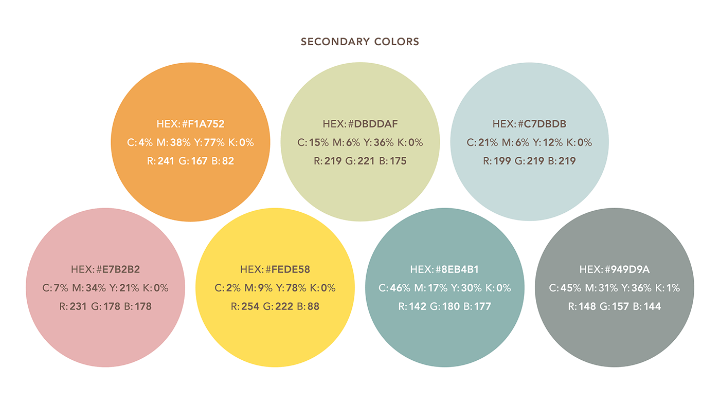
I chose bright aqua blue and warm, playful accent colors to capture the fun, family-centered personality of the brand while letting the photography take center stage.
Postcards
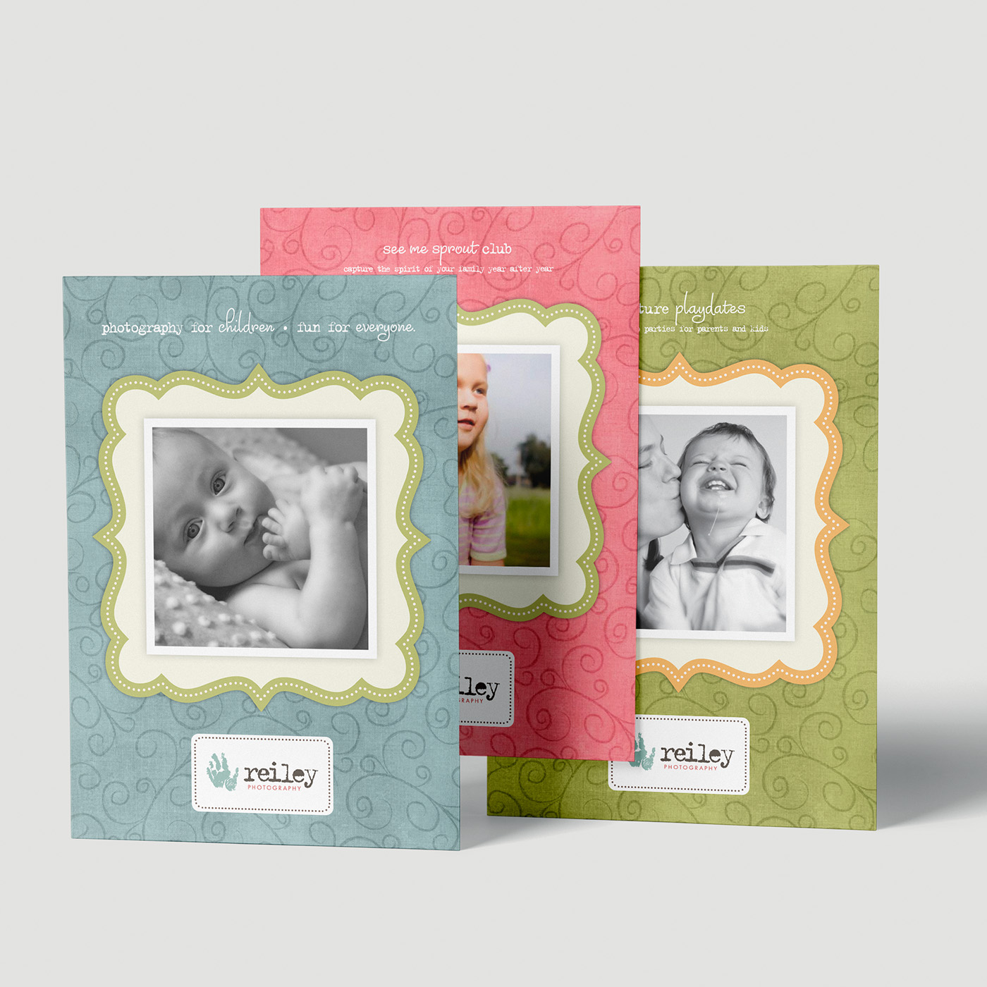
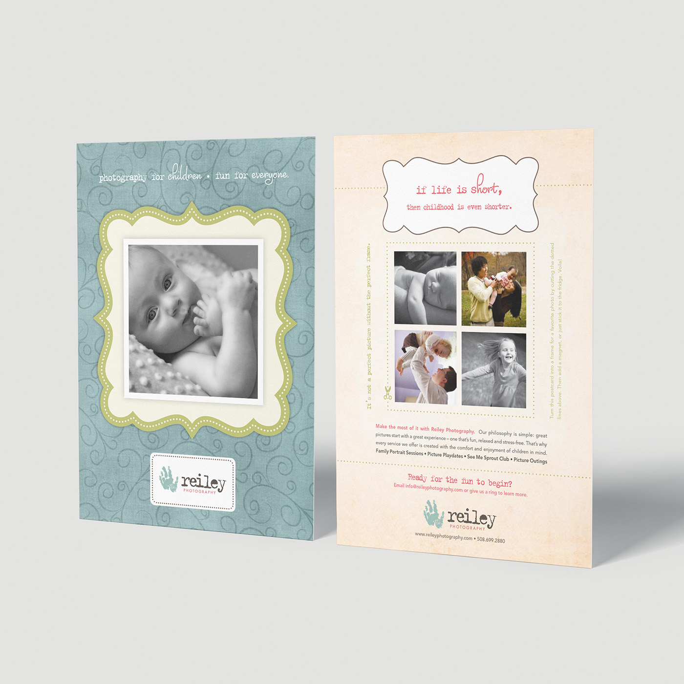
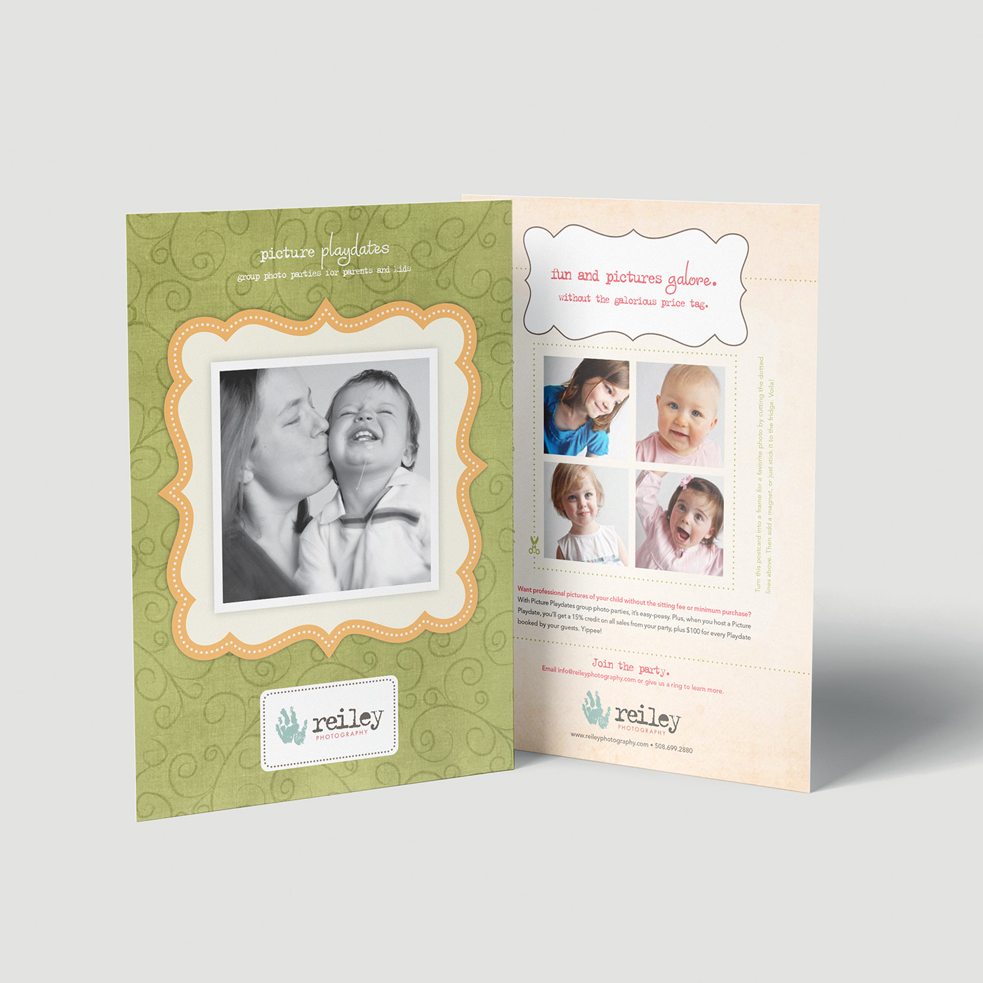
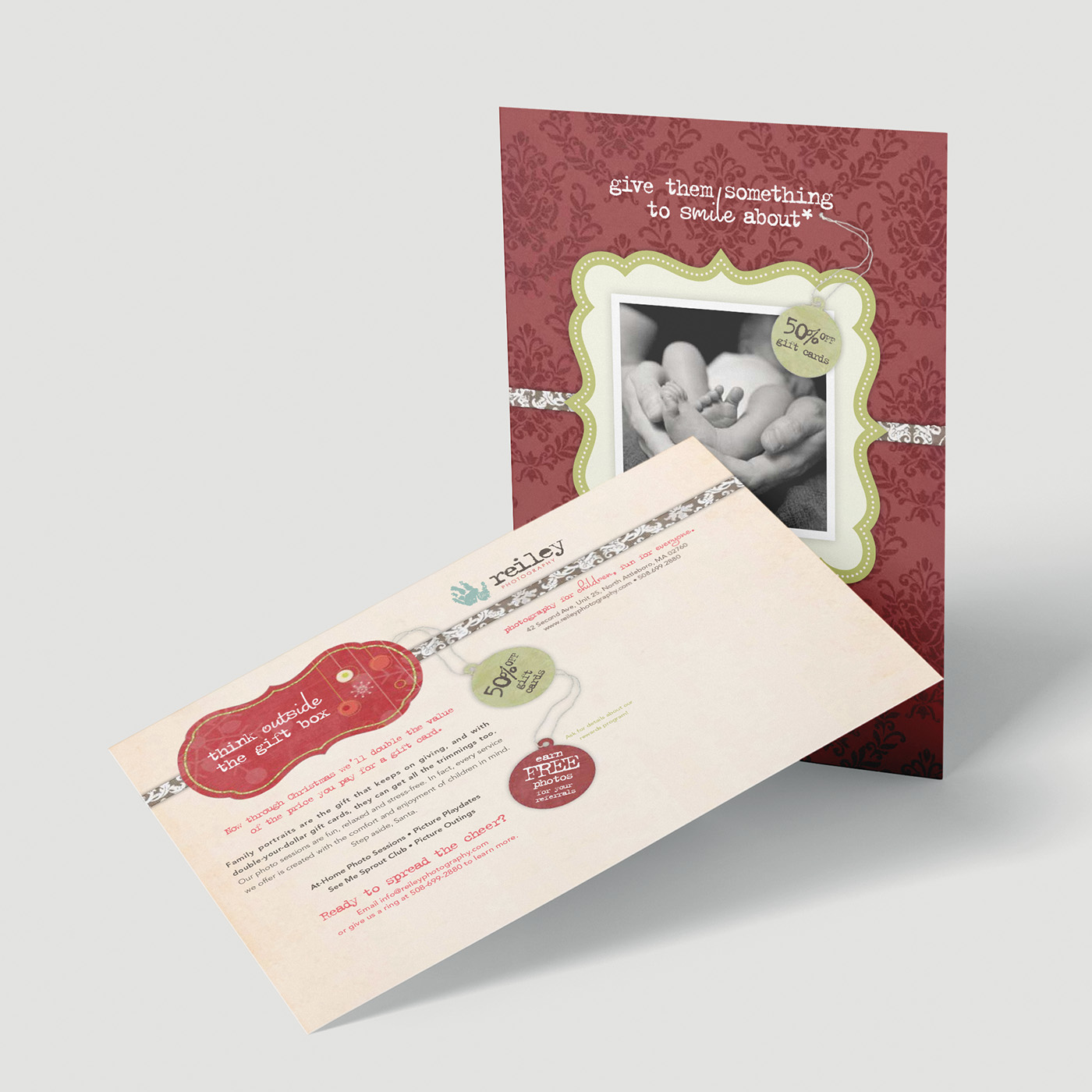
The postcards drew on scrapbook-inspired design, combining layered photography with playful type and graphic details. I also worked with a professional copywriter to develop a warm, witty voice that became a defining part of the brand.
I designed the postcards so they could be transformed into photo frames, with dotted cutting lines on the back that aligned with the image on the front.
Brochures
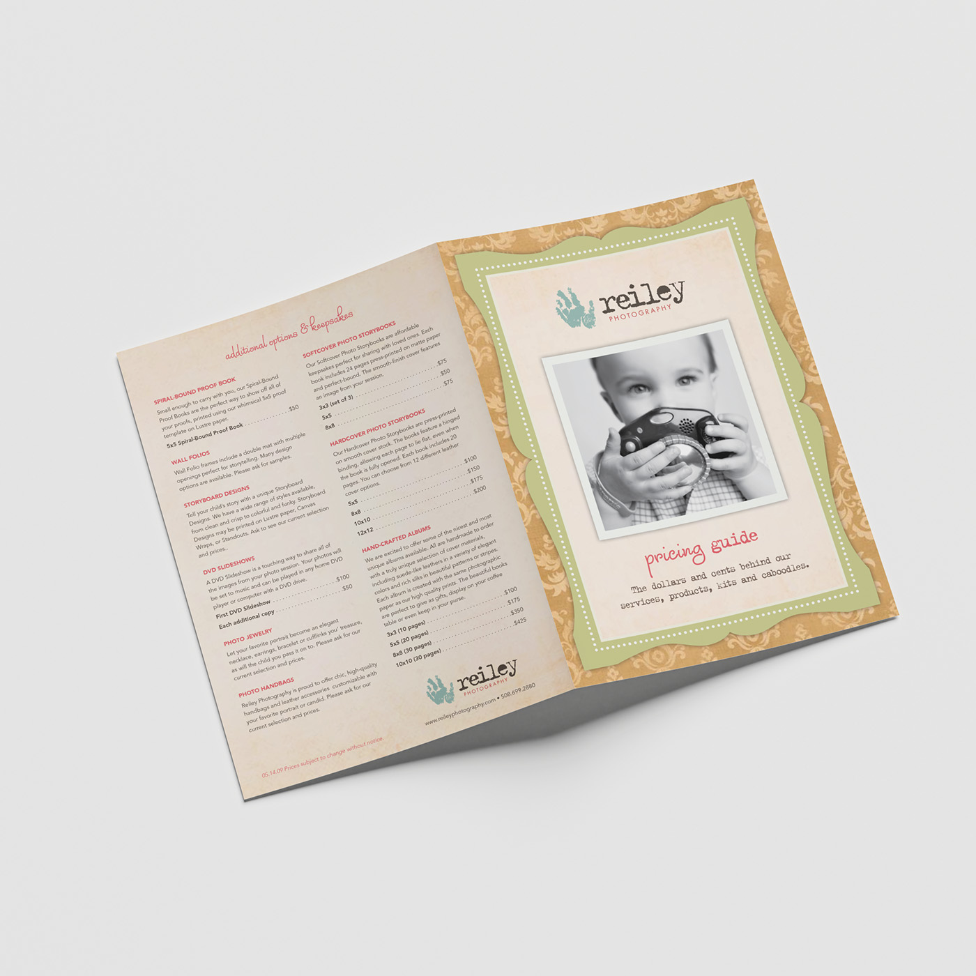
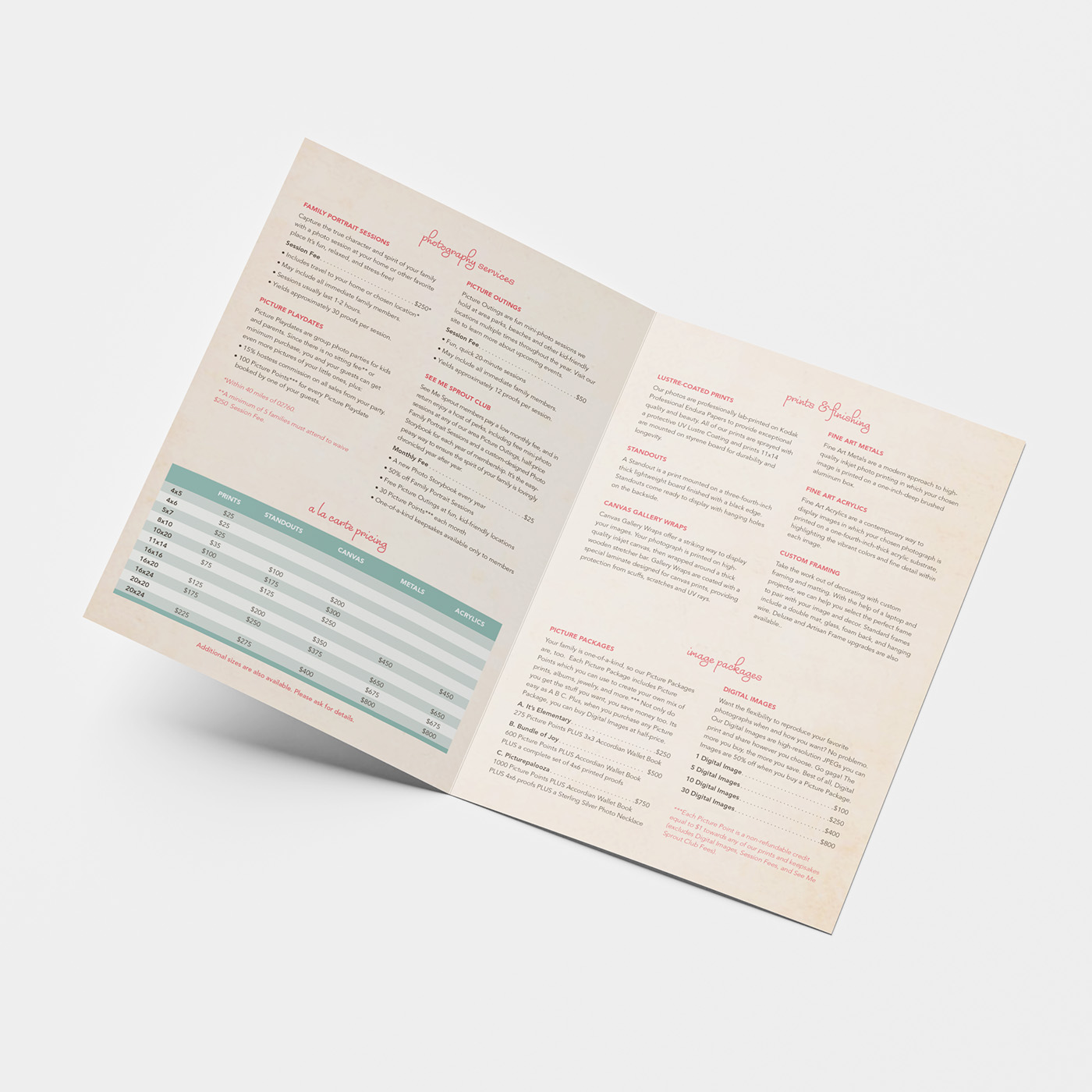
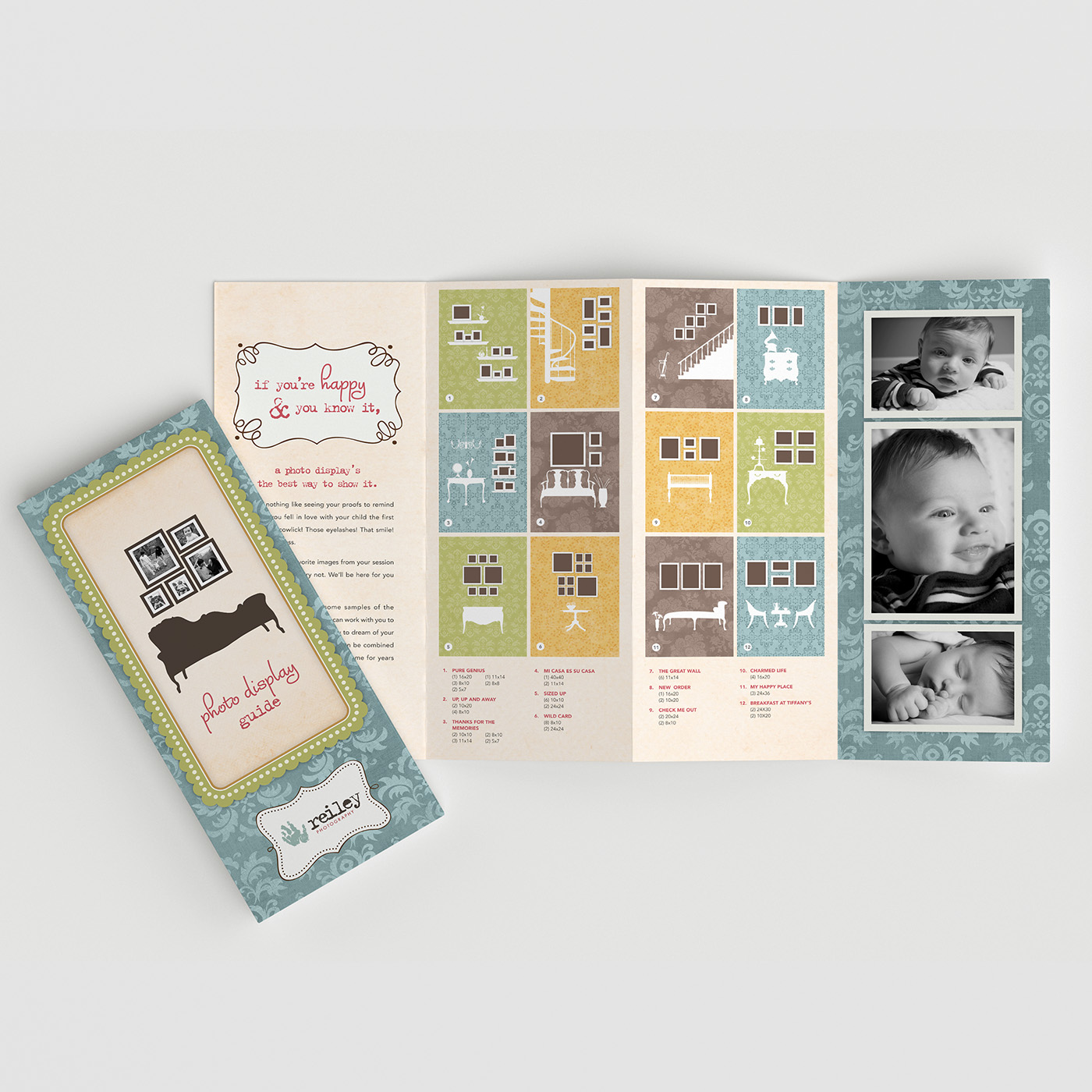
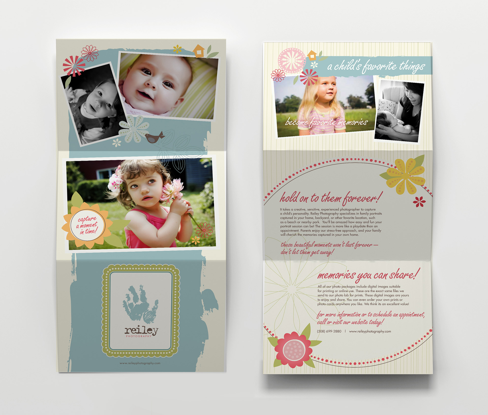
The brochures helped clients understand their options, from pricing guides to ways of displaying photographs in their homes. I organized the information and visual elements to make each piece approachable while keeping the playful personality of the brand consistent.
Gift Cards
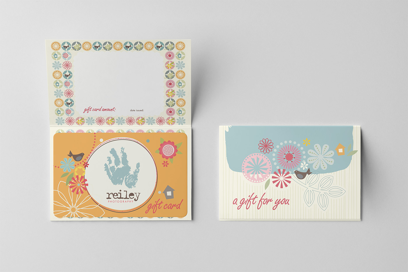
I designed the gift cards as laminated cards mounted on branded folded note cards, with space inside for a handwritten message from the giver. The playful presentation added a personal touch.
Digital Image Packaging
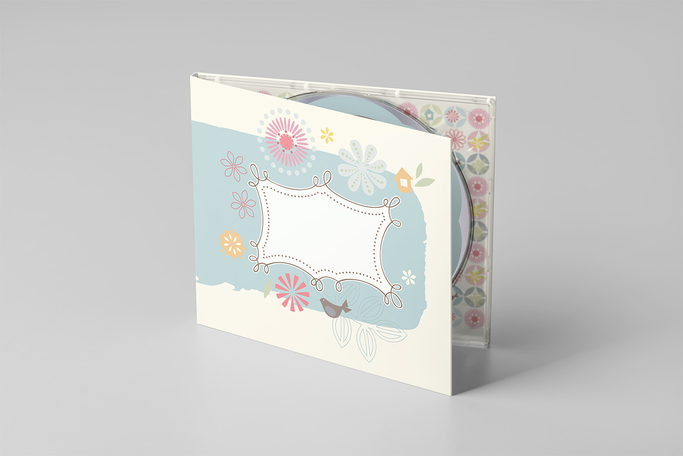
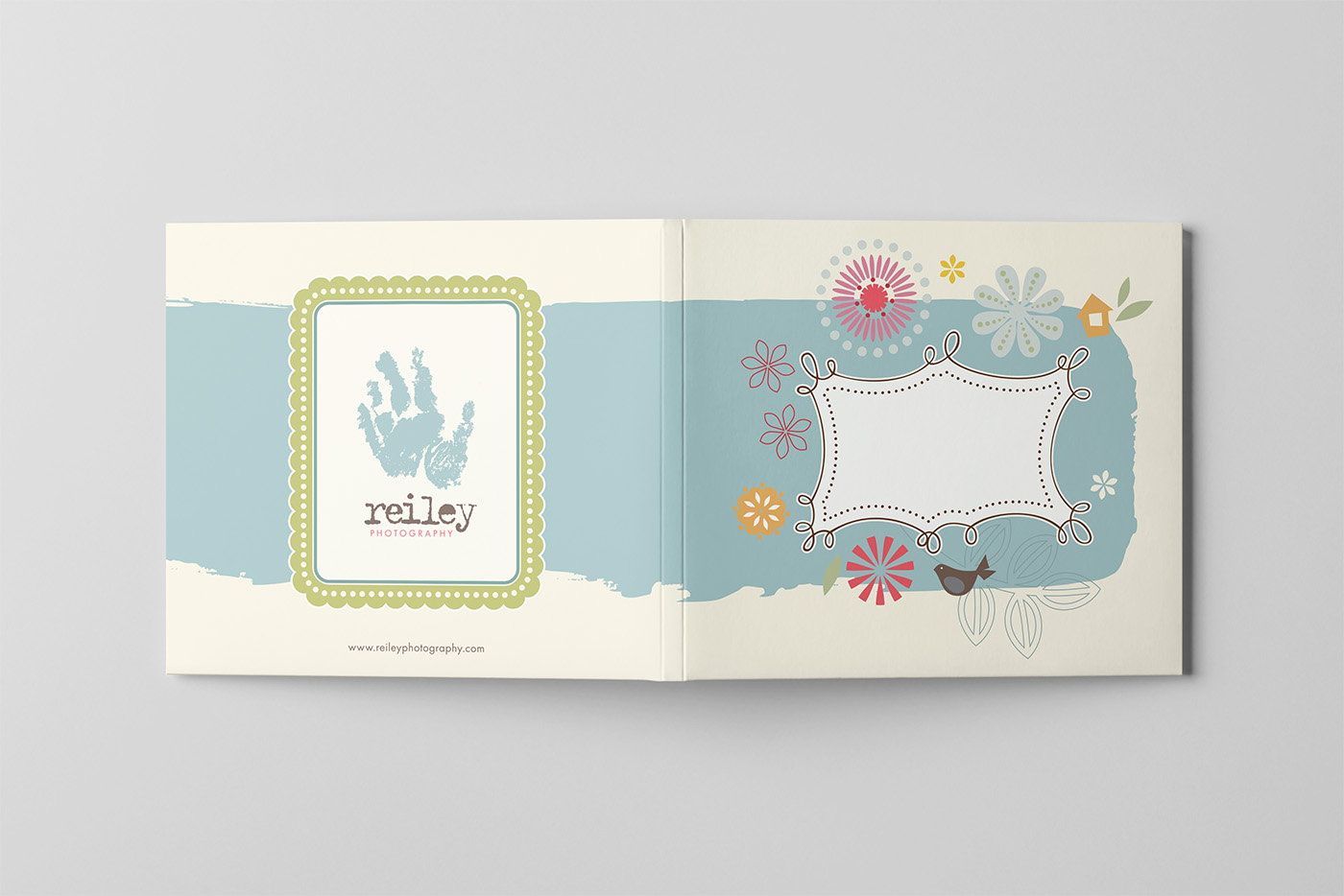
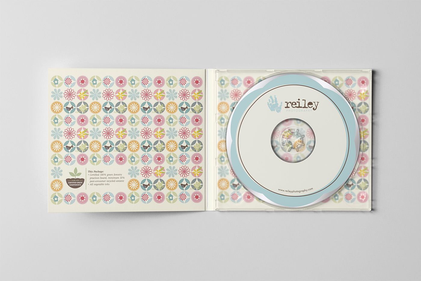
Digital images were delivered on branded DVDs in custom packaging, giving clients something tangible to see and hold. I designed the packaging to reinforce the value of the images and make receiving digital files feel like a thoughtful part of the photography experience.
Outcome
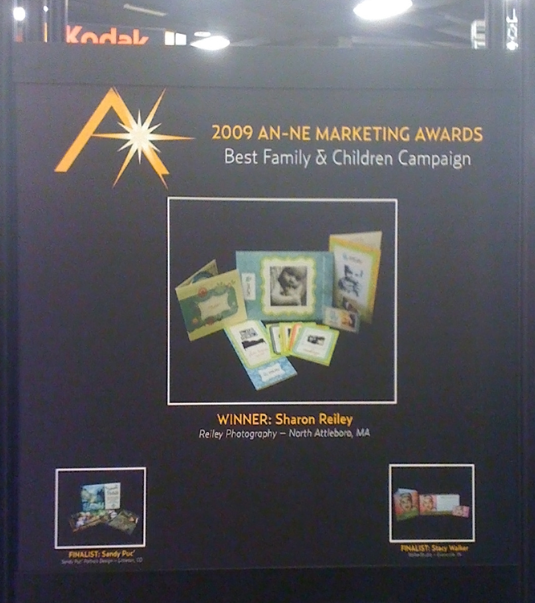
The identity brought the playful spirit of Reiley Photography to life, creating a brand that felt as fun, approachable, and personal as the photography itself. It carried across the client experience, from promotional materials through the final delivery of images, helping establish the brand as the business grew. The work was recognized with the 2009 AN-NE Best Family & Children Campaign award from Professional Photographers of America.
Outcome
The identity brought the playful spirit of Reiley Photography to life, creating a brand that felt as fun, approachable, and personal as the photography itself. It carried across the client experience, from promotional materials through the final delivery of images, helping establish the brand as the business grew. The work was recognized with the 2009 AN-NE Best Family & Children Campaign award from Professional Photographers of America.