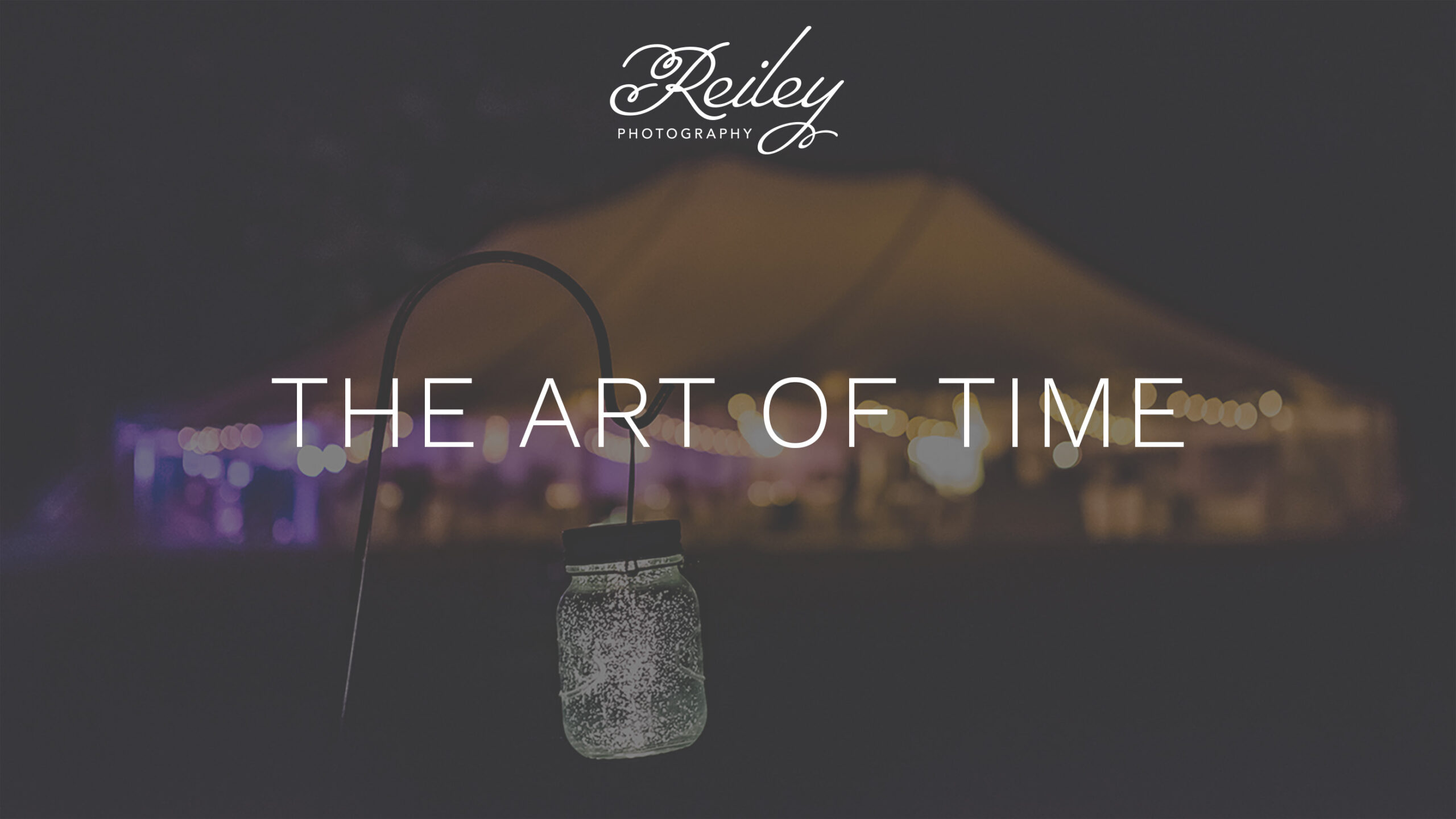
A Refined Identity for a Growing Client Base
As Reiley Photography expanded to include weddings alongside family sessions, the brand needed to evolve. The original identity was fun and playful with bright colors and whimsical designs, featuring a deeply personal touch, the handprint of my son. But by 2011, the business had grown—and the visual identity needed to reflect both the elegance of weddings and the warmth of family work.
I wanted the updated identity to have a clean, timeless look that would be able to speak to both audiences. I also wanted to develop an icon that could hold the same significance as my son’s handprint in the original design, while elevating the visual language to reflect a broader range of offerings.
Documentary Wedding Photography
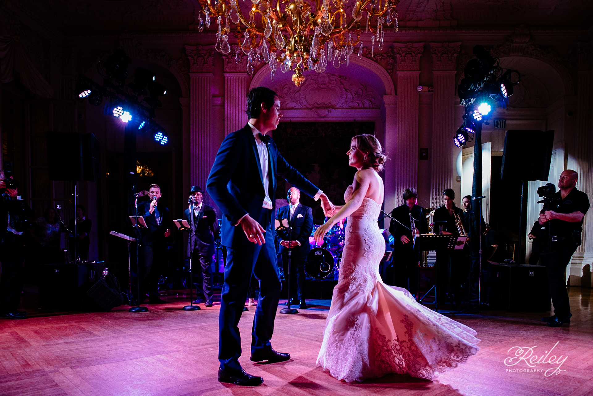
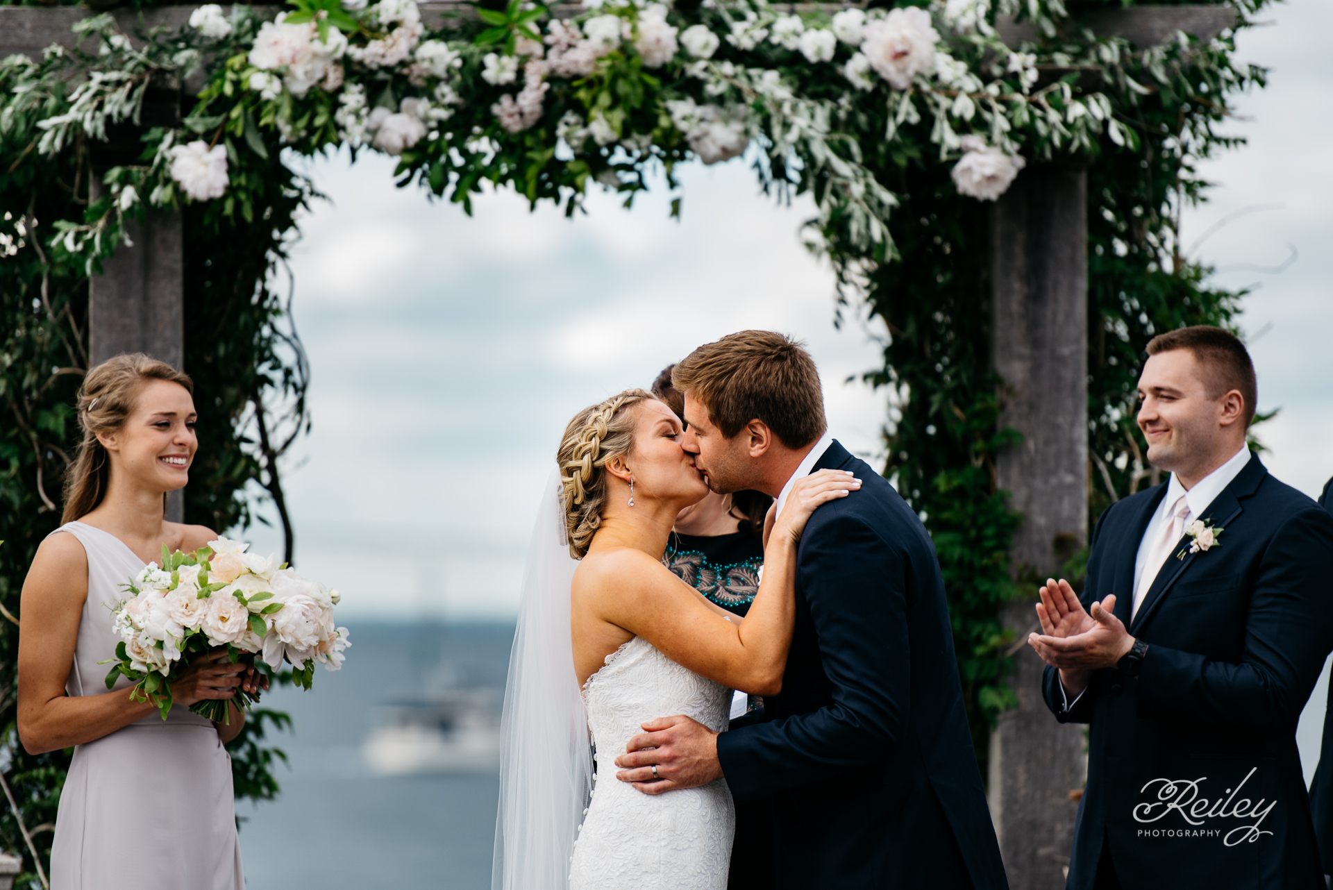
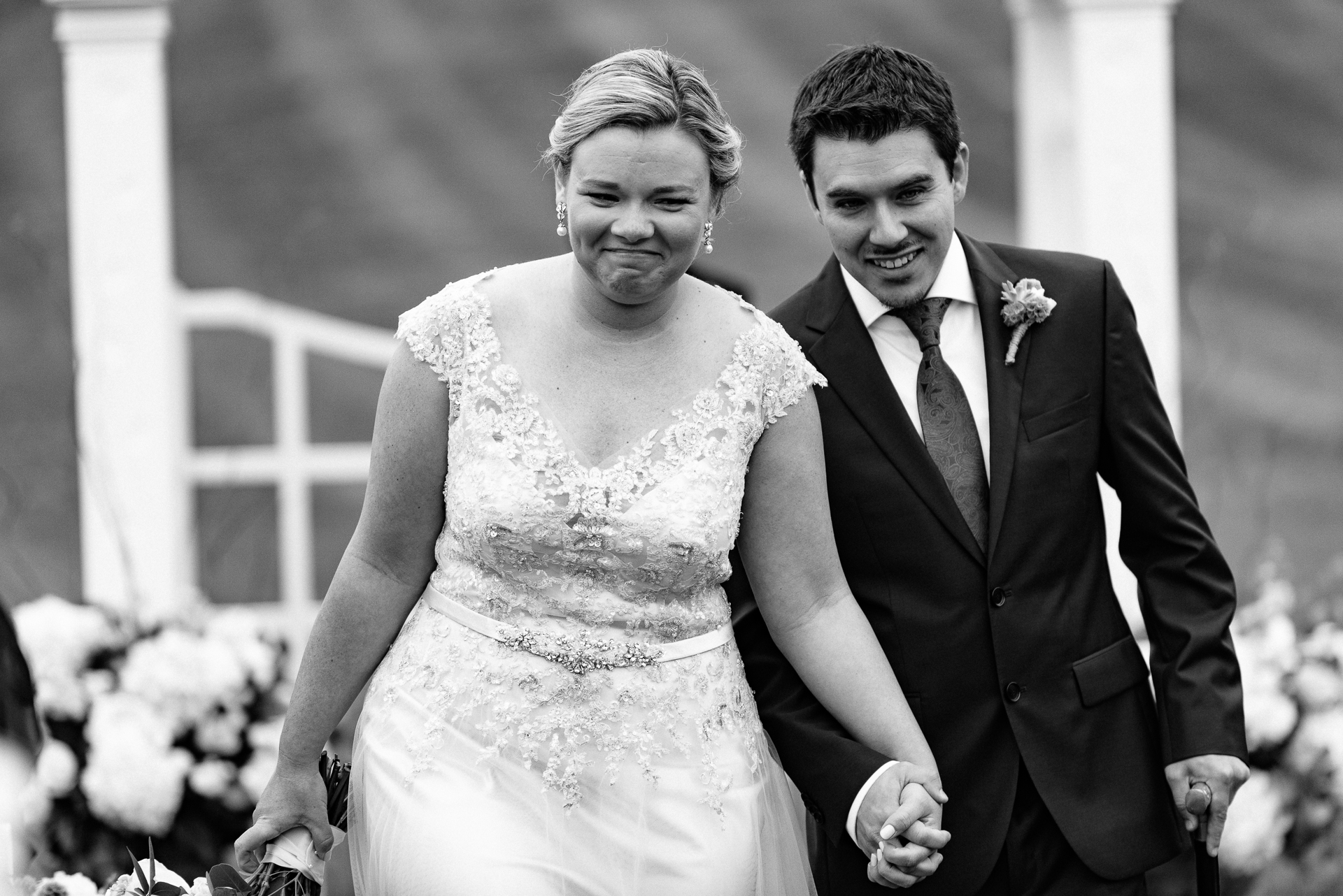
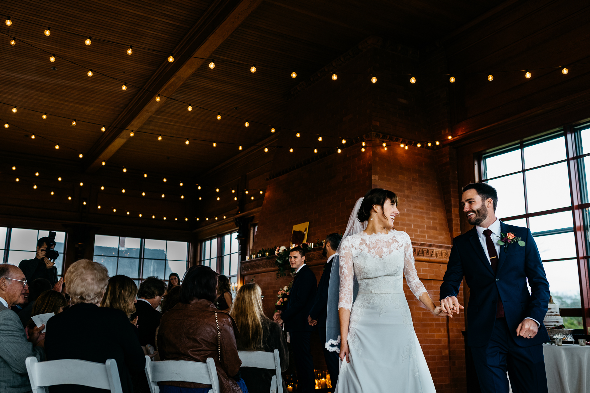
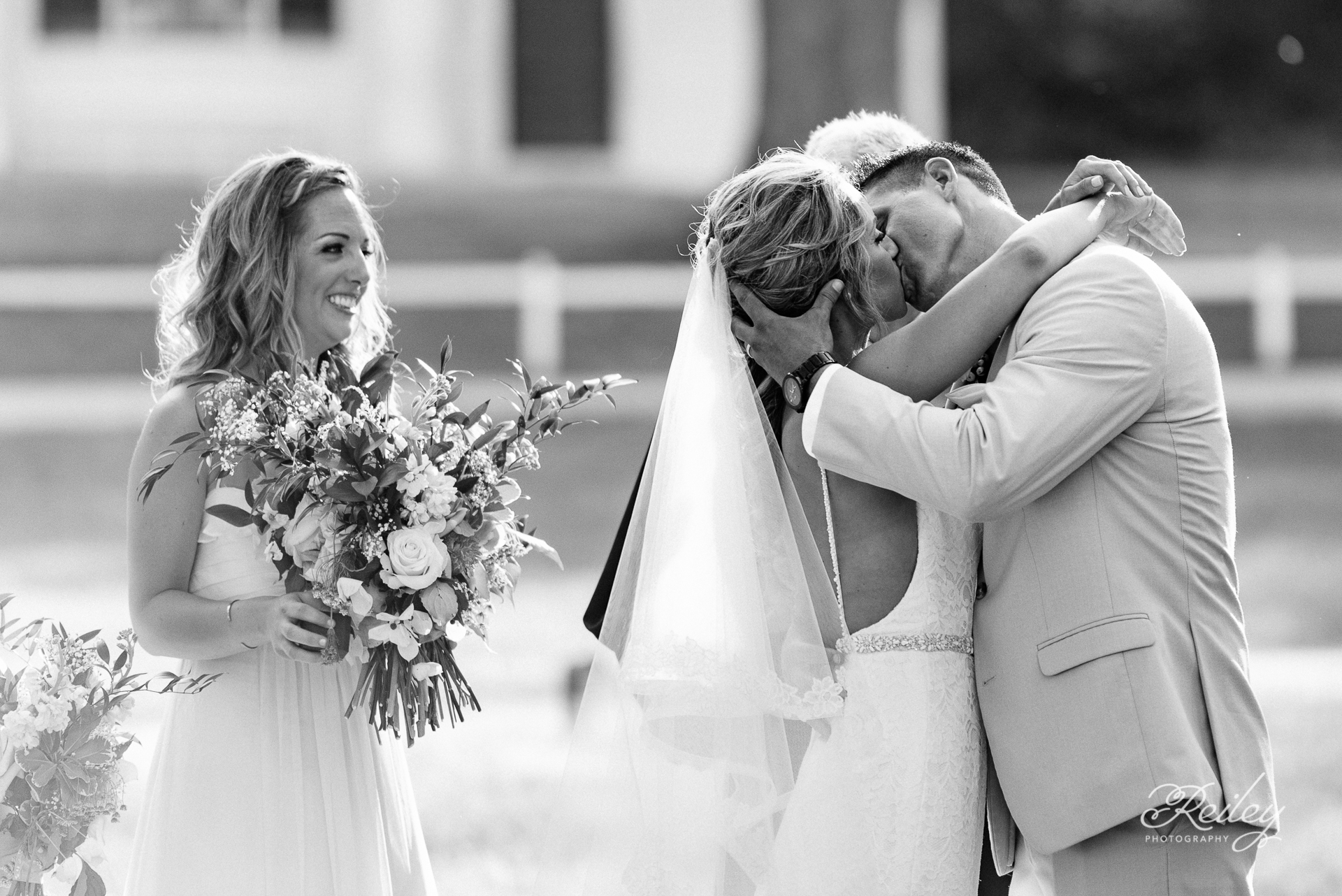
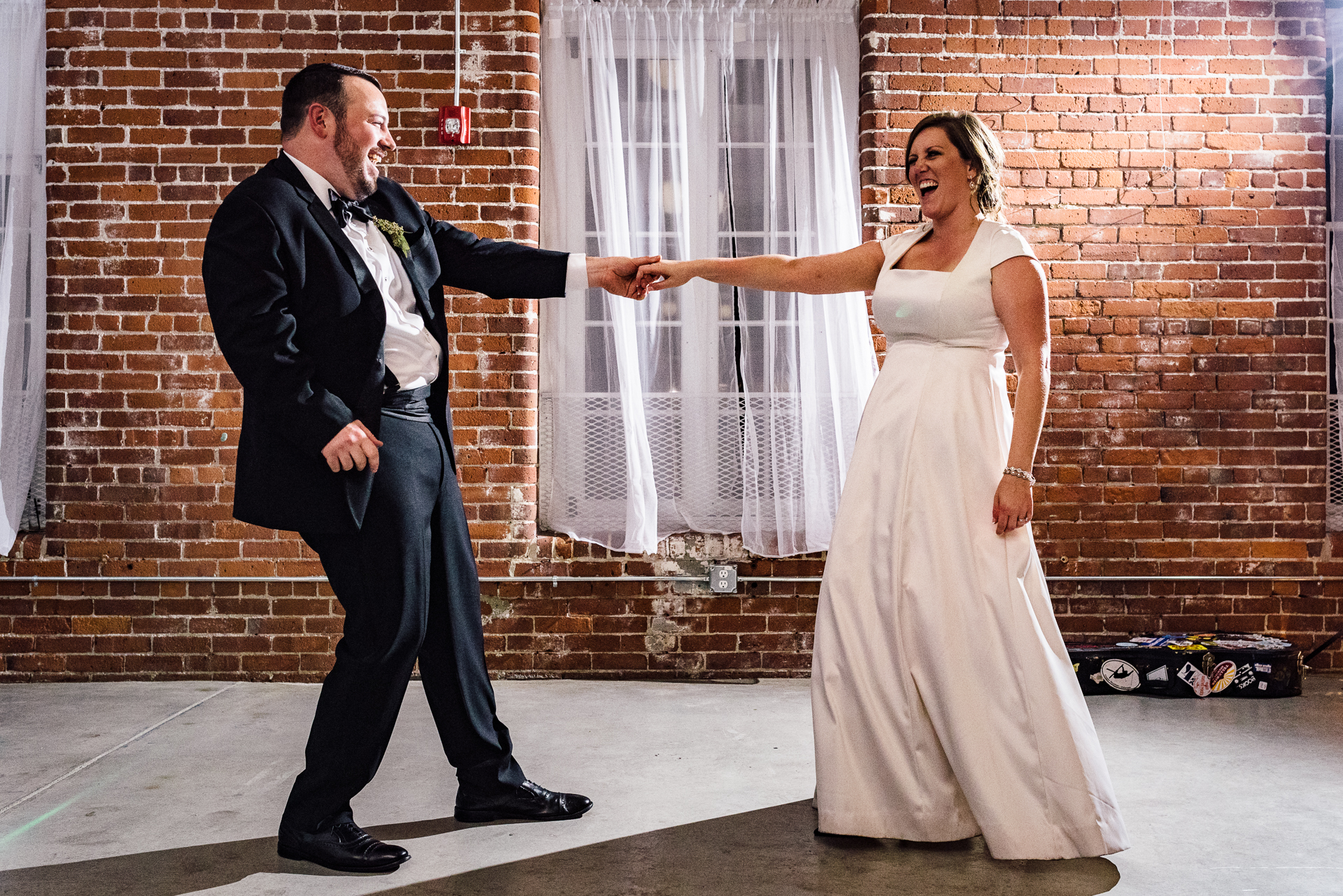
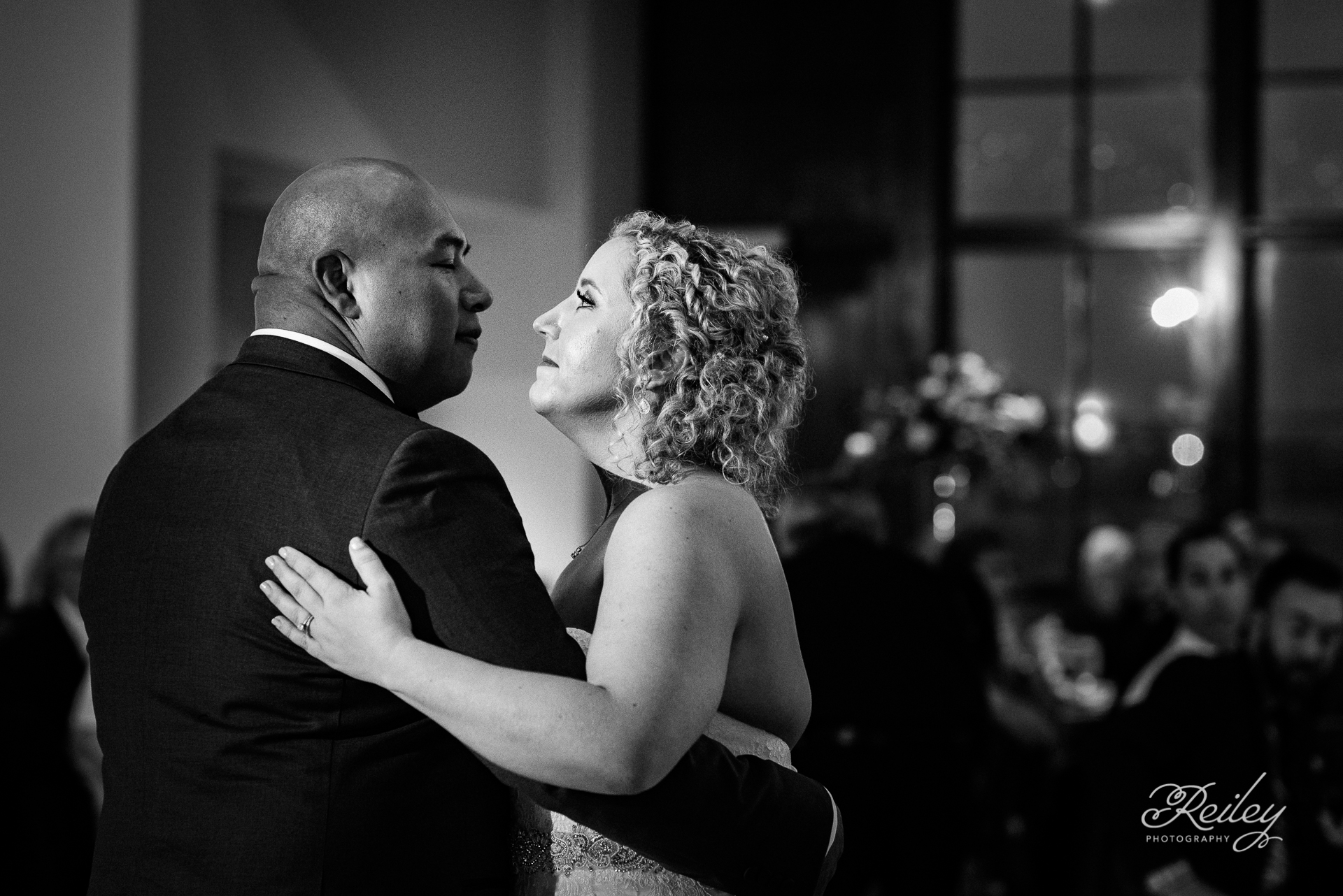
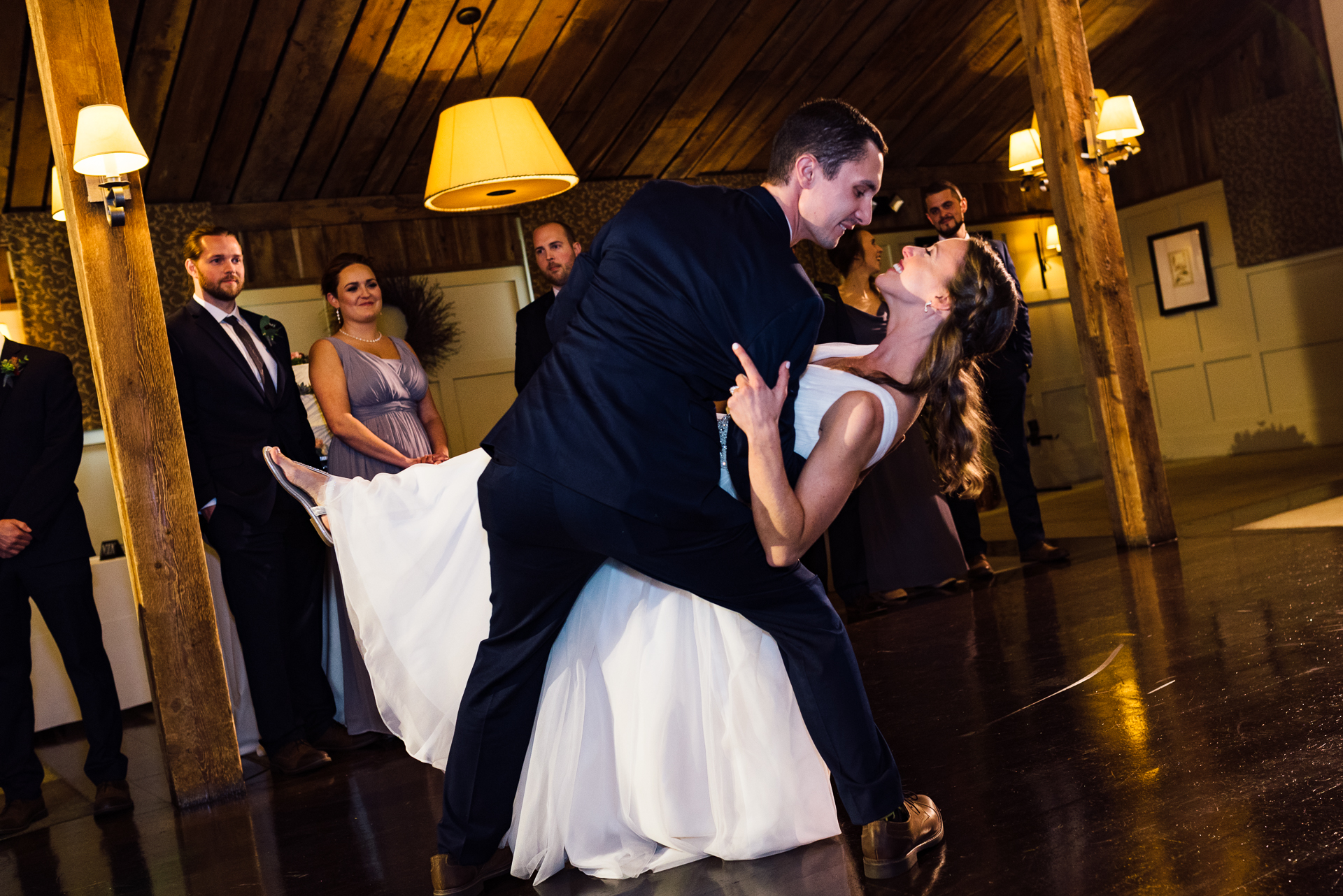
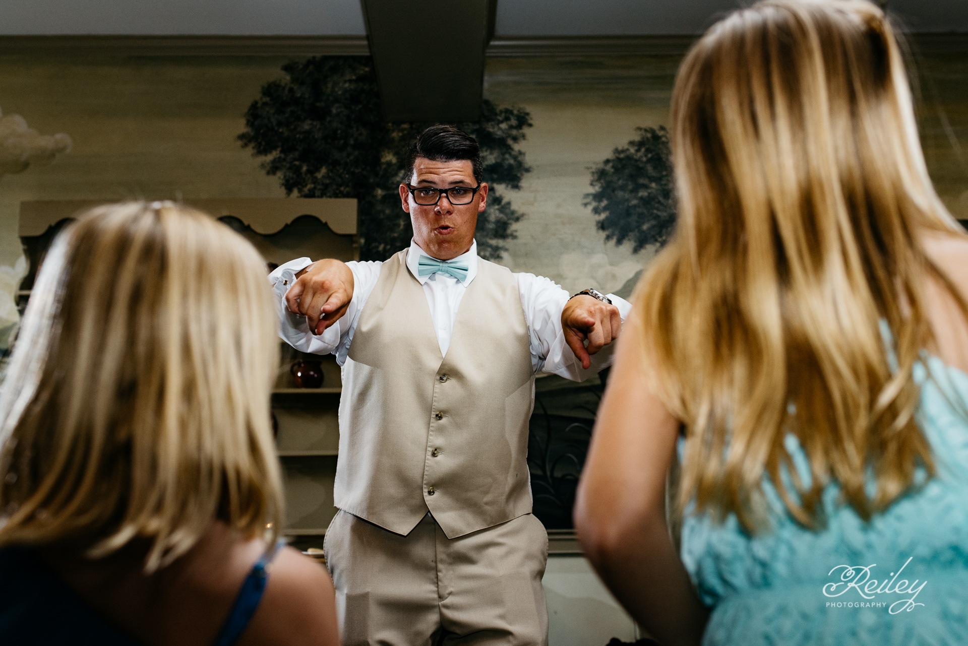
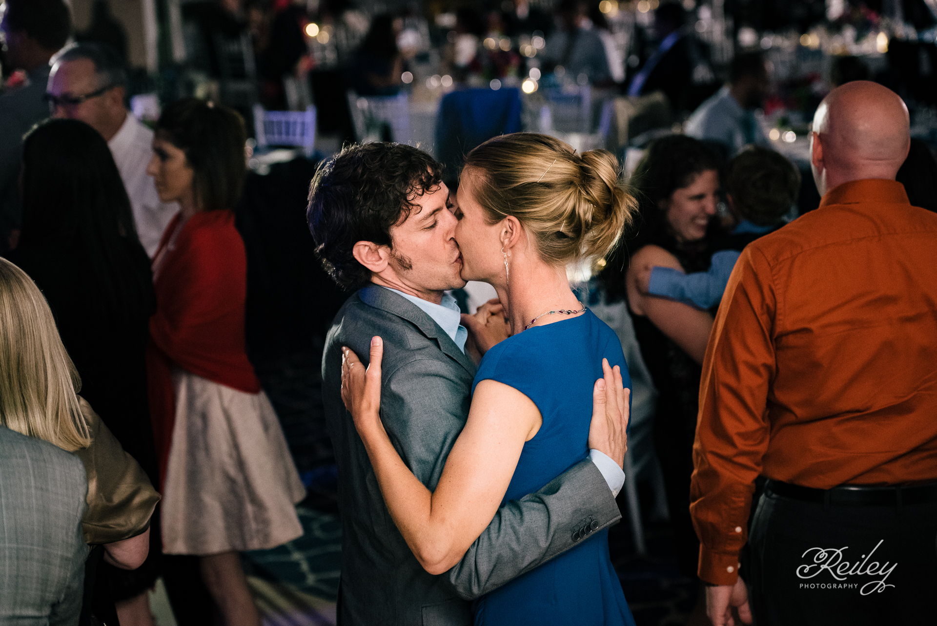
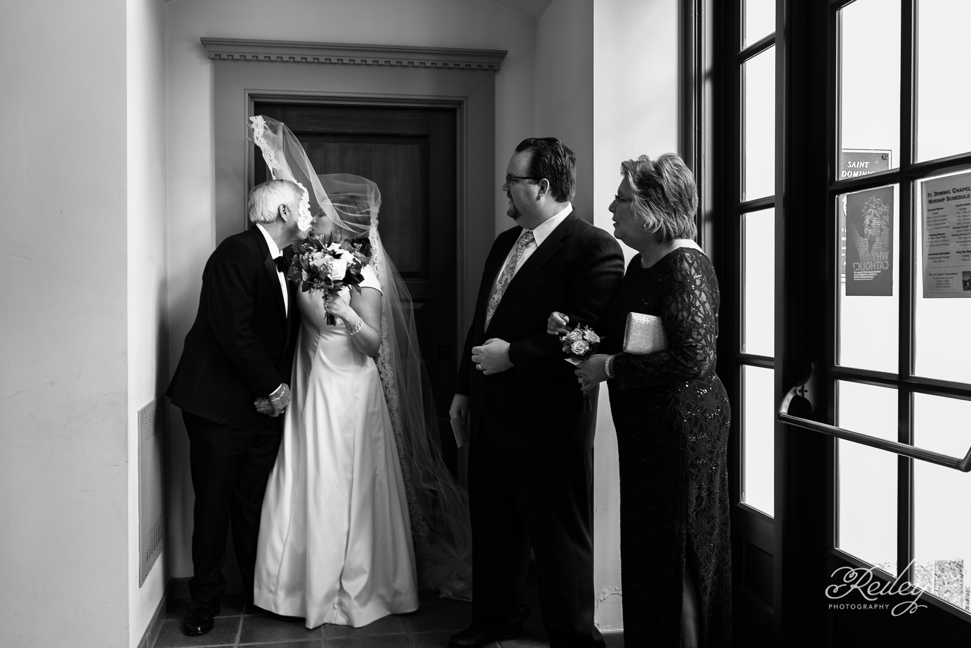
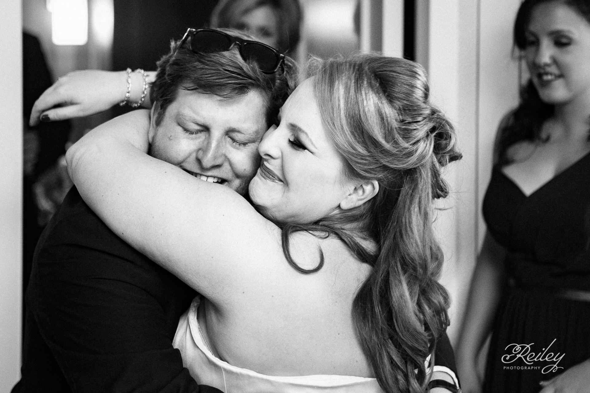
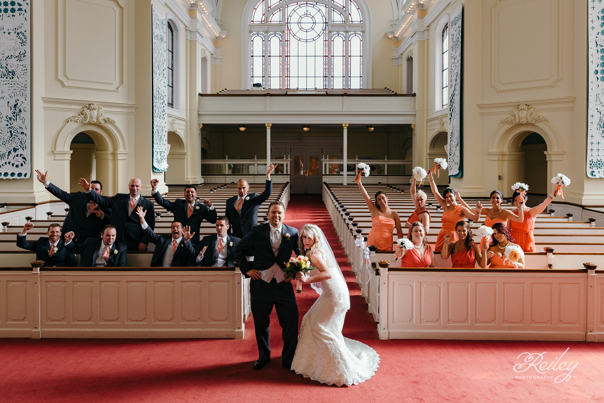
The rebrand made space for a growing wedding portfolio, while staying true to the storytelling style that defined the work.
Project Goals:
- Create a visual identity that works seamlessly across wedding and family photography
- Attract clients who value candid, emotionally driven photography
- Communicate a sense of luxury to increase the brand’s perceived value
- Refresh the visual identity while honoring the original brand’s deeply personal meaning
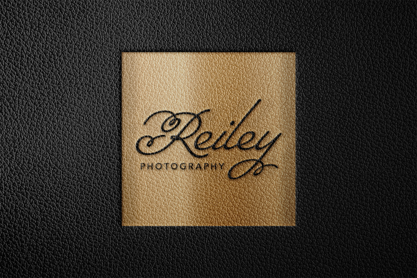
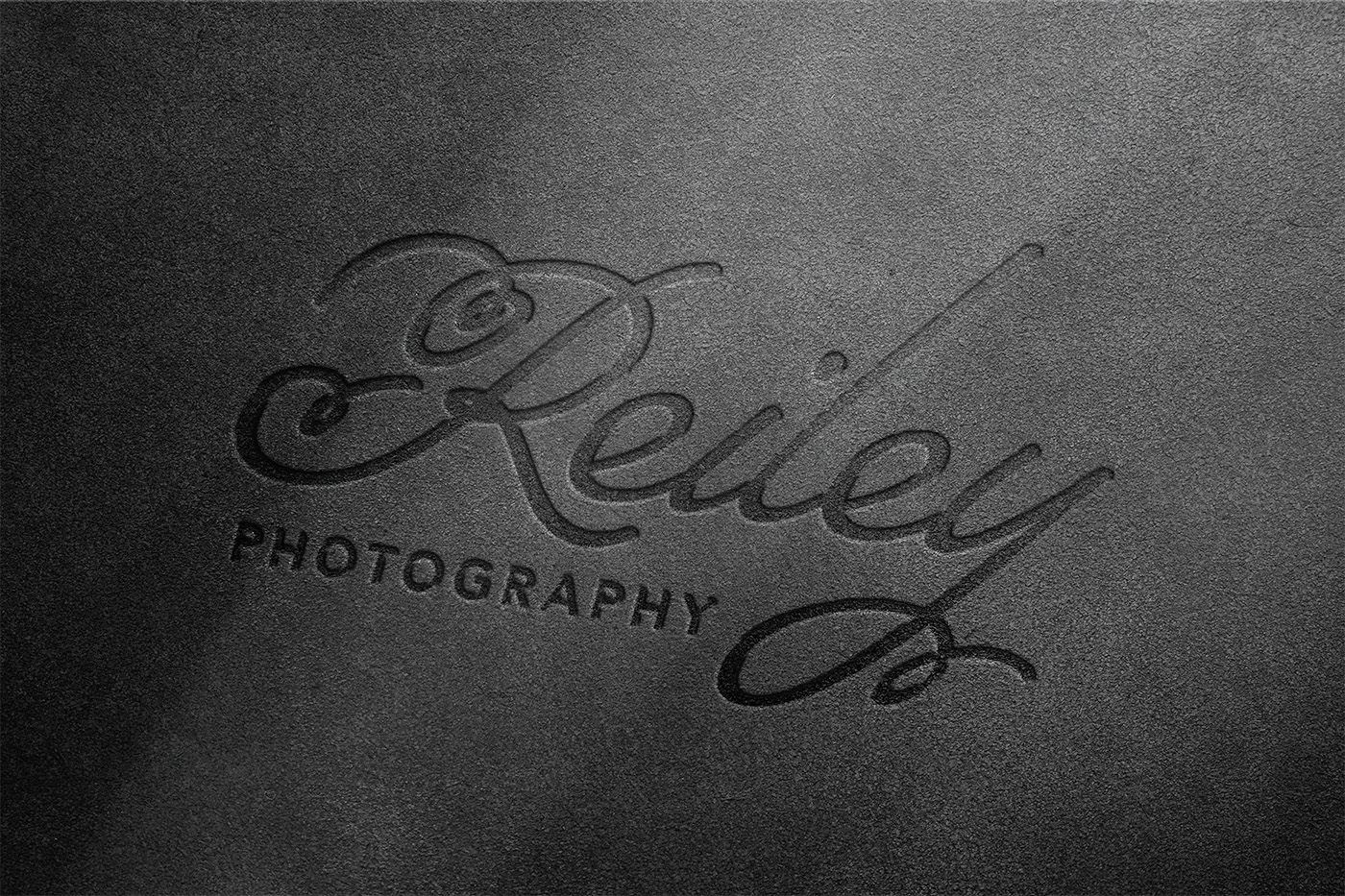
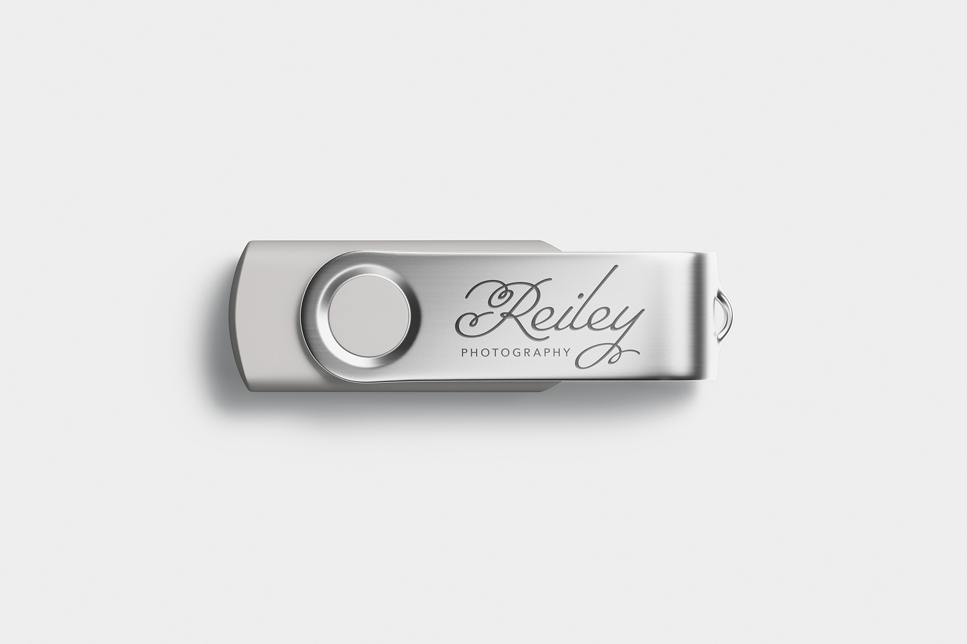
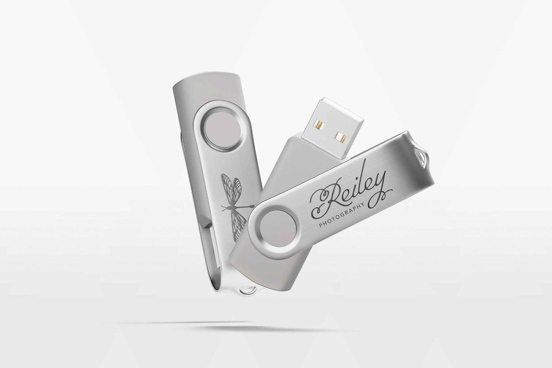
Logo
The new logo reflects a refined, type-driven aesthetic inspired by the elegant simplicity of high-end fashion and beauty brands. The design pairs clean lines with subtle personality, giving it a sense of quiet confidence.
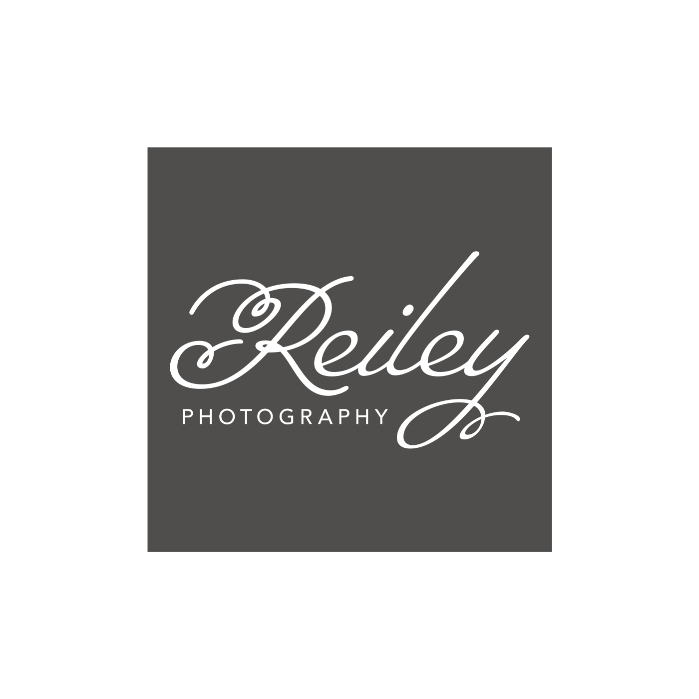
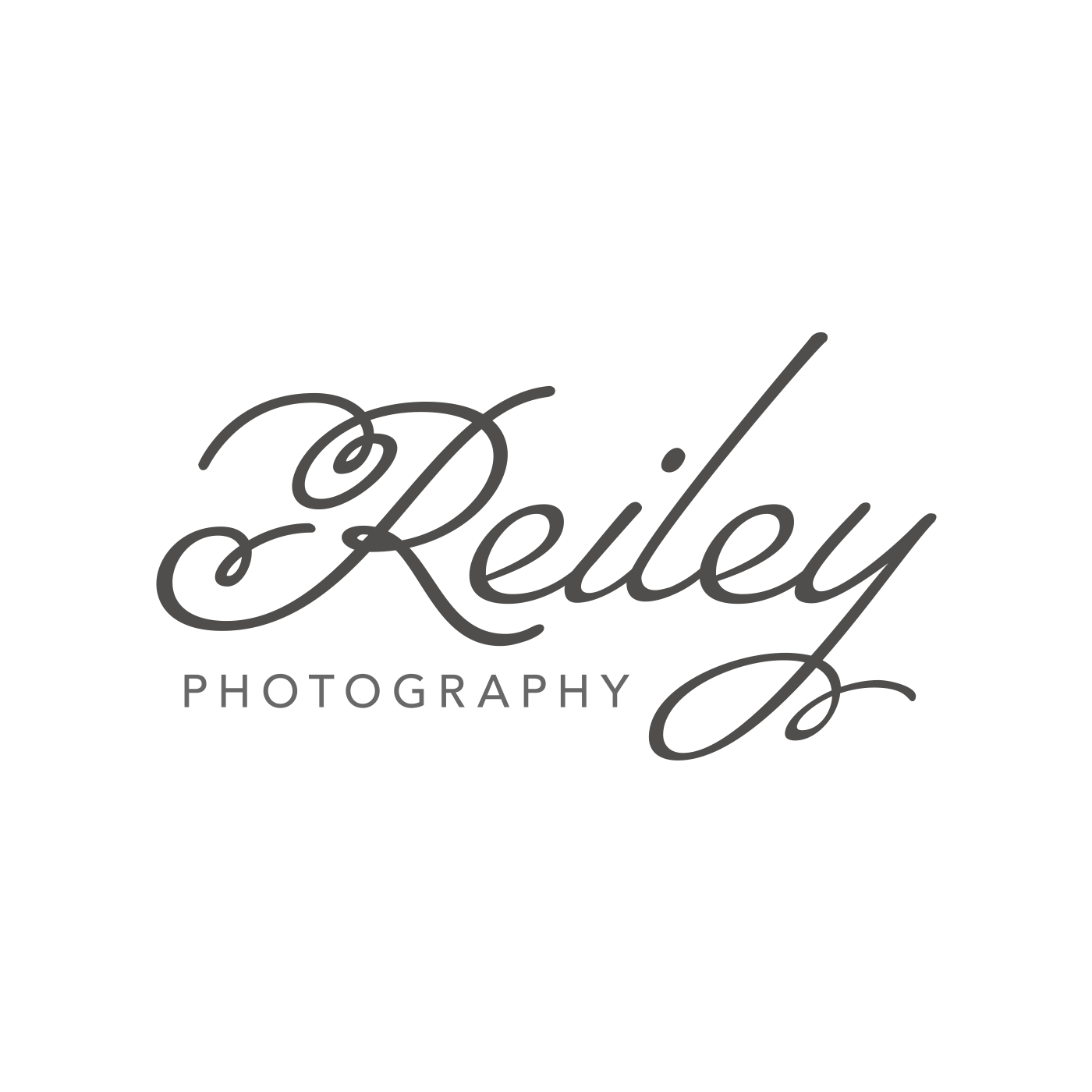
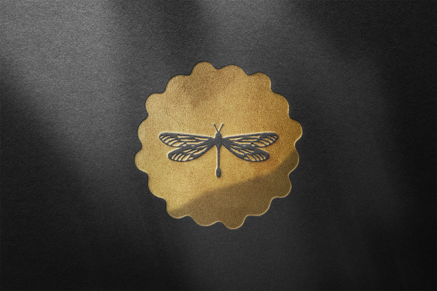
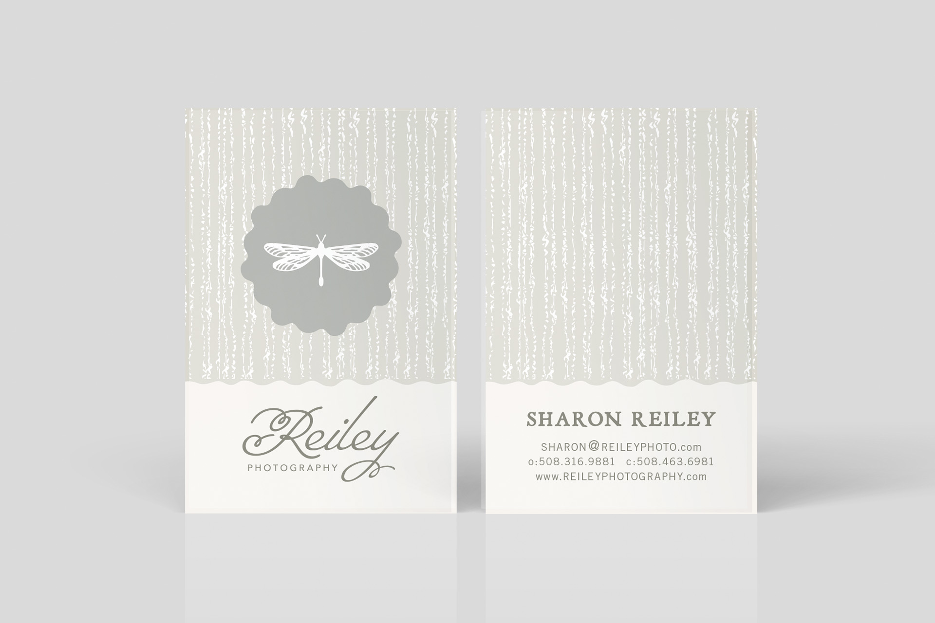
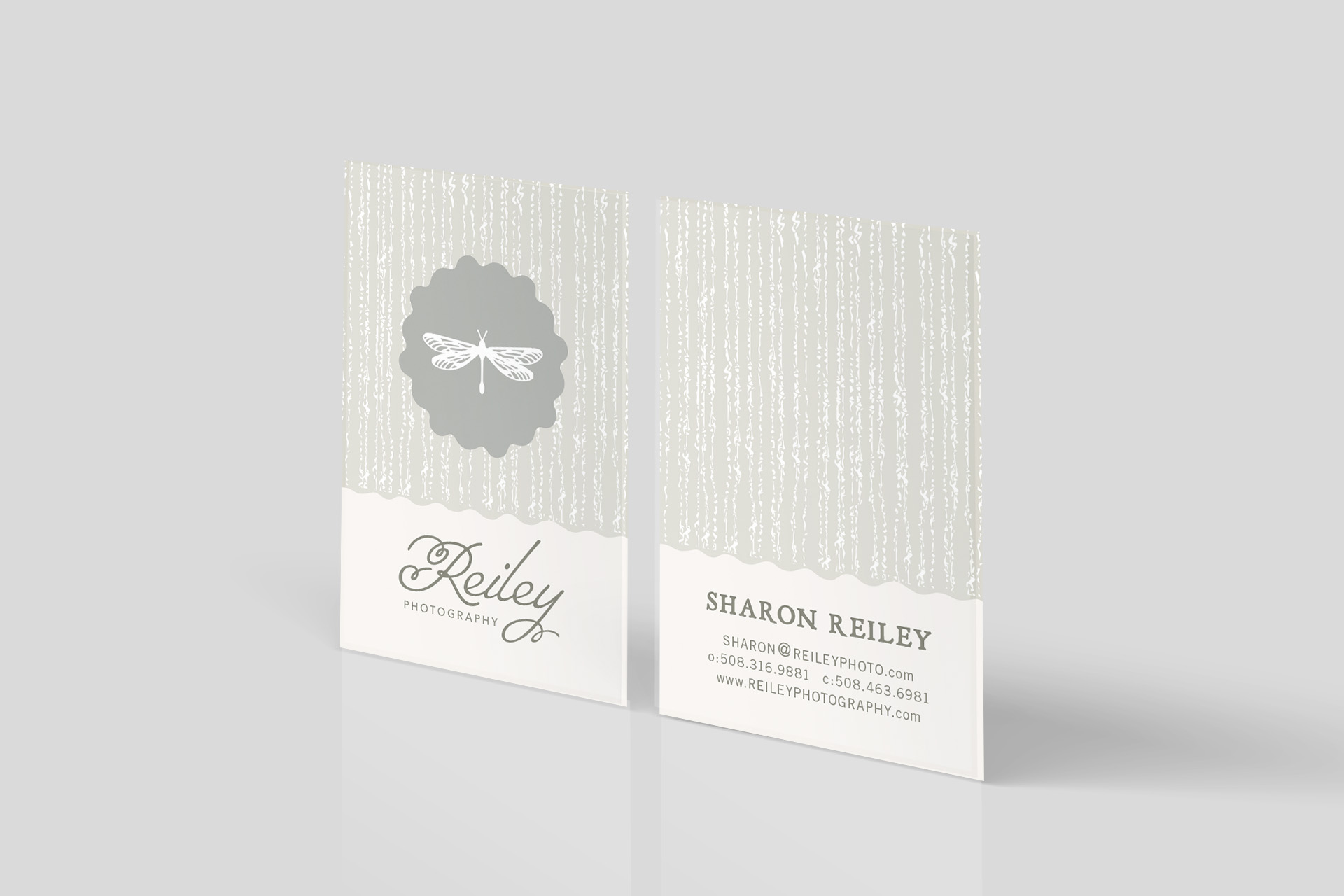
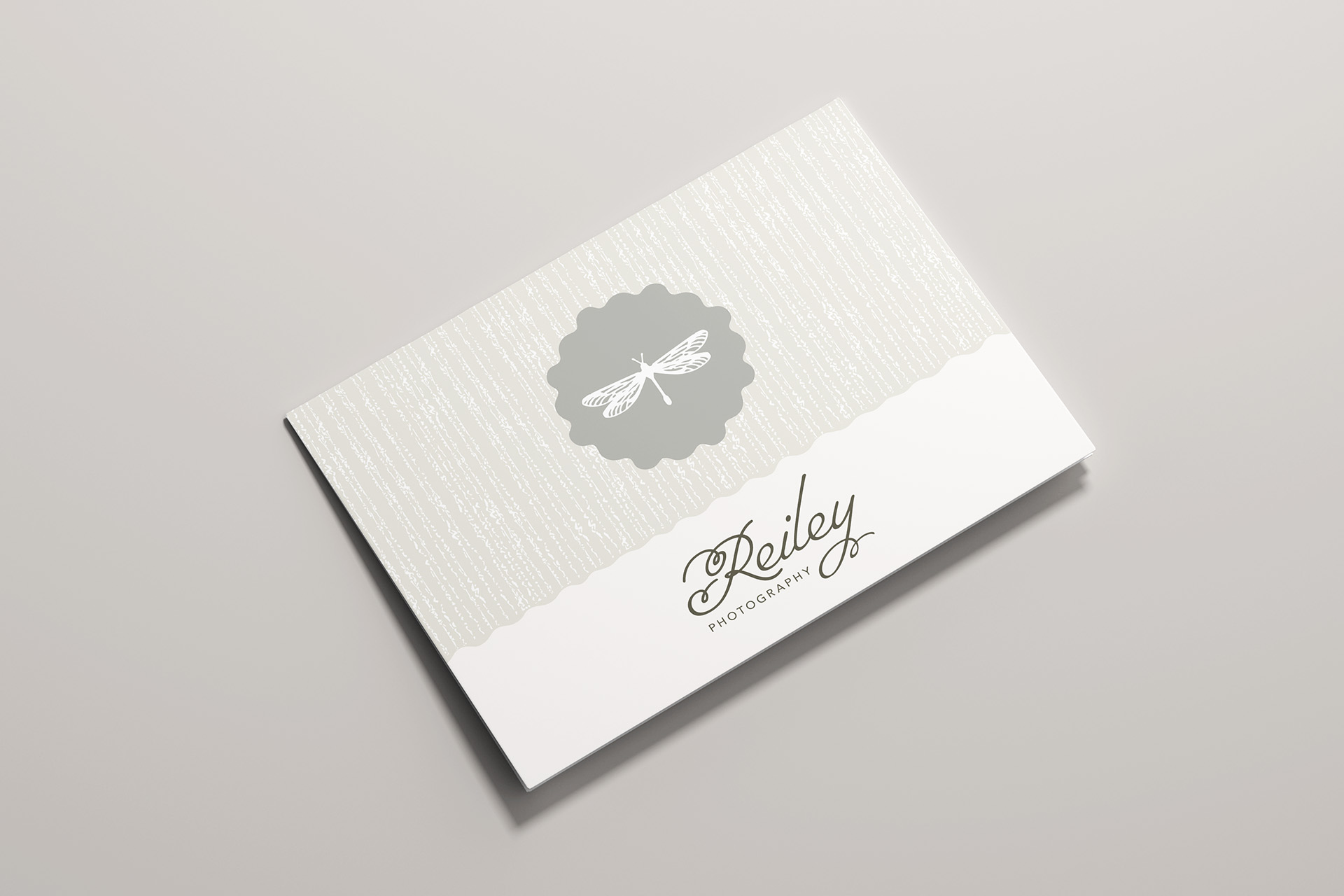
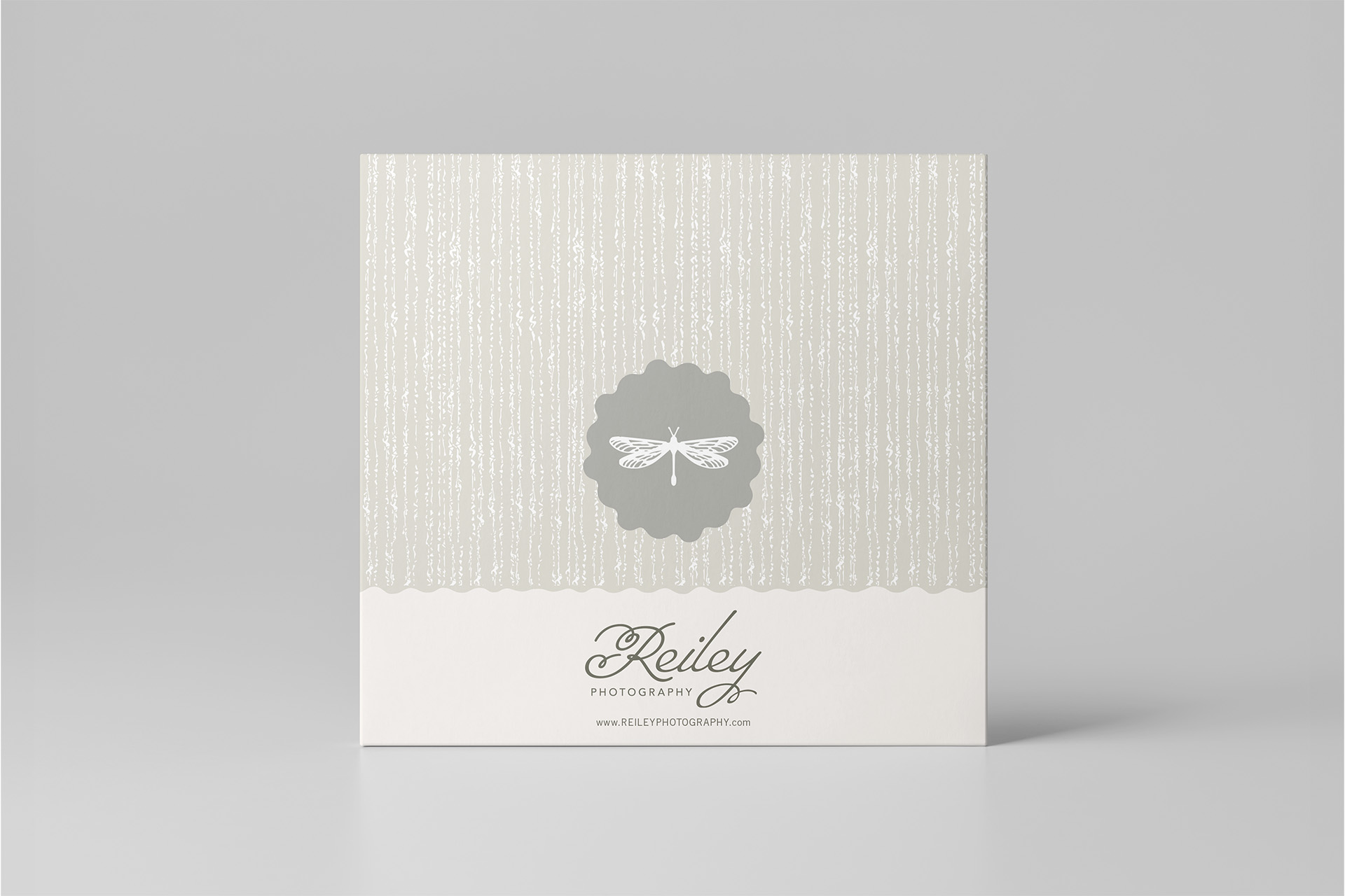
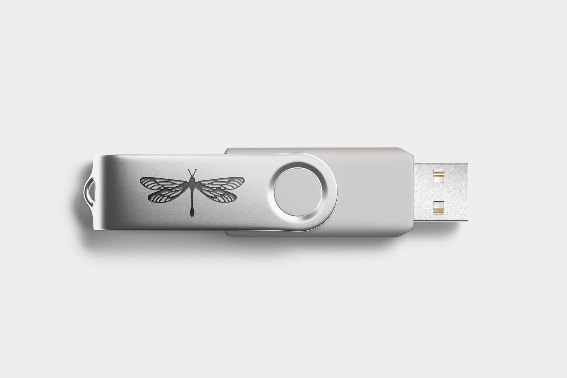
The original handprint was replaced with a dragonfly, as a quiet tribute to my son Owen. It’s a symbol that has always reminded me of him, so including it in the updated design allowed me to carry that connection forward in a more subtle, understated way.

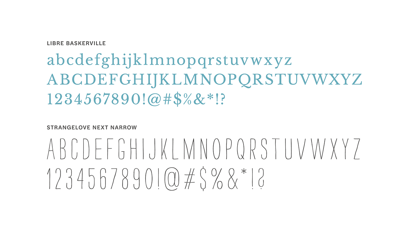
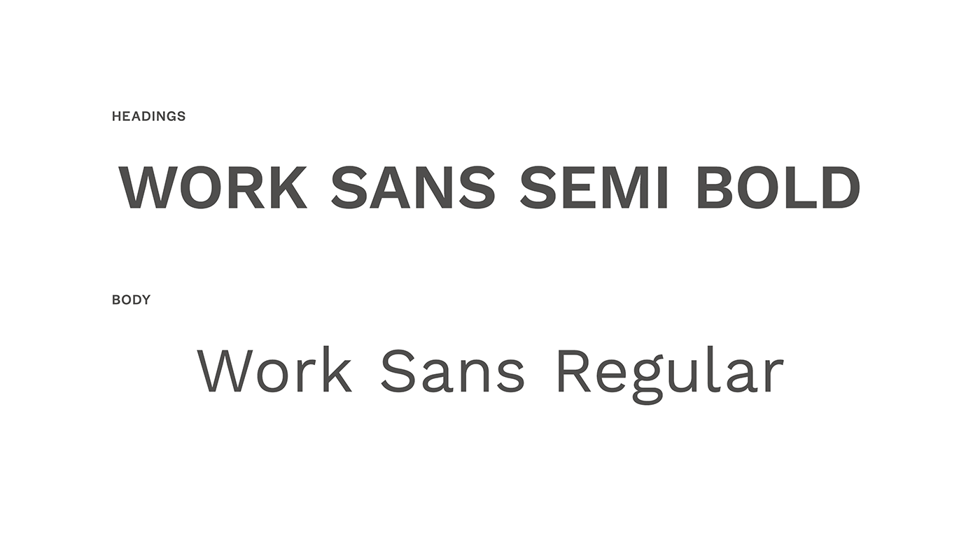
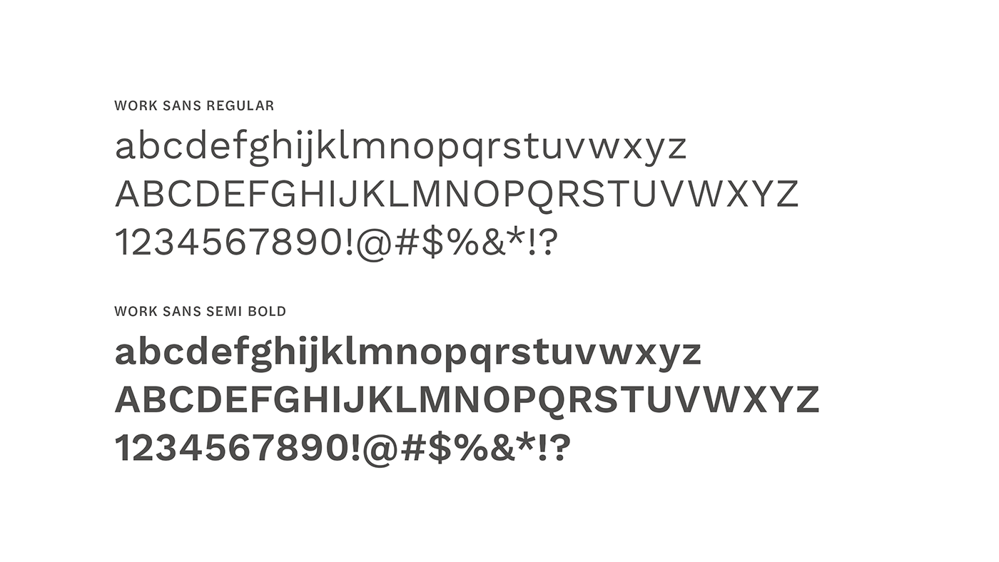
Typography
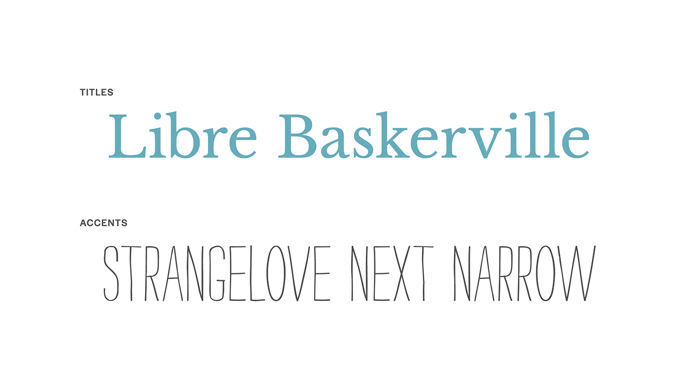
The type choices emphasized clarity and calm. A modern serif brought a sense of grace and editorial polish, while a sans serif companion supported legibility and structure. A handwritten accent font was also included to add warmth and a personal touch, softening the overall look and reinforcing the emotional tone of the brand. This combination allowed the brand to feel at home in both playful family settings and elegant wedding moments.
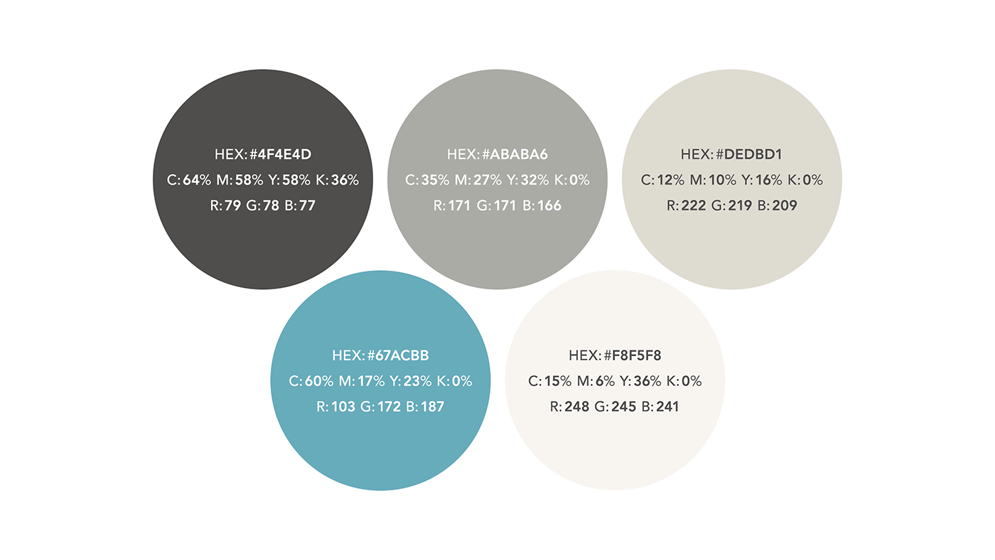
Color Palette
The updated palette centered around soft neutrals with subtle hints of Tiffany-inspired blue—a nod to timelessness, trust, and sophistication. These colors balanced a luxurious, understated feel with casual ease and approachability, offering flexibility across both family and wedding communications.
Business Cards
Business cards were designed to feel polished but approachable, with clean typography, minimal color, and careful attention to layout. Printed on thick, uncoated card stock with a soft, tactile feel, they offered a quiet first impression that reflected the brand’s balance of refinement and warmth.
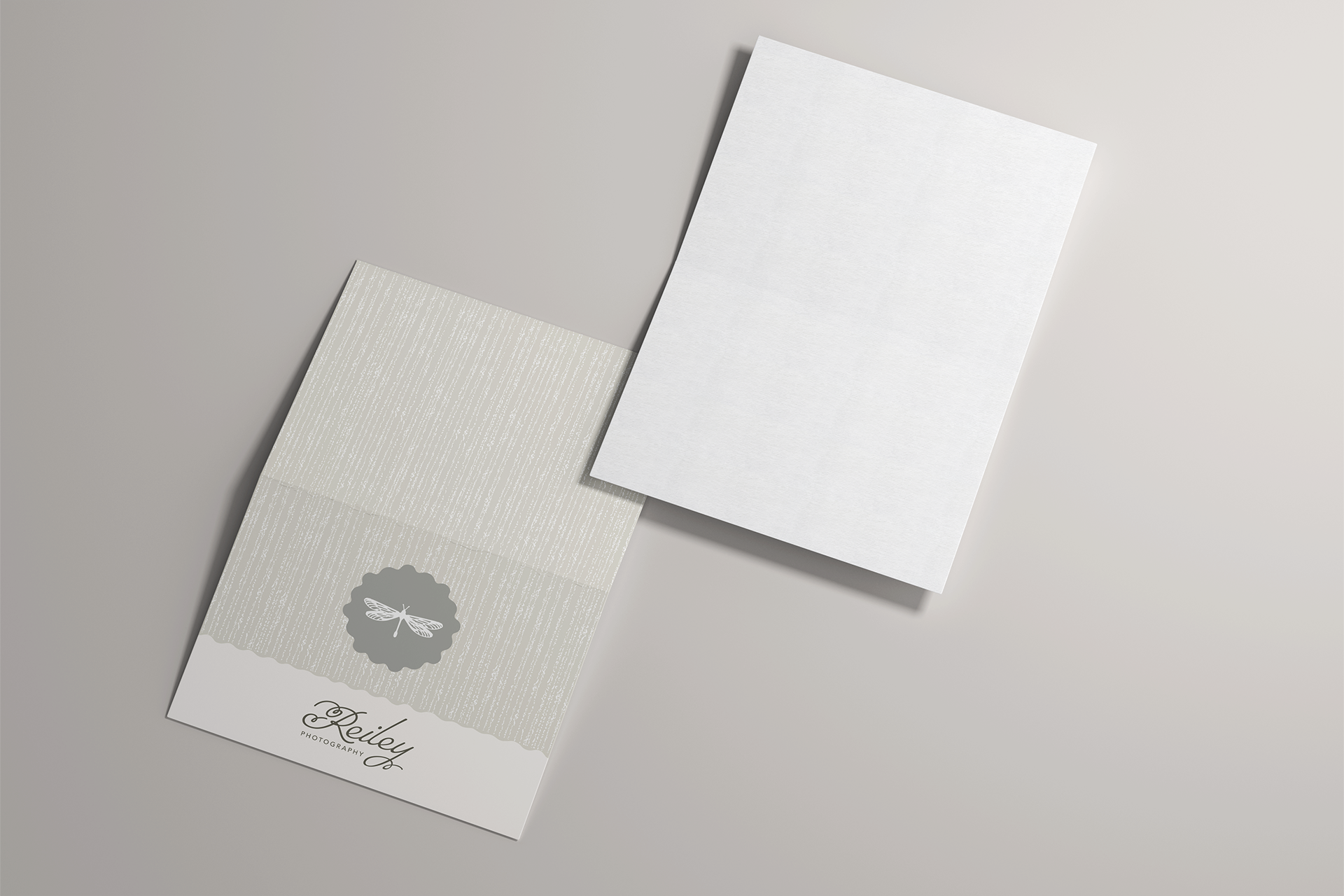
Note Cards
Branded note cards provided a warm, handwritten touchpoint to thank clients or follow up after sessions. The cards were printed on heavyweight watercolor card stock, offering a luxurious feeling consistent with the overall brand, and were intentionally left blank on the inside, leaving room for personal messages and making them versatile for any occasion.

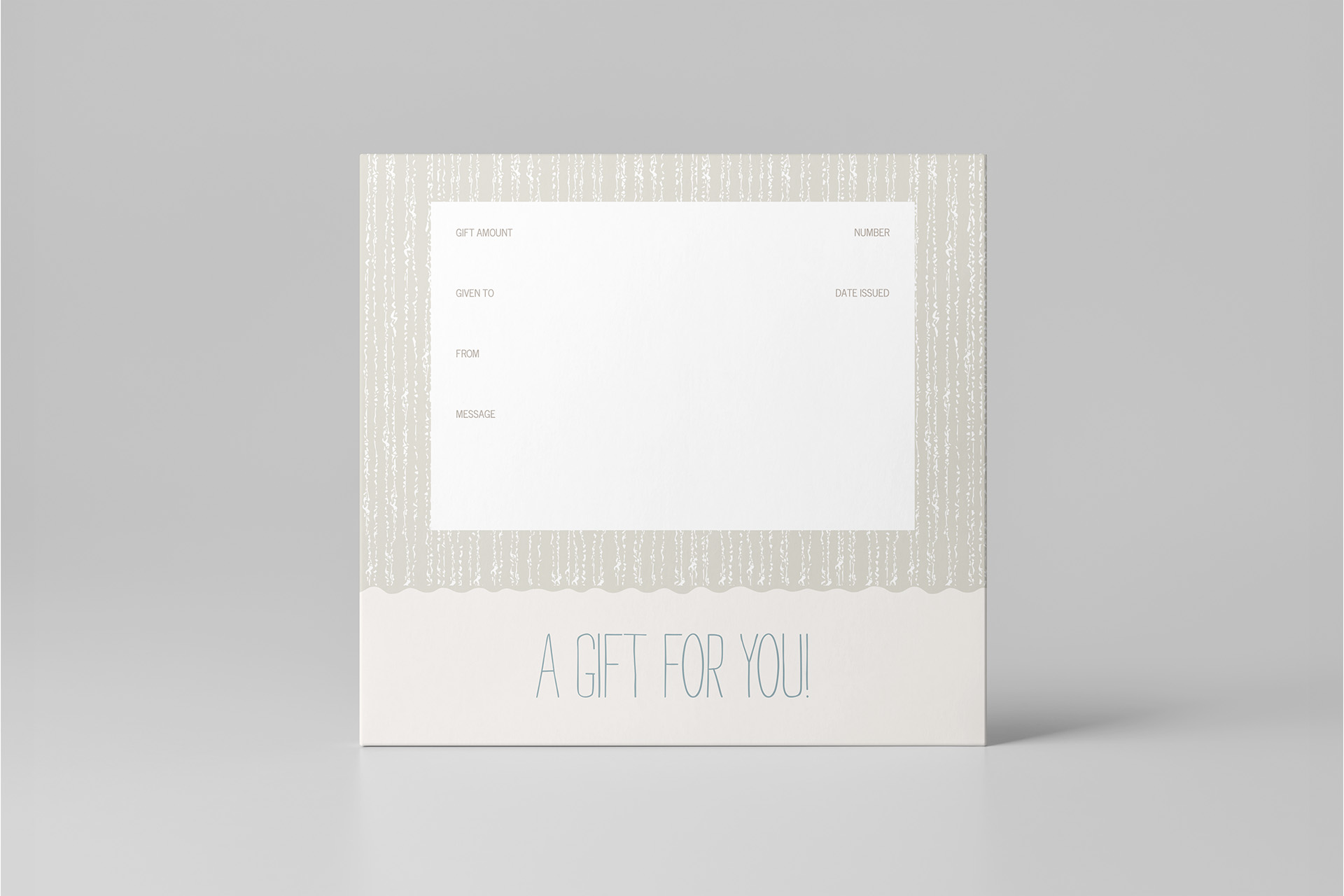
Gift Certificates
Gift certificates were styled to feel like a experience in themselves—simple, beautiful, and easy to present as a thoughtful gesture. Designed to reflect the refined tone of the brand and printed on thick, velvety water-color paper, they reinforced the value of photography as a meaningful gift while remaining easy and affordable to order in small quantities.
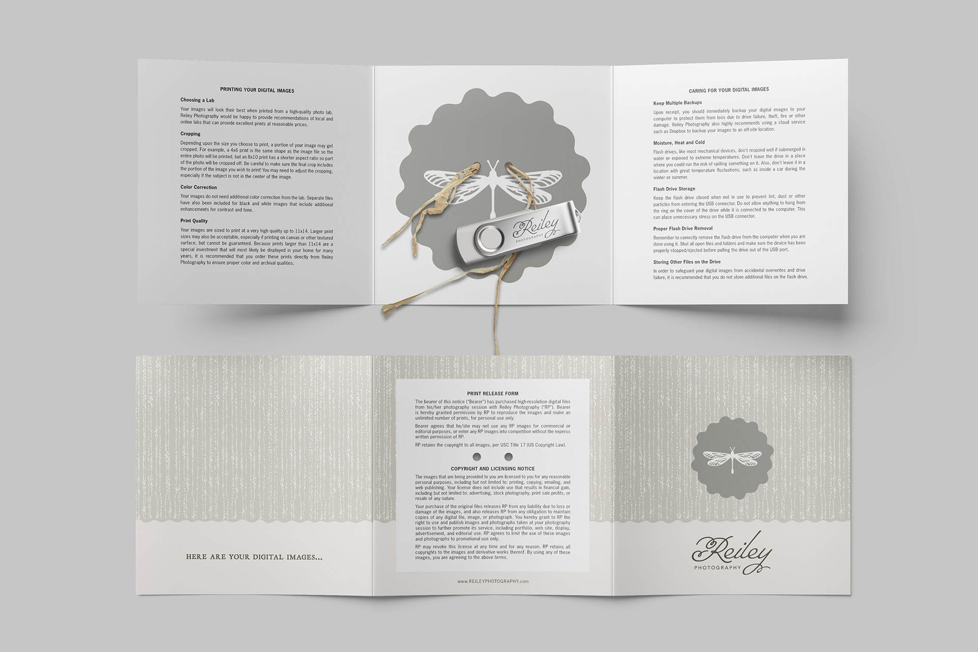
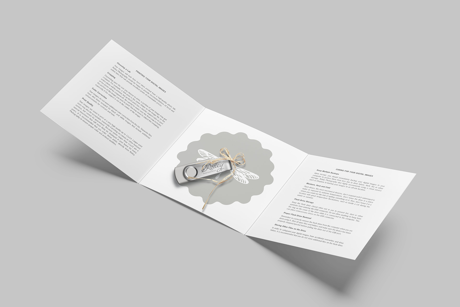
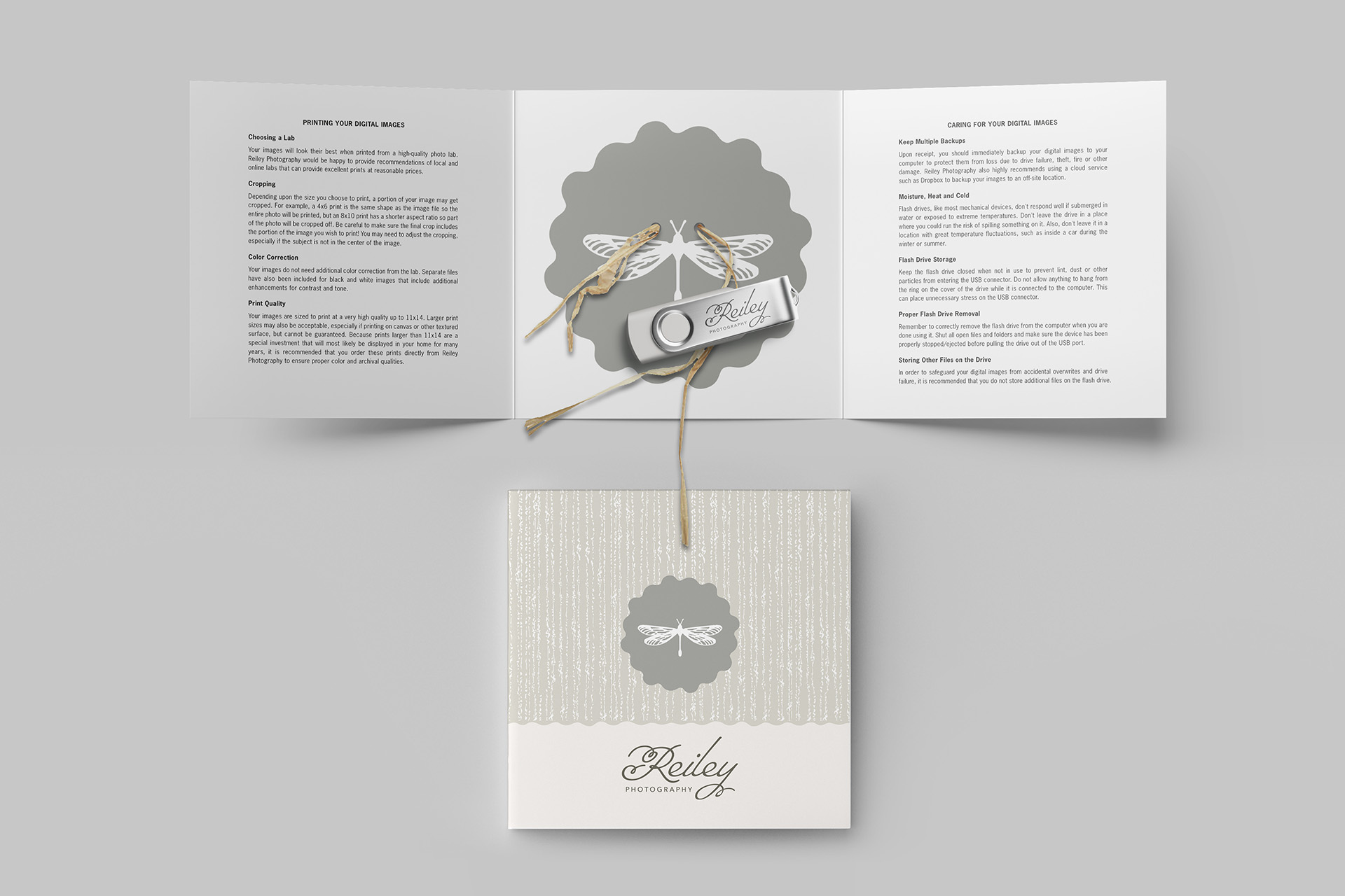
Digital Image Packaging
Digital files were delivered on a USB thumb drive, secured inside a custom 5×5 tri-fold card. Designed to feel like opening a small gift, the card included helpful information on image care, printing, and usage rights. Two holes allowed the drive to be tied in place with raffia ribbon—a cost-effective, beautiful packaging solution that still felt personal and intentional.
Results:
- A cohesive visual identity that effectively served both wedding and family audiences
- Increased inquiries from clients aligned with my candid, emotional style
- Higher perceived value of services, leading to increased average wedding package bookings
- A refined brand system that preserved emotional and personal significance of the original


