
A New Brand Identity Designed to Spark Joy
Fotoskribe was founded by photographer and entrepreneur Rachel Conley to help photographers blog consistently without added stress. Her existing brand, The Photographer’s Blogger, communicated the core benefits—saving time, reducing overwhelm, and improving SEO—but lacked the personality and professionalism to match her vision. Rachel wanted the new brand to feel clean, minimal, and friendly, while standing out in a crowded market with a distinctive, modern identity that conveyed trust and confidence. Most importantly, the brand needed to take away the burden photographers often feel about blogging, replacing it with a sense of ease and enjoyment.
The Photographer’s Blogger (Original Brand Identity)

BEFORE: The Photographer’s Blogger’s original brand identity lacked a distinctive visual style, using generic fonts and a muted maroon palette that didn’t reflect the modern, energetic, or professional feel Rachel envisioned for her business.
Project Goals:
- Communicate clarity and trust through clean, professional design
- Bring vibrancy and fun to make blogging feel approachable and enjoyable
- Communicate trust, clarity, and relief from overwhelm
- Create a modern identity that feels confident and fresh
Project Goals:
- Communicate clarity and trust through clean, professional design
- Bring vibrancy and fun to make blogging feel approachable and enjoyable
- Communicate trust, clarity, and relief from overwhelm
- Create a modern identity that feels confident and fresh
Logo Design
The Fotoskribe logo is a custom wordmark designed to convey a sense of modern professionalism and approachability. Its lowercase letterforms feel friendly and conversational, while clean lines and subtle geometric structure provide clarity and confidence. The shapes of the letters are also a subtle nod to Rachel’s Norwegian heritage and her love of modern Scandinavian design. This balance reflects the brand’s goal of making blogging feel both easy and expertly handled.
Color Palette
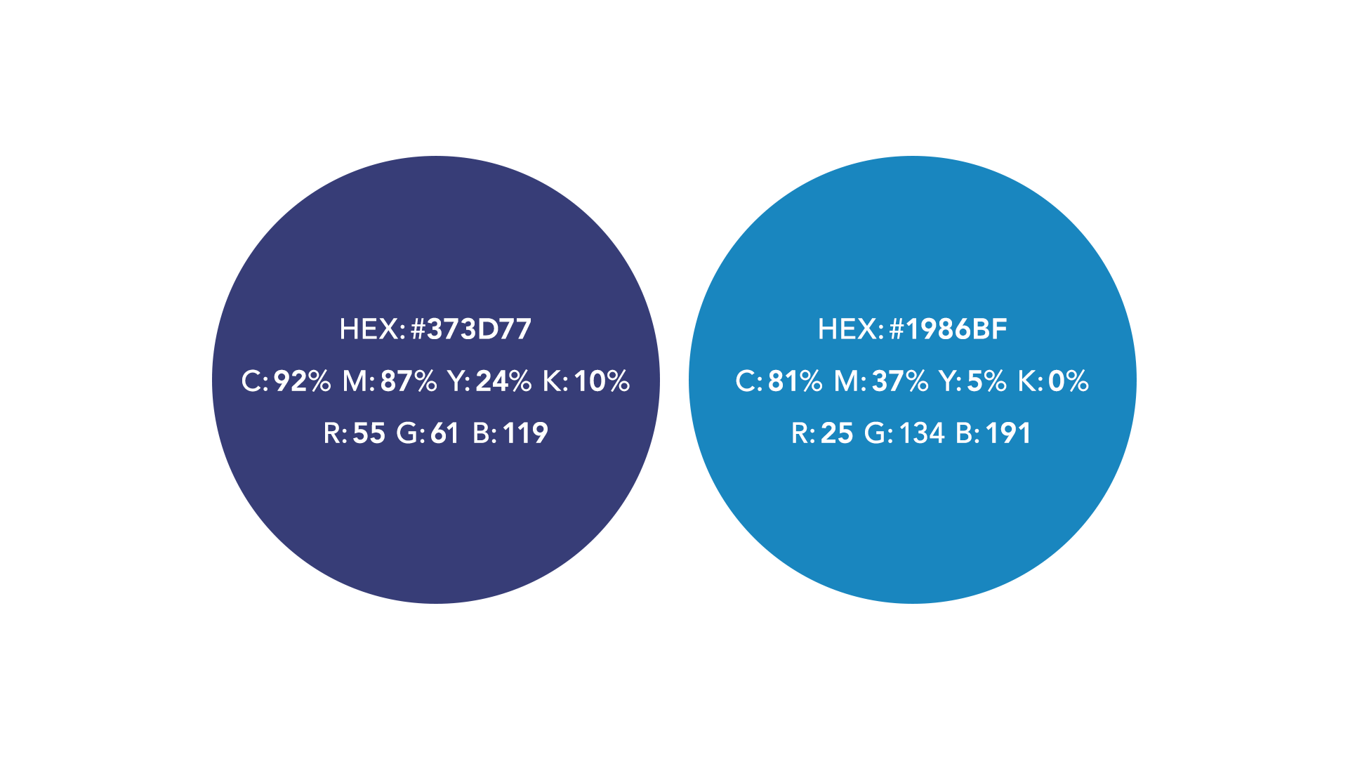
Fotoskribe’s primary color is a deep, saturated blue inspired by architectural blueprints, evoking clarity, creativity, and trust. This strong, grounded hue anchors the brand and establishes a confident, professional presence. Supporting accent colors are used strategically to bring vibrancy and energy to digital and print materials, without overwhelming the calming foundation.
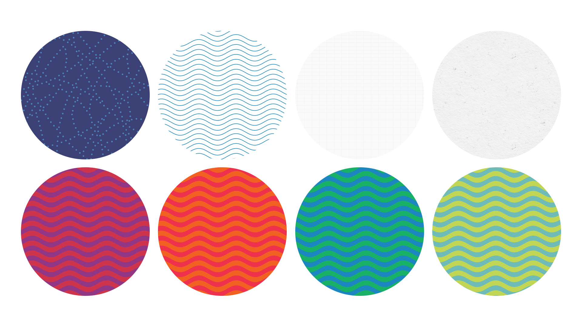
Custom Patterns
To add visual interest and personality to the brand, I created a set of bold graphic patterns. These patterns complement the clean layout and typography, injecting energy and a handcrafted feel. Used across marketing materials and the website, they reinforce Fotoskribe’s approachable, human-centered service while adding moments of delight throughout the experience.
Business Cards & Stationery
To bring the Fotoskribe brand to life in client touchpoints, I designed a set of business cards and stationery that combine structure with playfulness. The business cards feature the clean wordmark on a deep blue background accented by a playful dotted scribbled line, conveying trust and clarity. The reverse side uses a crisp grid texture, reinforcing the brand’s organized, editorial feel.

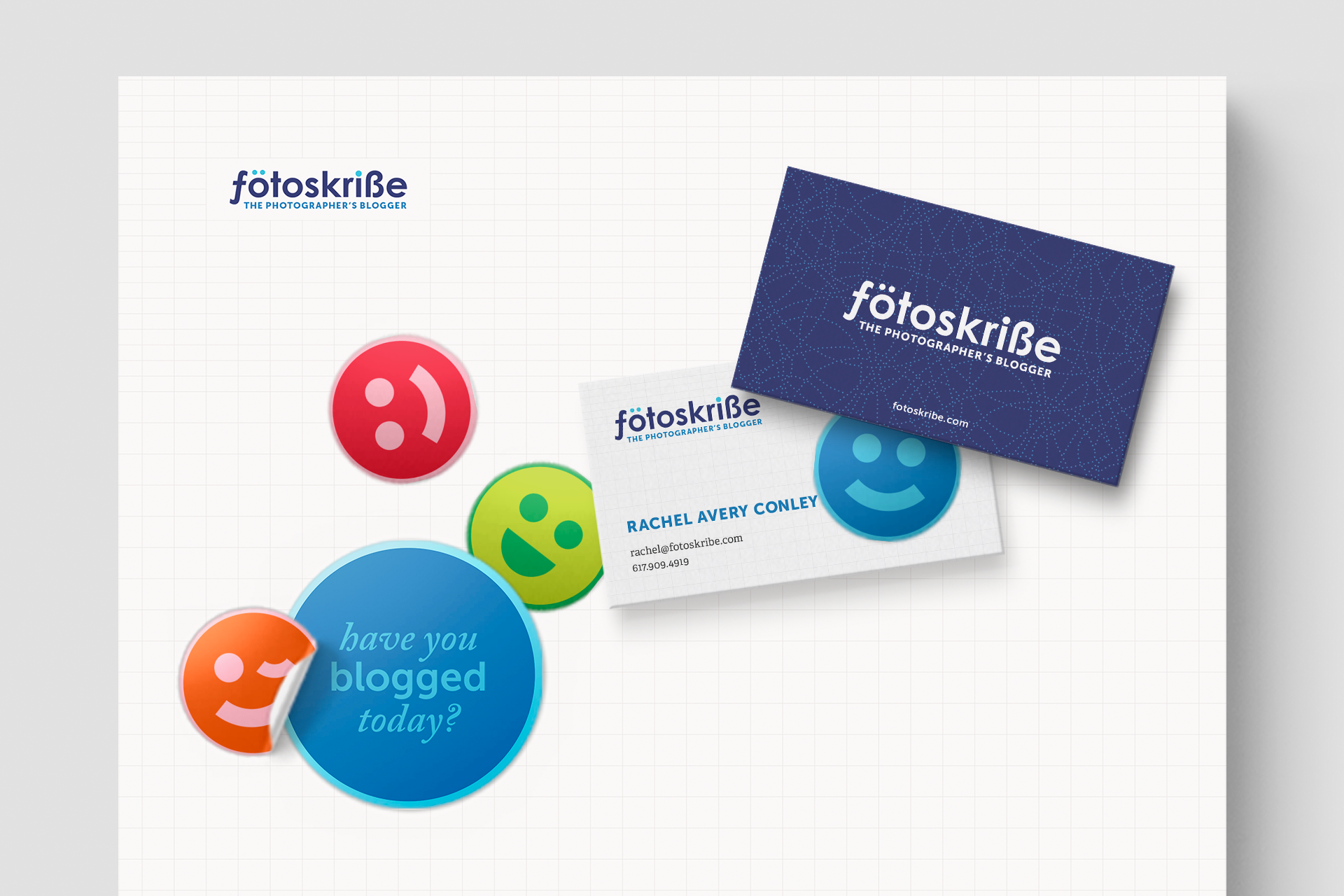
Emoji Designs & Fun Brand Touches
To infuse the brand with personality and joy, I created a set of bright emoji designs. These playful graphics can be used flexibly as stickers, button pins, or digital icons—adding color, approachability, and moments of delight to the Fotoskribe experience. Each emoji reinforces the brand’s mission to make blogging feel simple, fun, and creatively fulfilling.


Results:
- Established a brand that feels clear, trustworthy, and polished
- Brought energy and fun to the experience of blogging
- Delivered a clean, modern design with bright, playful icons that help spark joy
- Helped Fotoskribe stand out with a look that’s distinct in the photography space
Results:
- Established a brand that feels clear, trustworthy, and polished
- Brought energy and fun to the experience of blogging
- Delivered a clean, modern design with bright, playful icons that help spark joy
- Helped Fotoskribe stand out with a look that’s distinct in the photography space


