Photography for children, fun for everyone.
Reiley Photography was founded in 2006 as a lifestyle portrait business specializing in newborns, babies, and families. It began during a time of personal loss, following the stillbirth of my son, Owen, and quickly grew into a way to celebrate joy, connection, and the beauty of everyday life.
From the beginning, the focus was on natural, candid photography—images that captured real moments rather than posed ones. As the business took shape, it became clear that it needed a brand identity to match: one that reflected both the style of the work and the meaning behind it. The goal was to build a brand that resonated with clients on a personal level, helping them feel seen and understood—and in doing so, to create lasting client relationships in a competitive market.
Lifestyle Family Photography
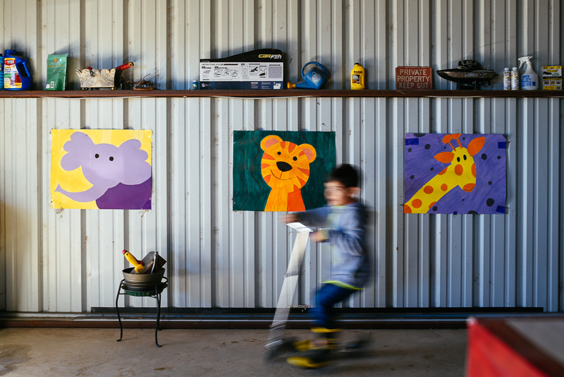
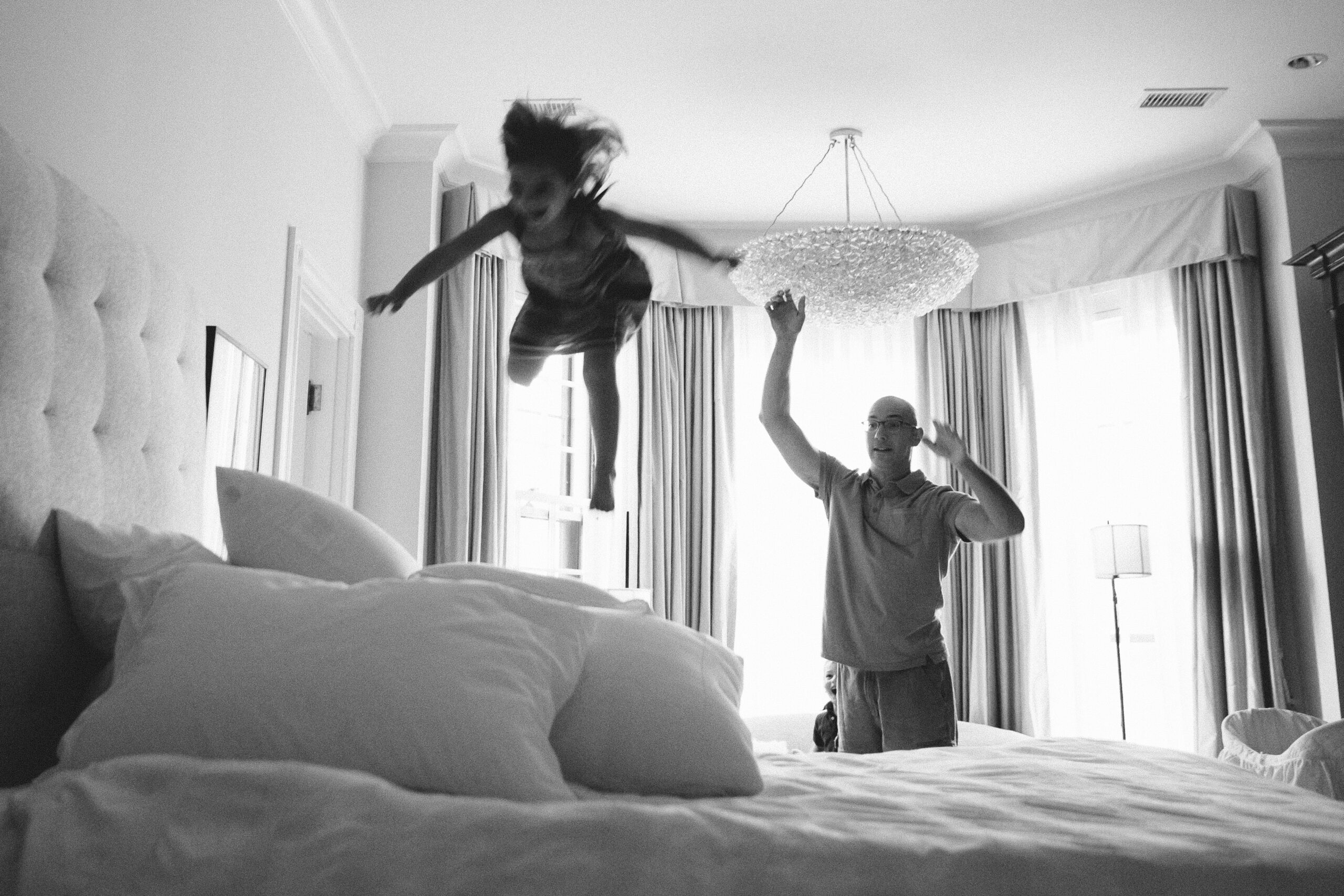
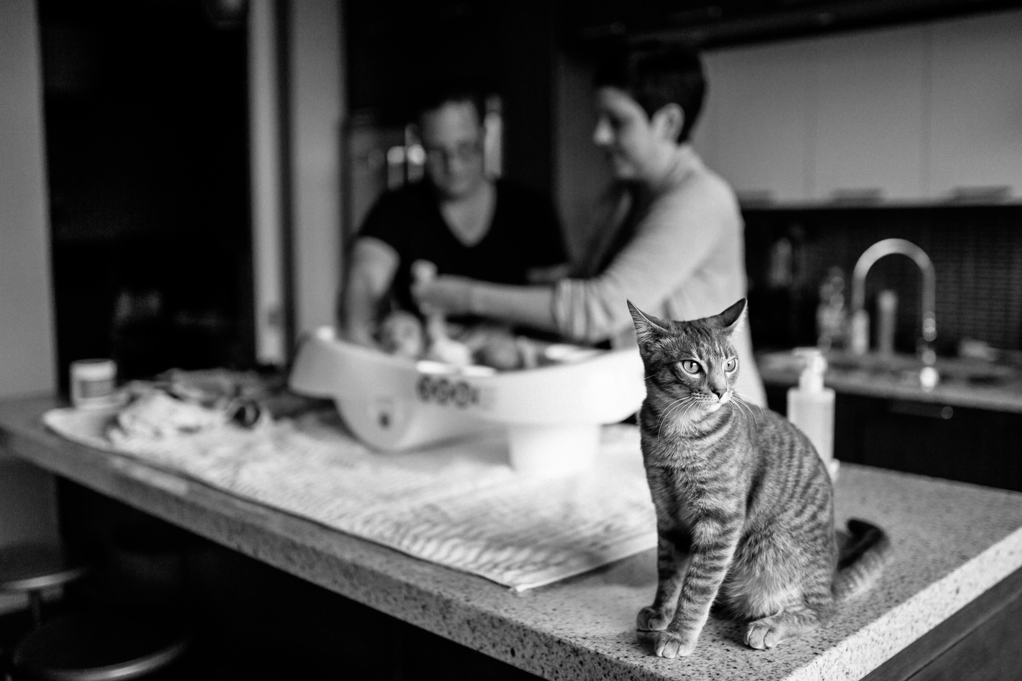
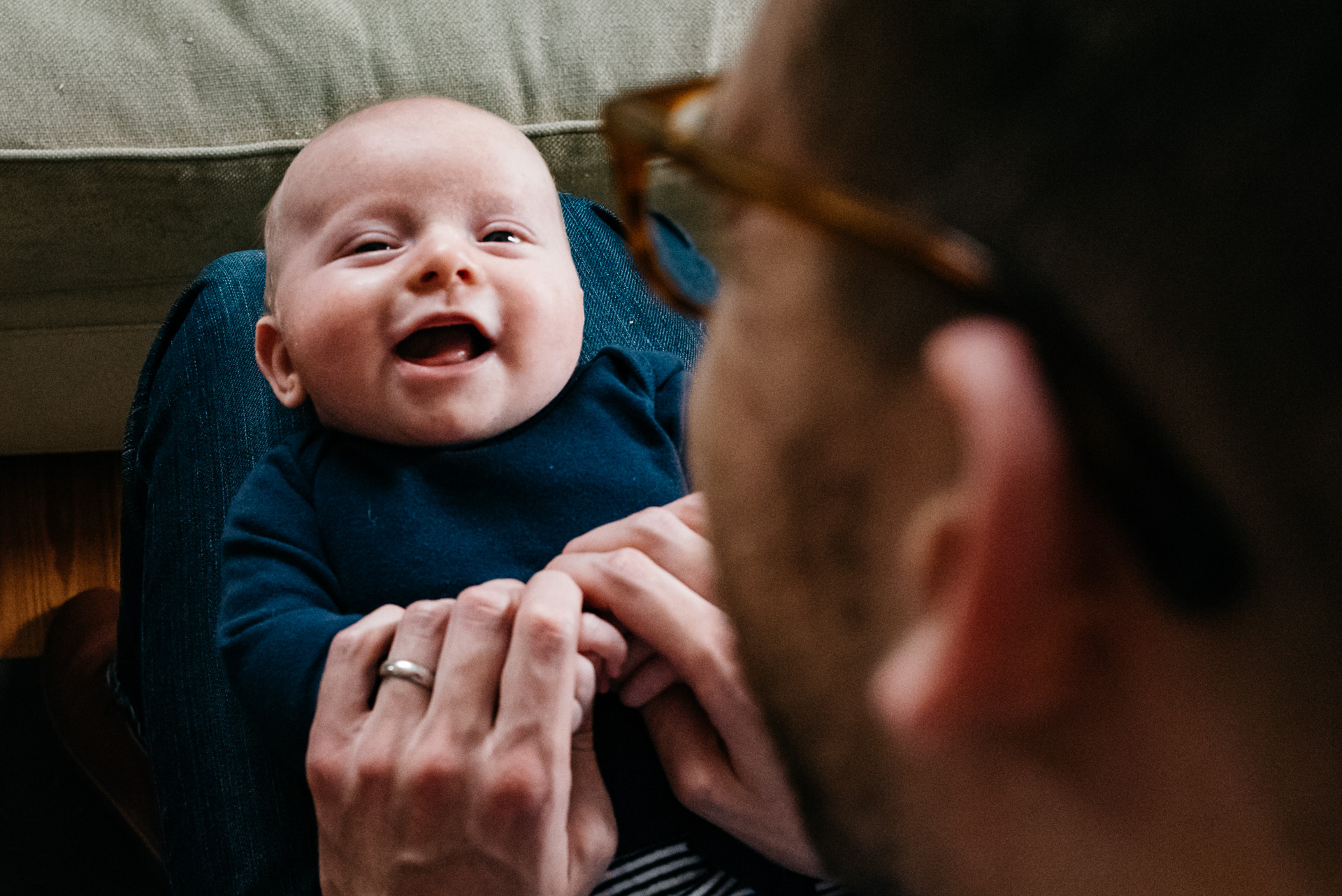
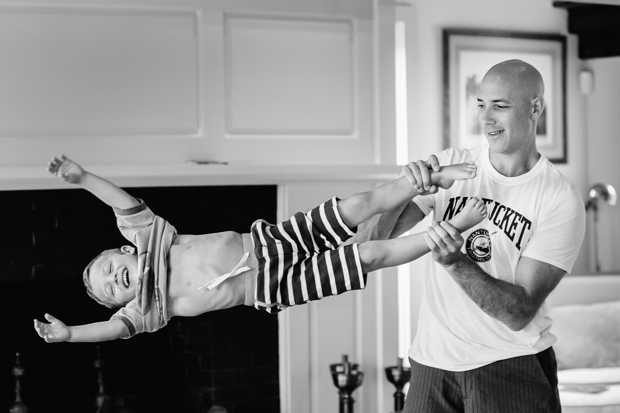
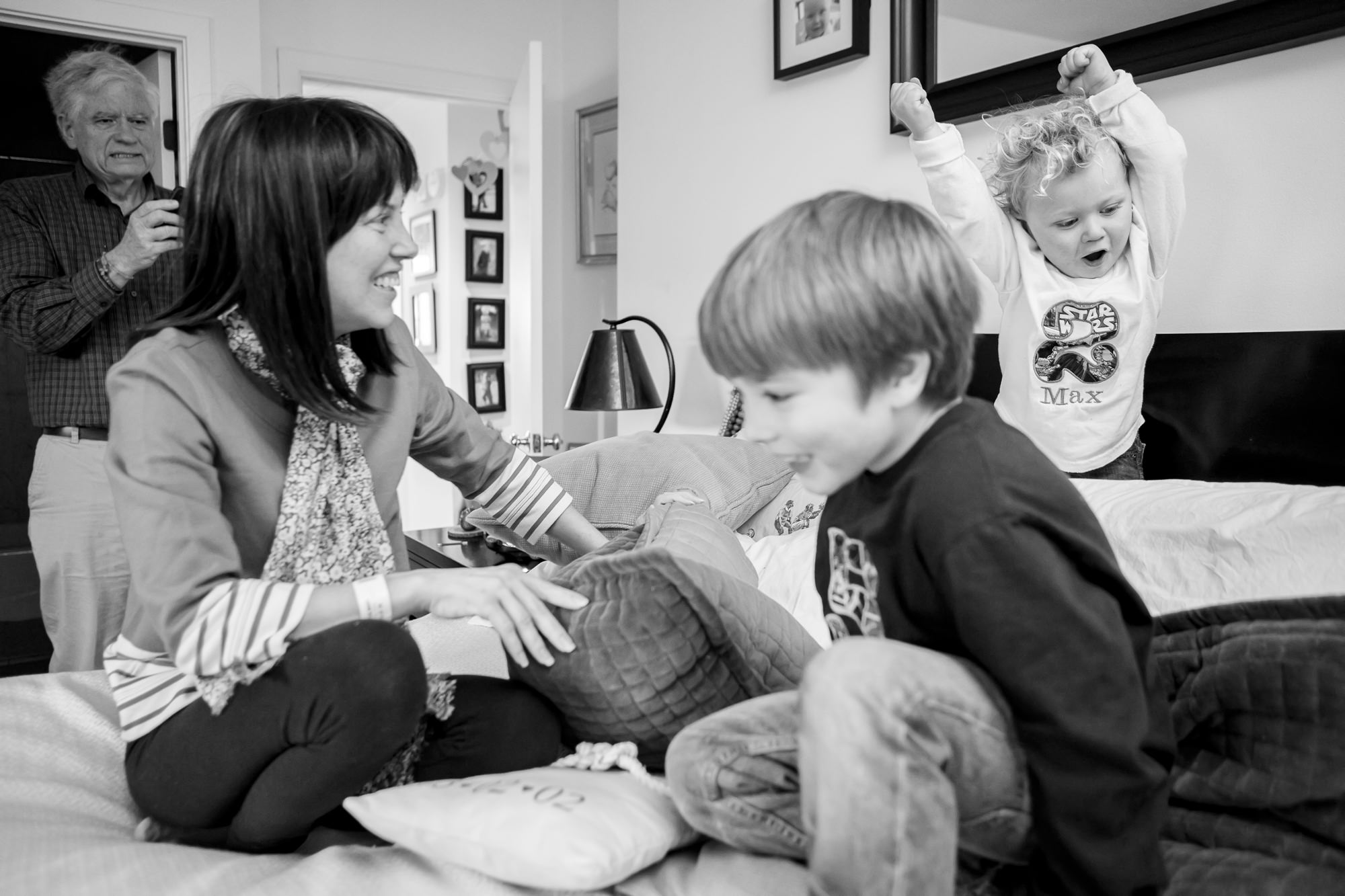
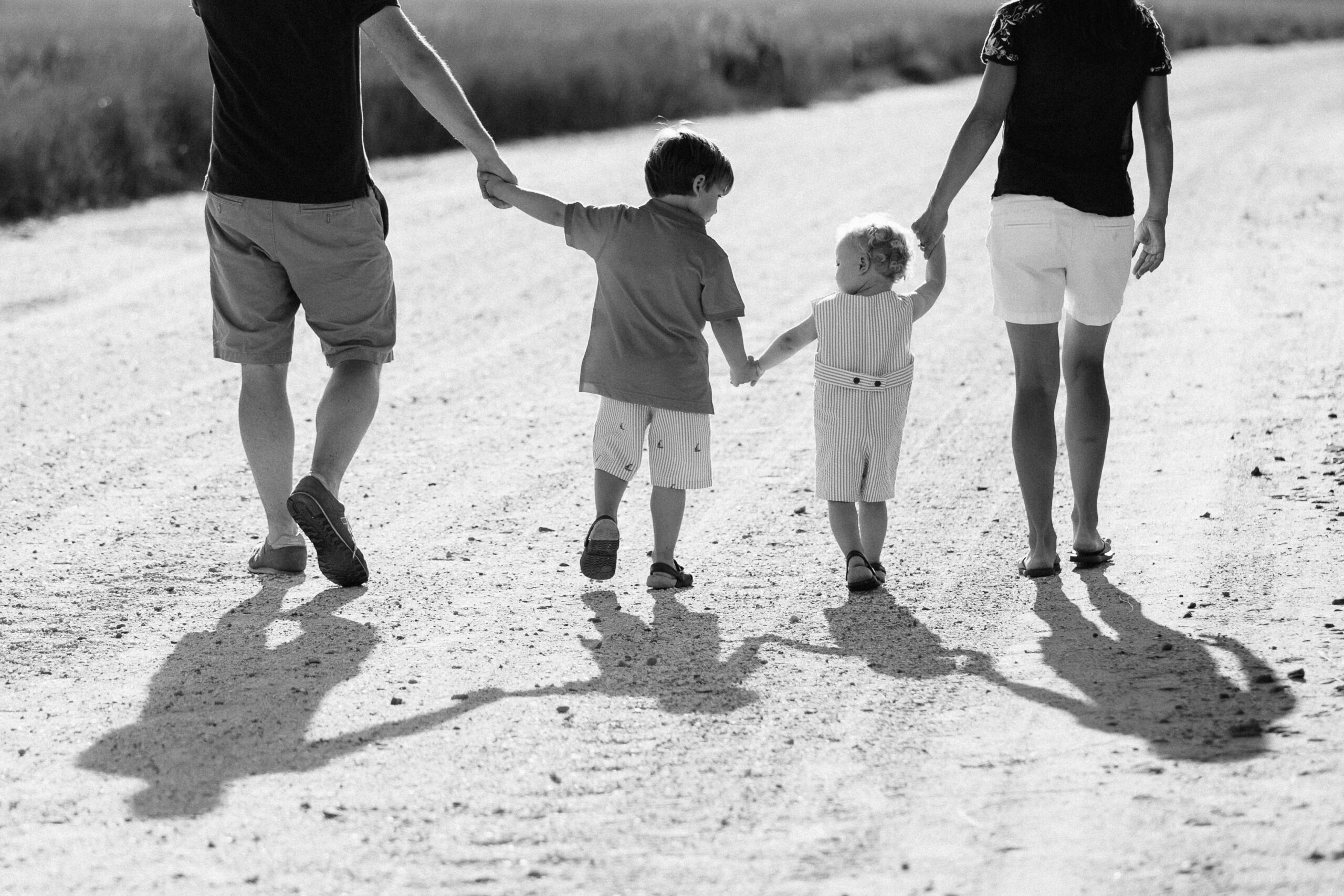
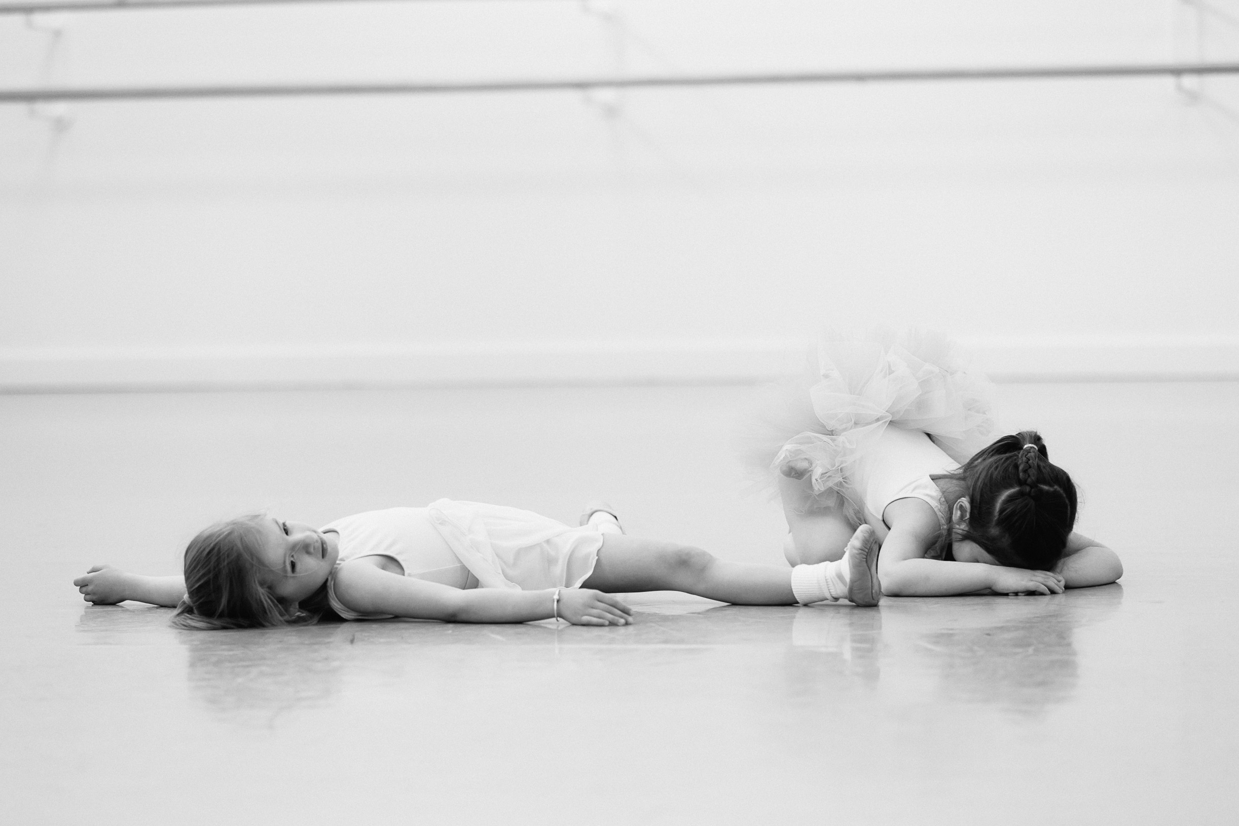

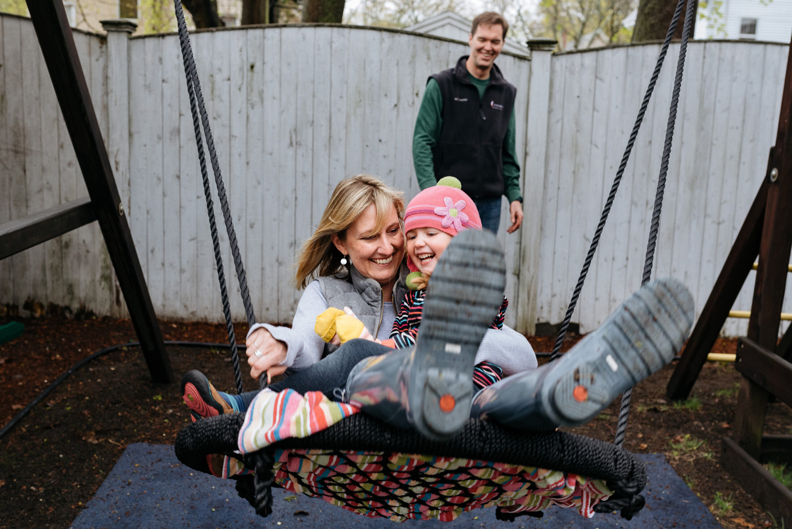
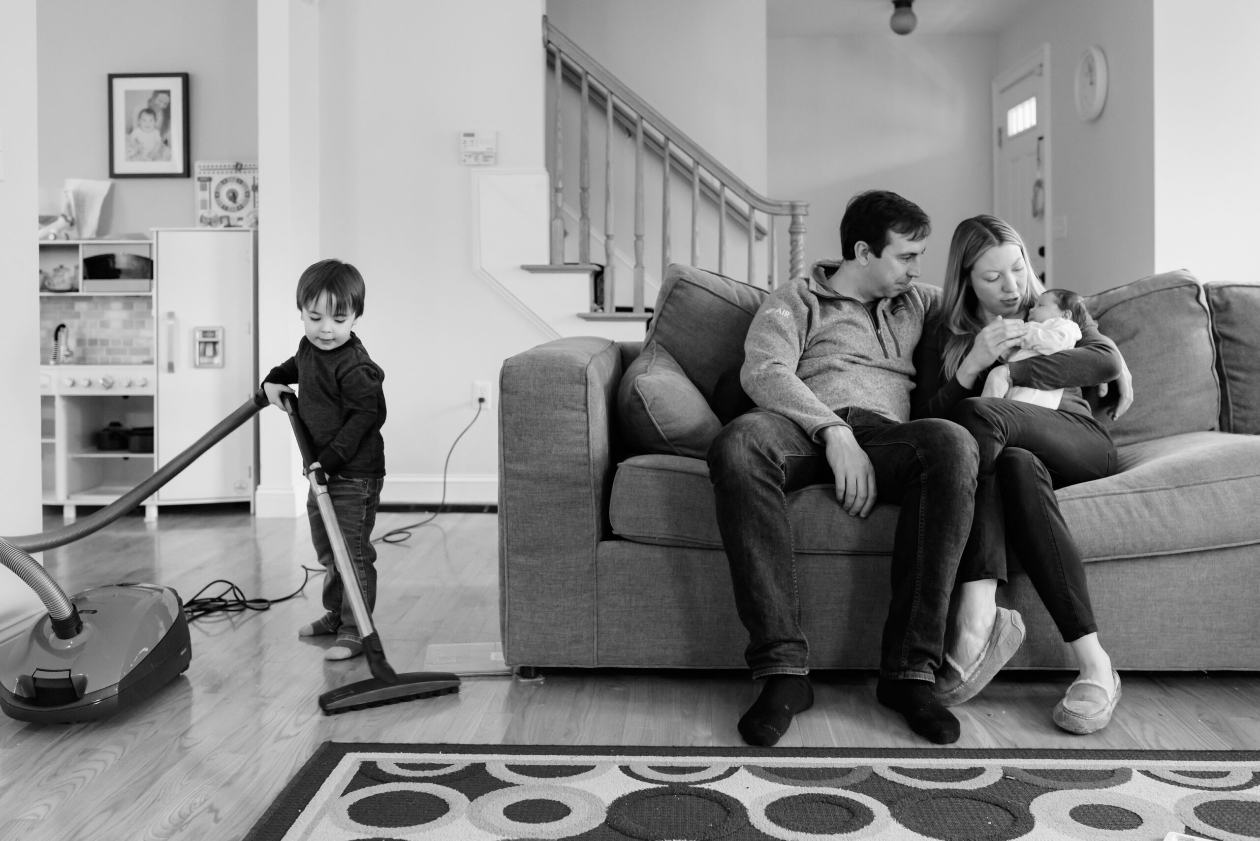
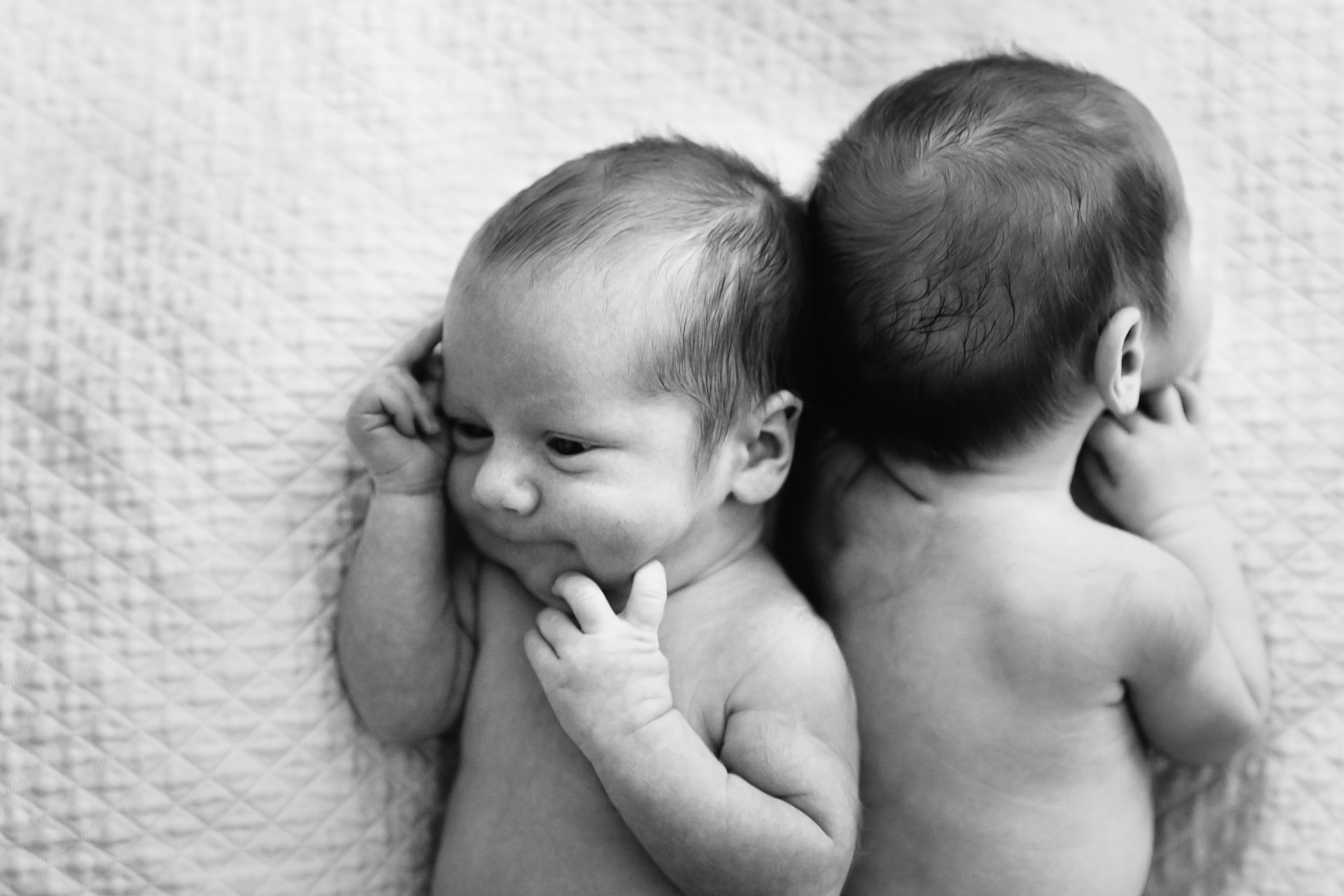
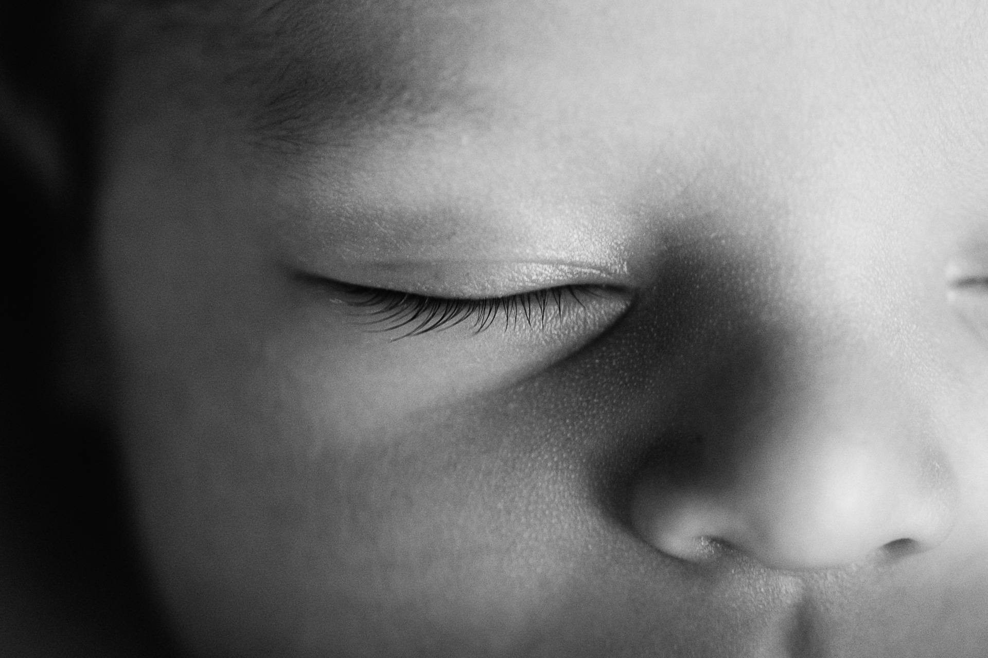
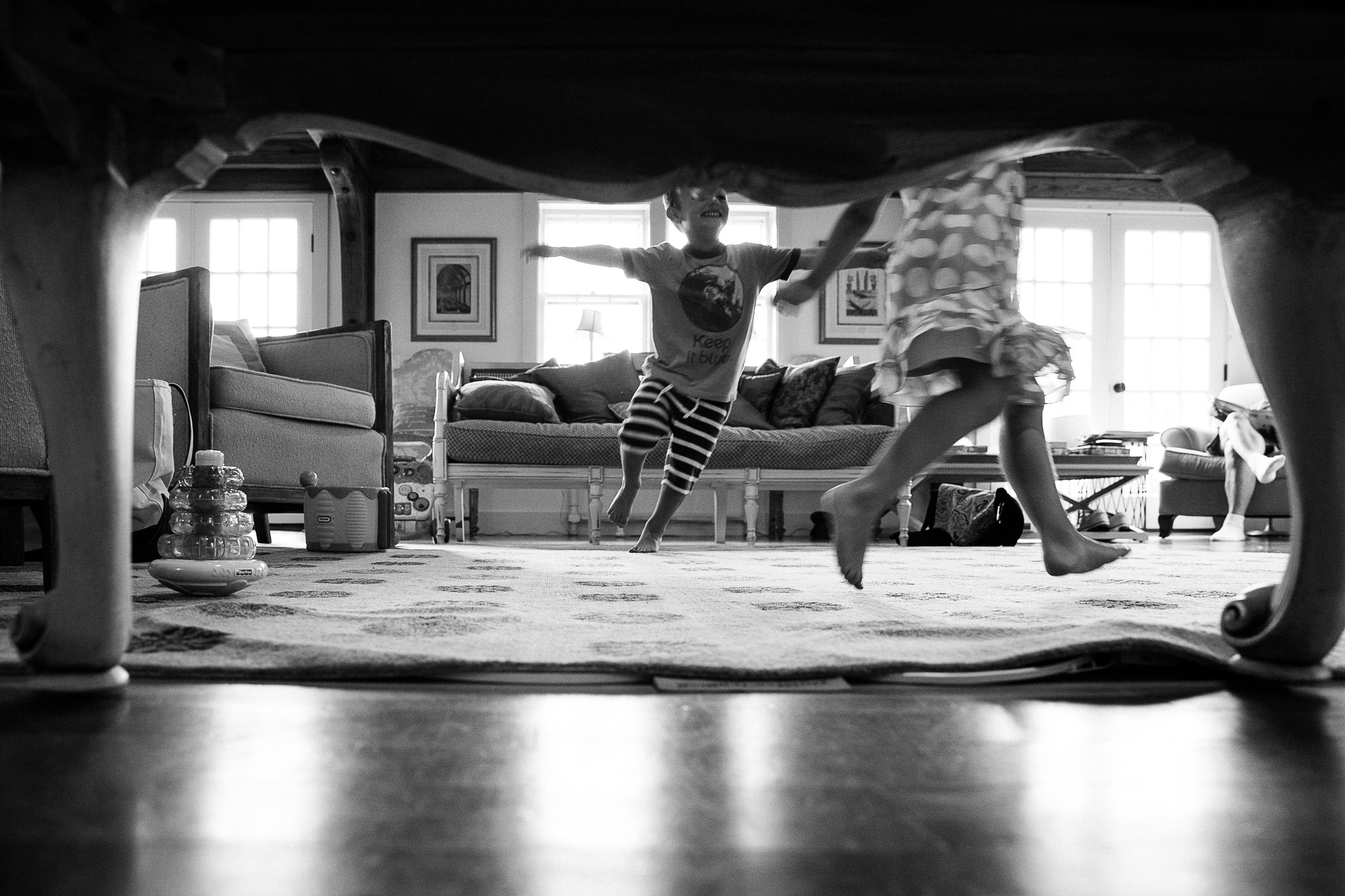
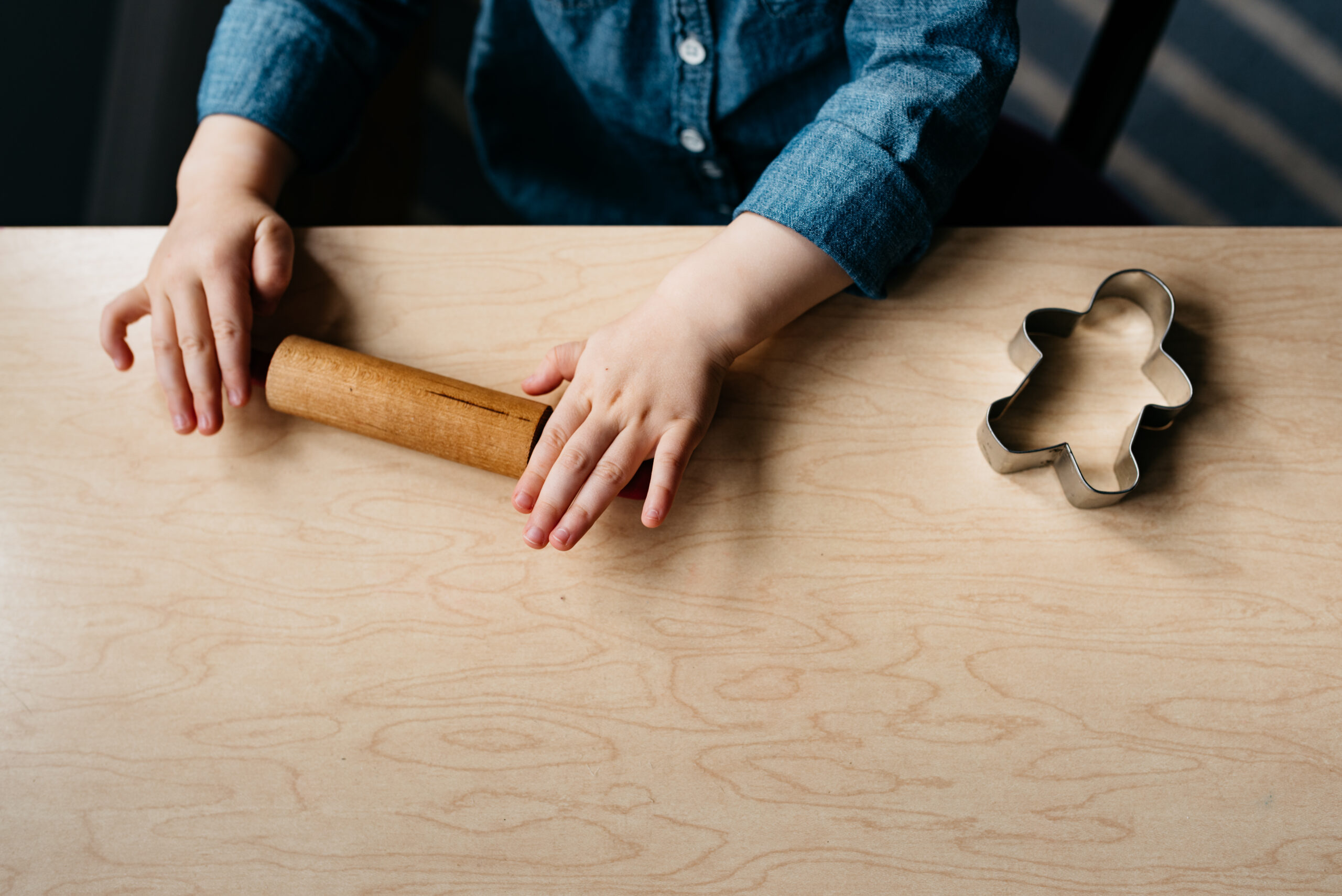
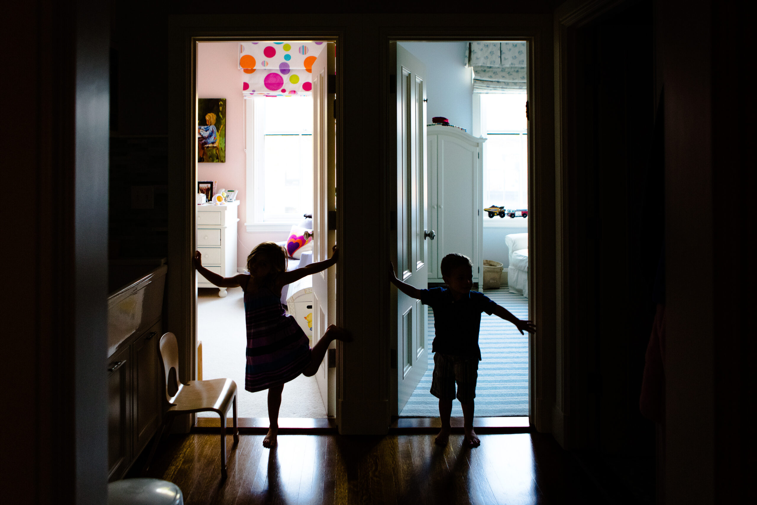
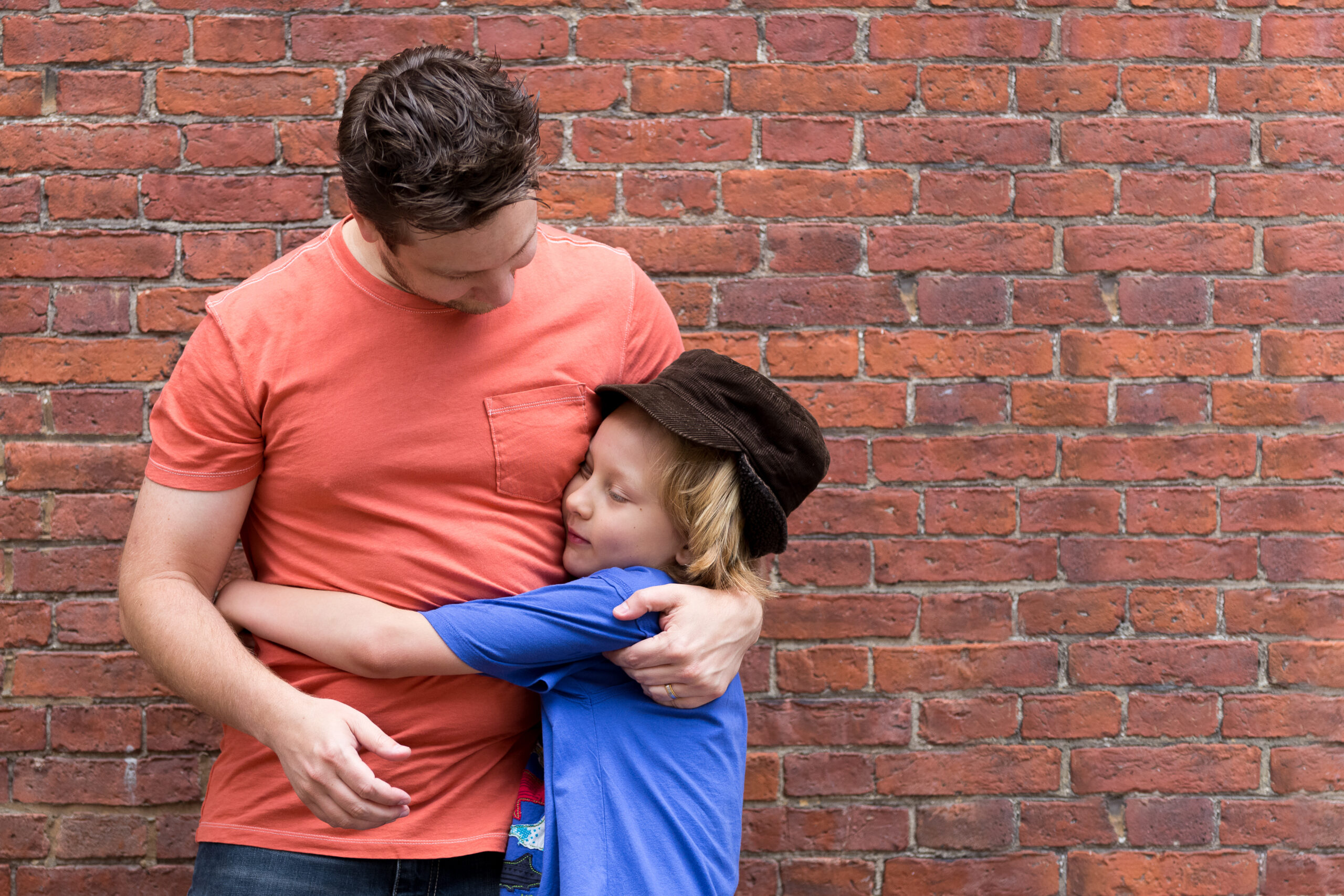

My photography focused on capturing the beauty of real, everyday moments—unscripted, joyful, and full of connection.
Project Goals:
- Create a unique brand identity that feels personal and meaningful
- Connect with families who value meaningful, candid photography
- Educate and inspire clients to invest in tangible keepsakes
- Create a brand experience that fosters lasting client relationships
Project Goals:
- Create a visual identity that works seamlessly across wedding and family photography
- Attract clients who value candid, emotionally driven photography
- Communicate a sense of luxury to increase the brand’s perceived value
- Refresh the visual identity while honoring the original brand’s deeply personal meaning
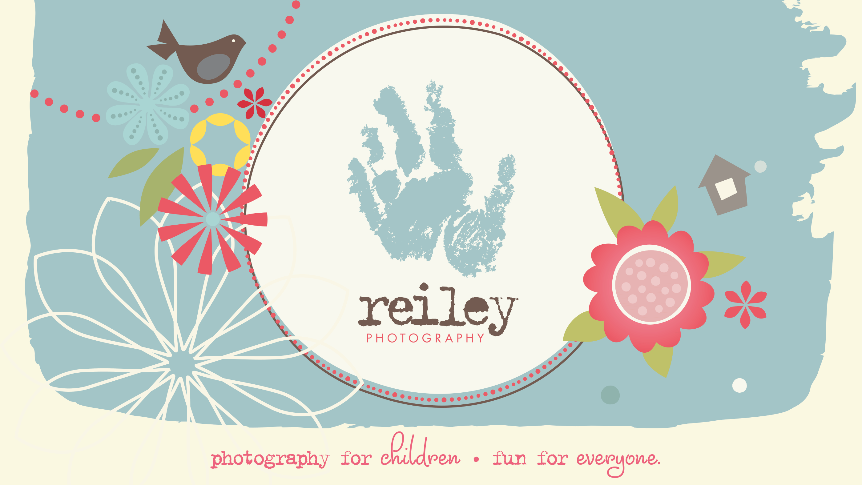
Logo
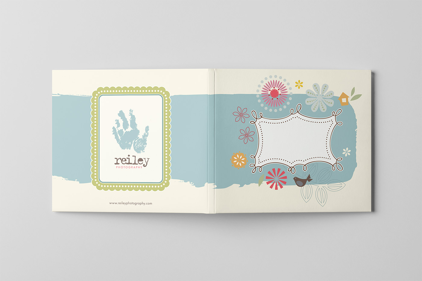
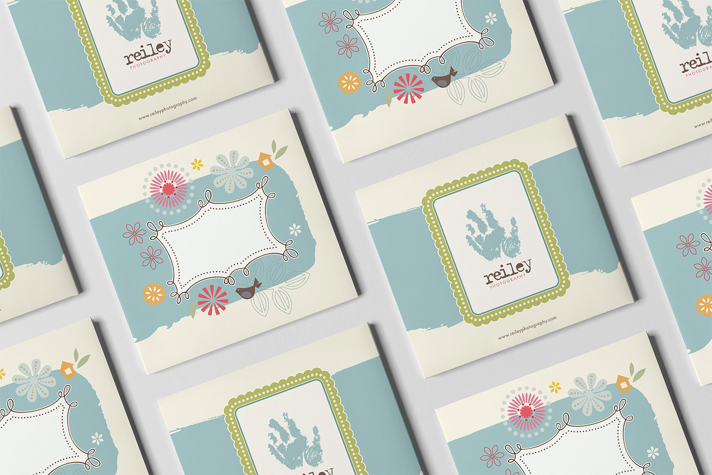
At the heart of the Reiley Photography logo is a simple yet deeply meaningful detail: the handprint used in the mark is Owen’s actual handprint. It serves as a quiet tribute to the son I lost, and a reminder of the purpose behind the work—to celebrate the joy of family, and to honor how even the smallest lives can leave a lasting impact. The combination of clean typography with this personal symbol balances professionalism with heart, just like the brand itself.
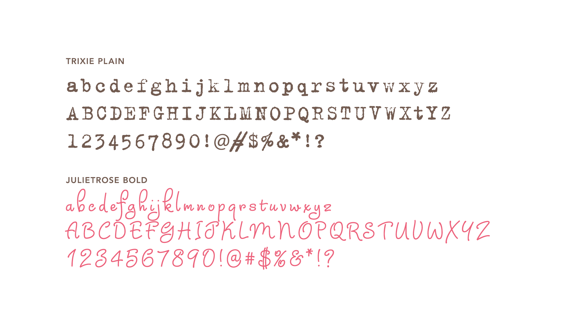
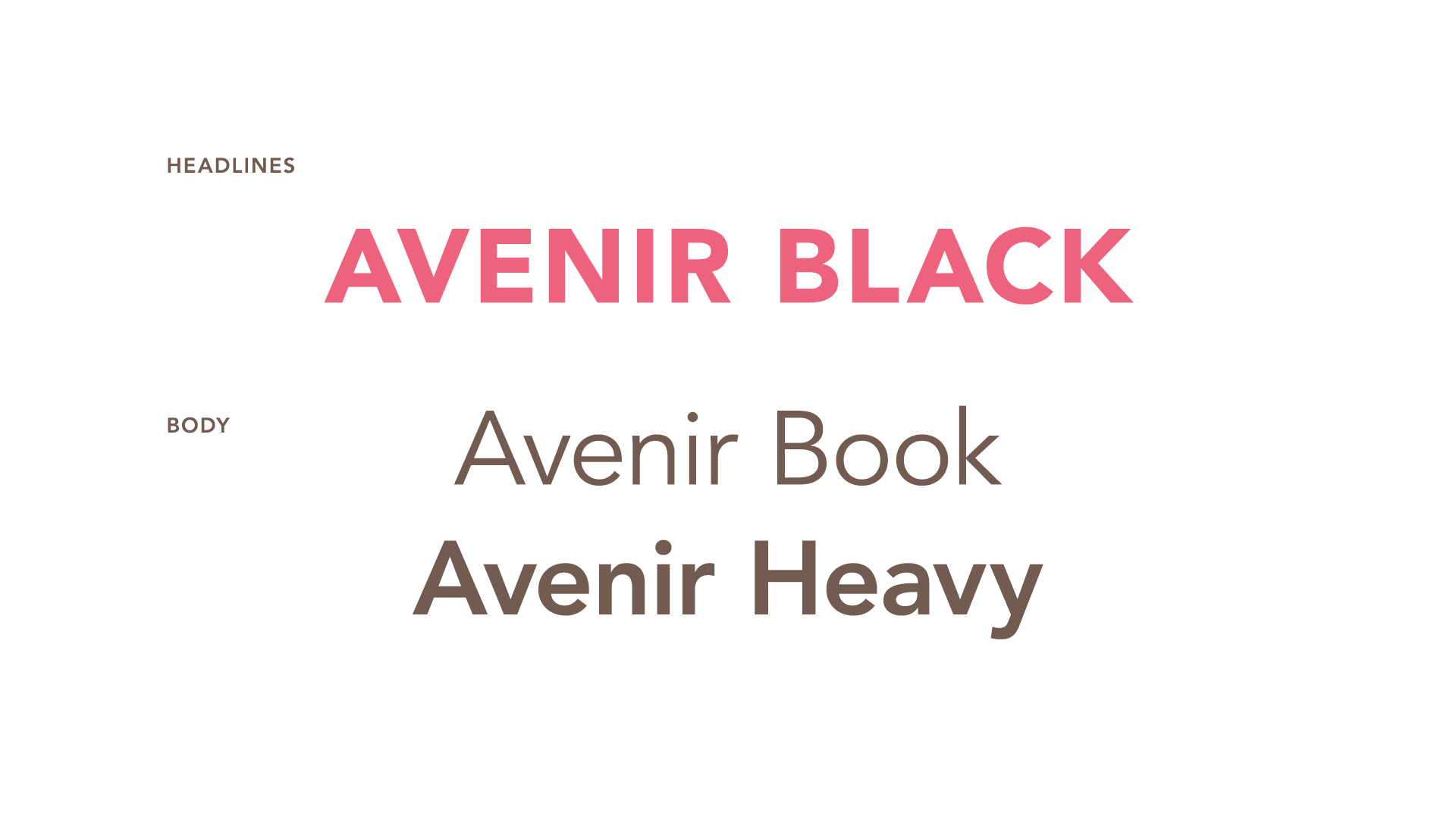
Typography
The typography for Reiley Photography was chosen to echo both the emotional heart of the brand and the style of the photography itself. The typeface Trixie, with its stamped, slightly imperfect texture, subtly mirrors the hand-inked quality of Owen’s actual handprint in the logo—a quiet nod to where the story began. Julietrose adds a touch of whimsy and warmth, capturing the playful spirit of childhood, while Avenir provides clean, modern structure that aligns with the polished yet candid look of the images. Together, these typefaces reflect a balance of memory, joy, and professionalism.


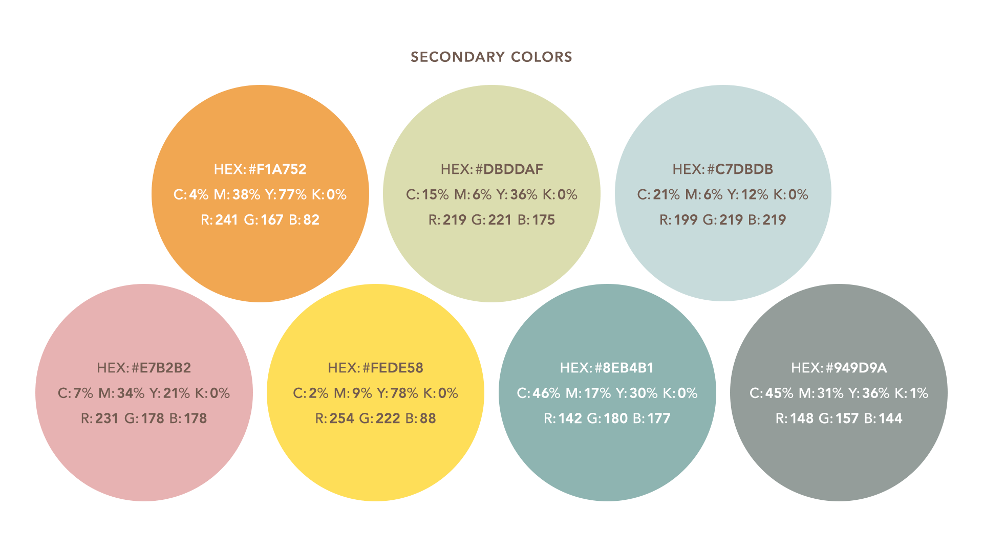
Color Palette
Soft, natural tones inspired by sunlight, coastal landscapes, and the gentle messiness of real family life created a palette that felt both calming and full of life. These hues were selected to harmonize with the warm tones in the photography and to evoke feelings of joy, presence, and ease—much like a golden hour afternoon spent with your favorite people.

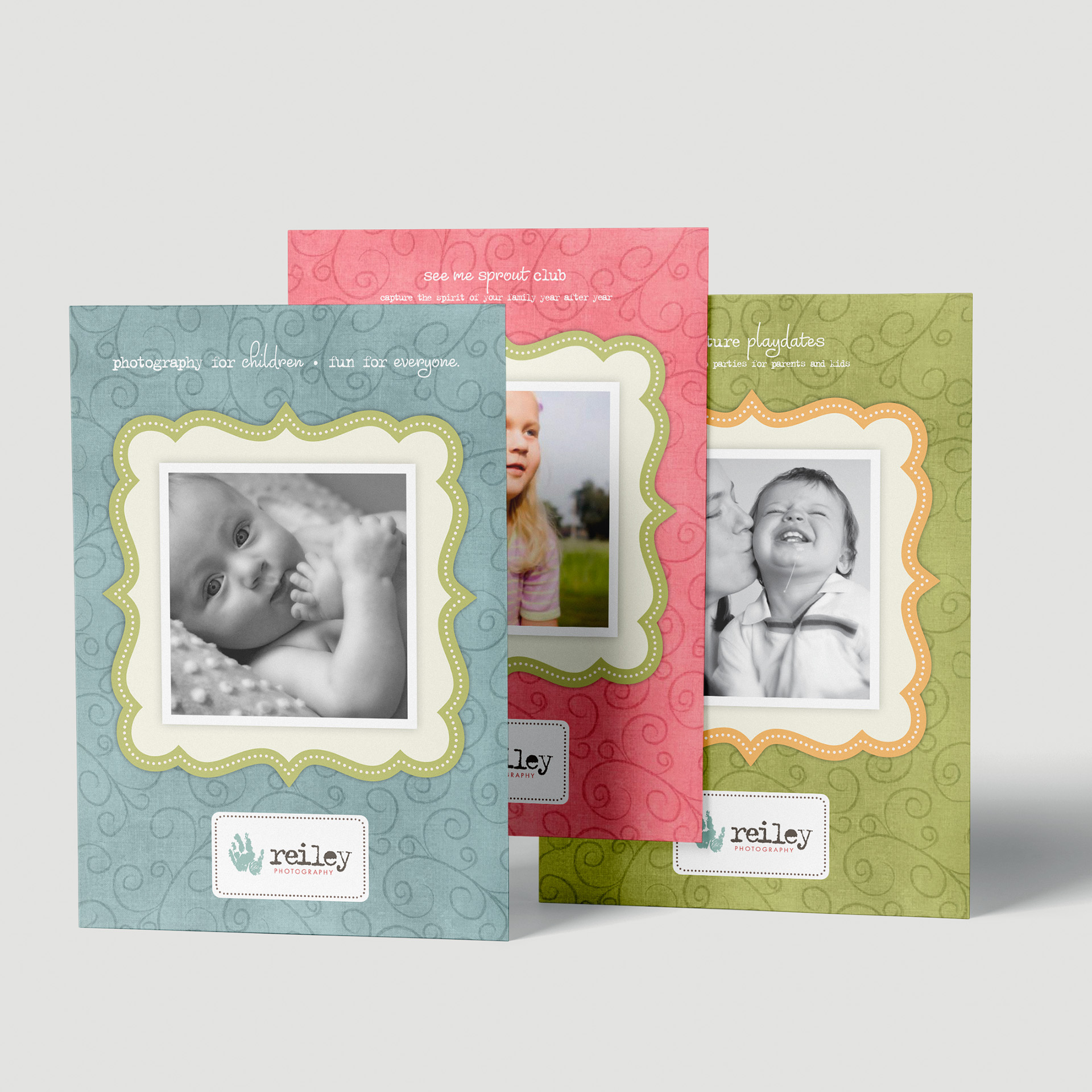
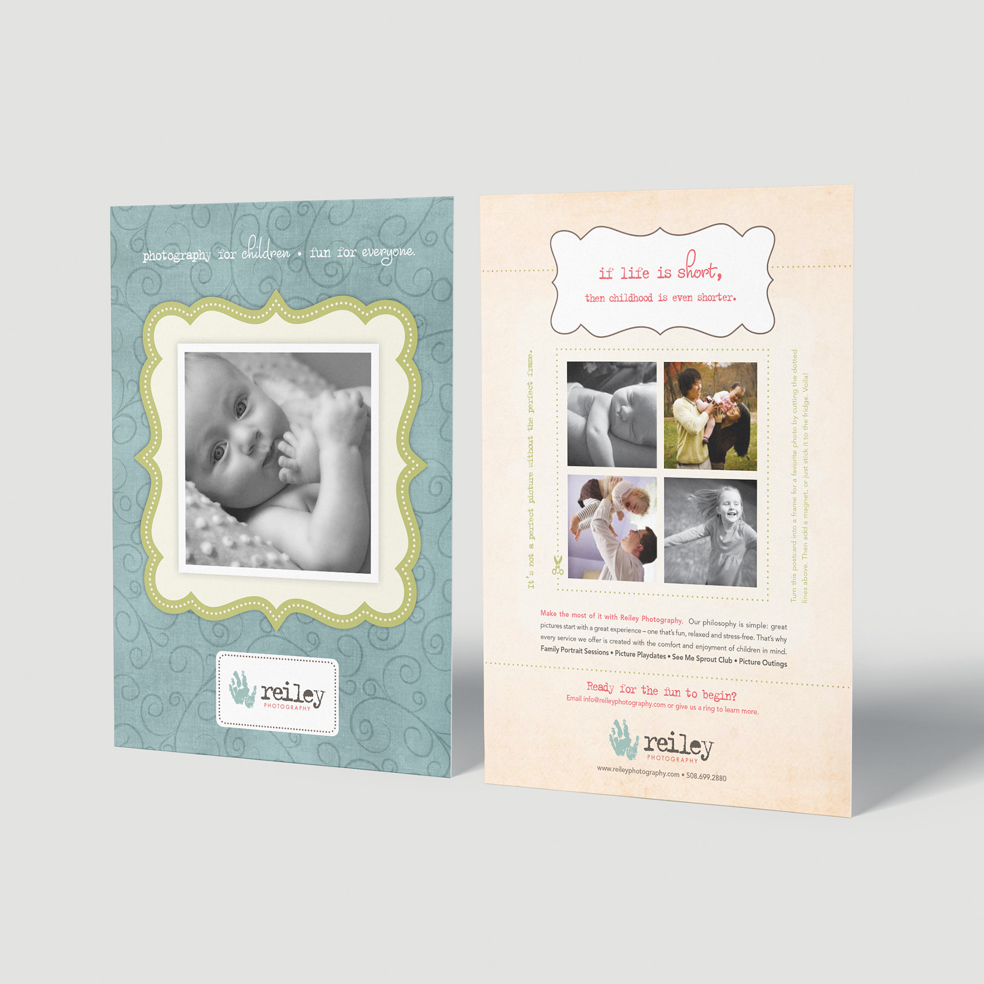
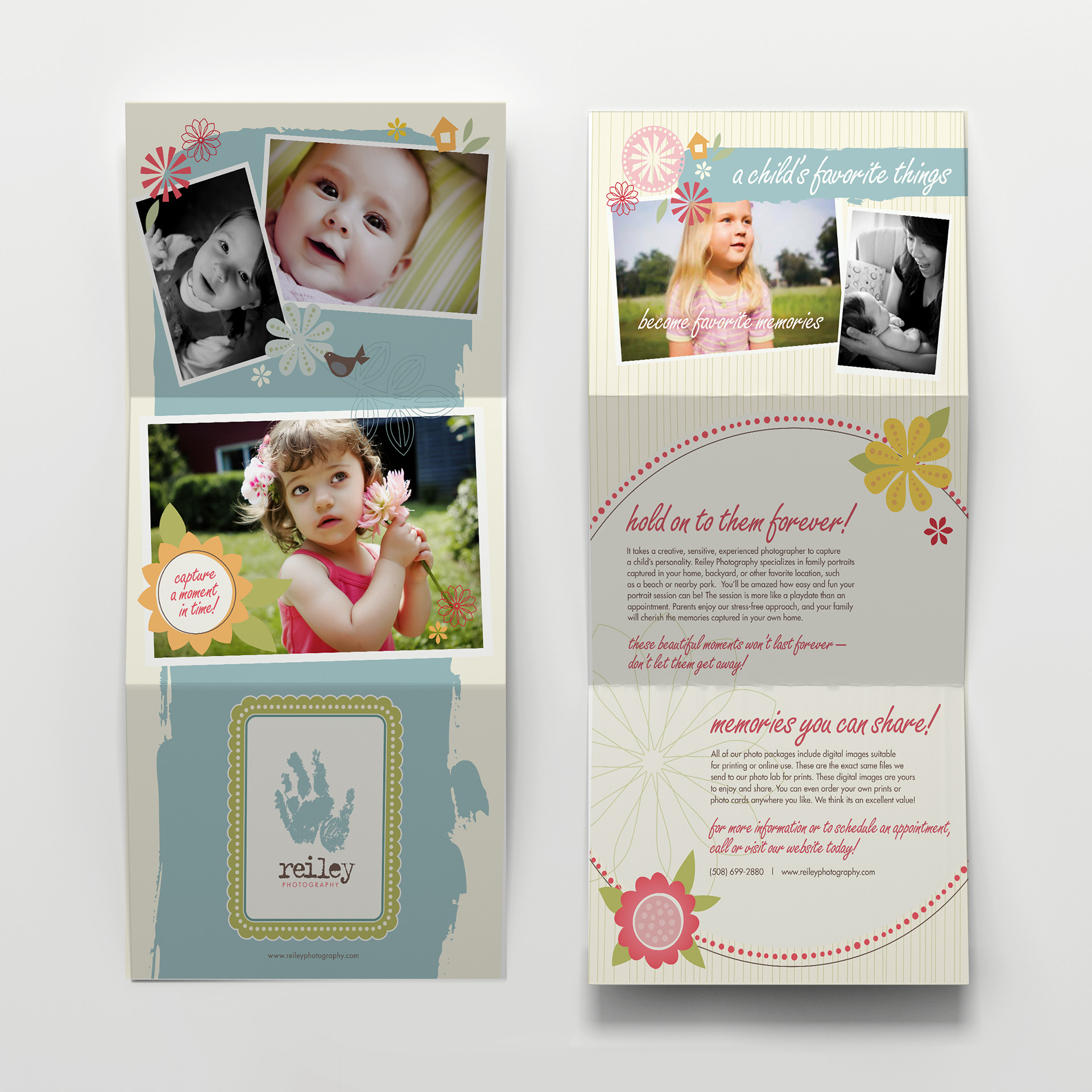
Postcards
Each promotional postcard was designed to be more than just a marketing piece—it was an experience. On the front, colorful, curvilinear shapes echoed the brand’s playful energy and framed an image full of life. On the back, a dotted green line invited clients to cut along the border, transforming the postcard into a frame they could use for their own snapshots. Whether used for scrapbooking or displayed on the fridge, the cards became a little extension of the brand’s heart: celebrating family, memory, and creativity in
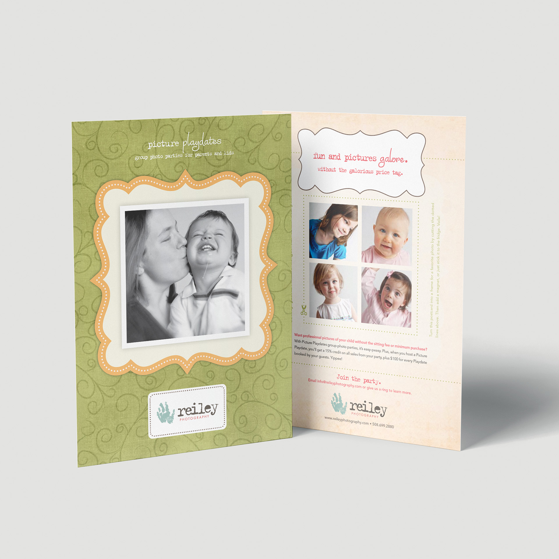
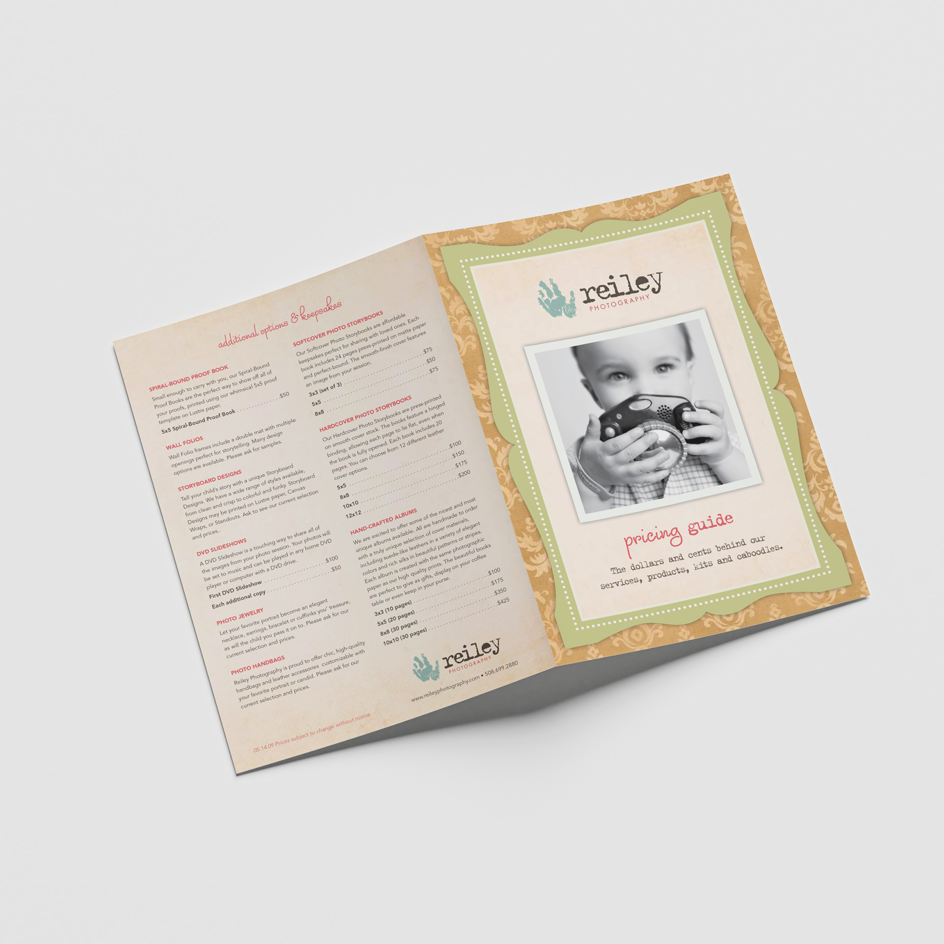
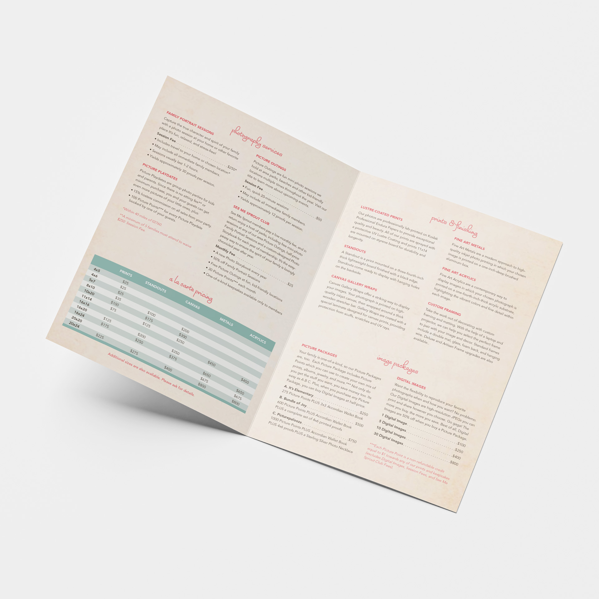
Brochures
Created to give clients a quick and friendly overview of session options and available products, these brochures made it easier for families to understand what was offered—and what they might want to take home. With a warm, approachable tone and clean design, they helped encourage interest in tangible items like prints, albums, and gifts. Just by holding one in their hands, clients were reminded of the value of something real and lasting—a feeling that aligned perfectly with the experience of working with

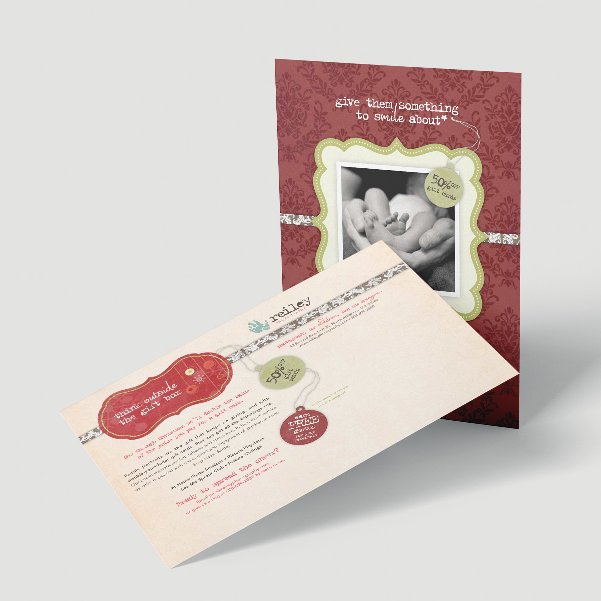
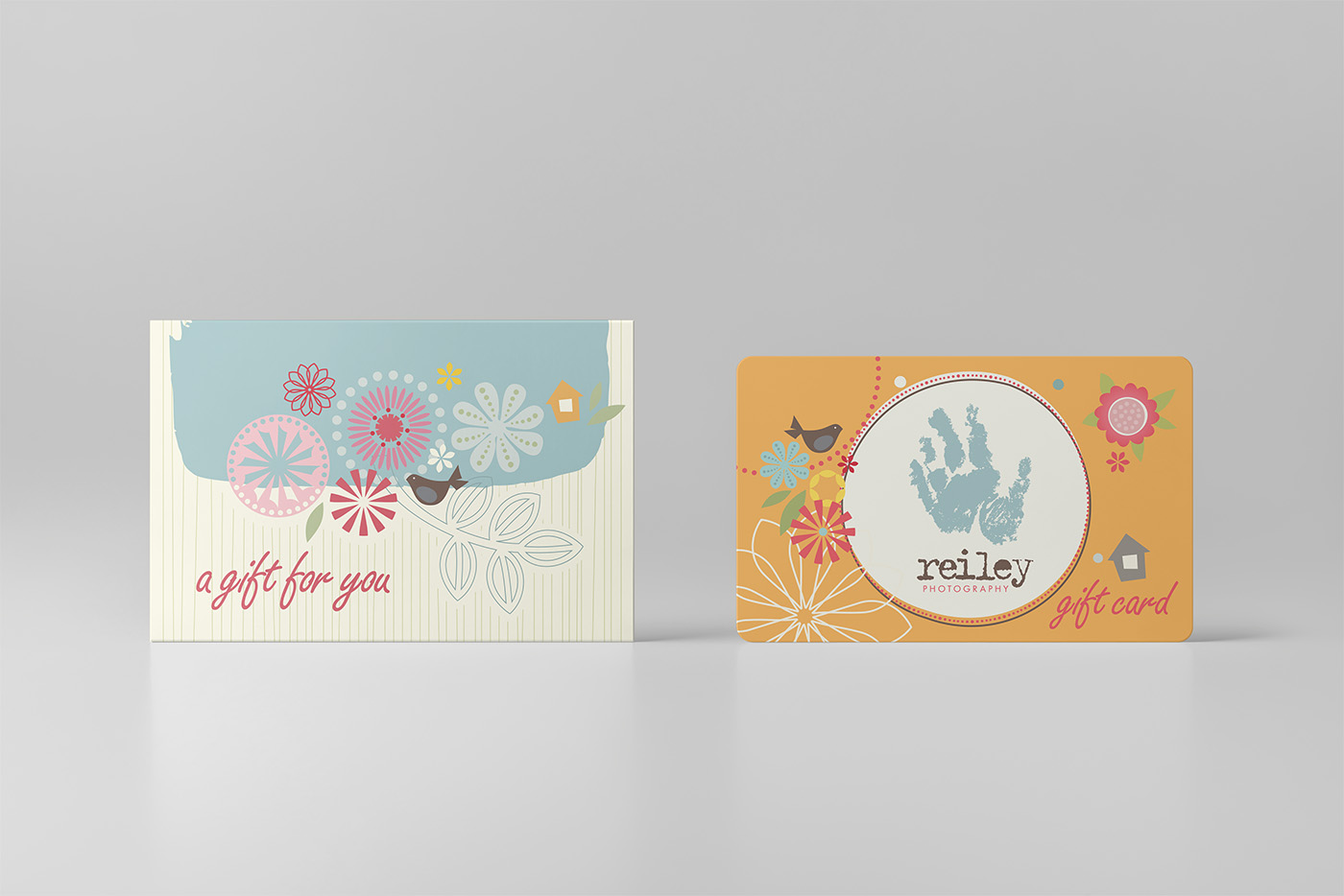
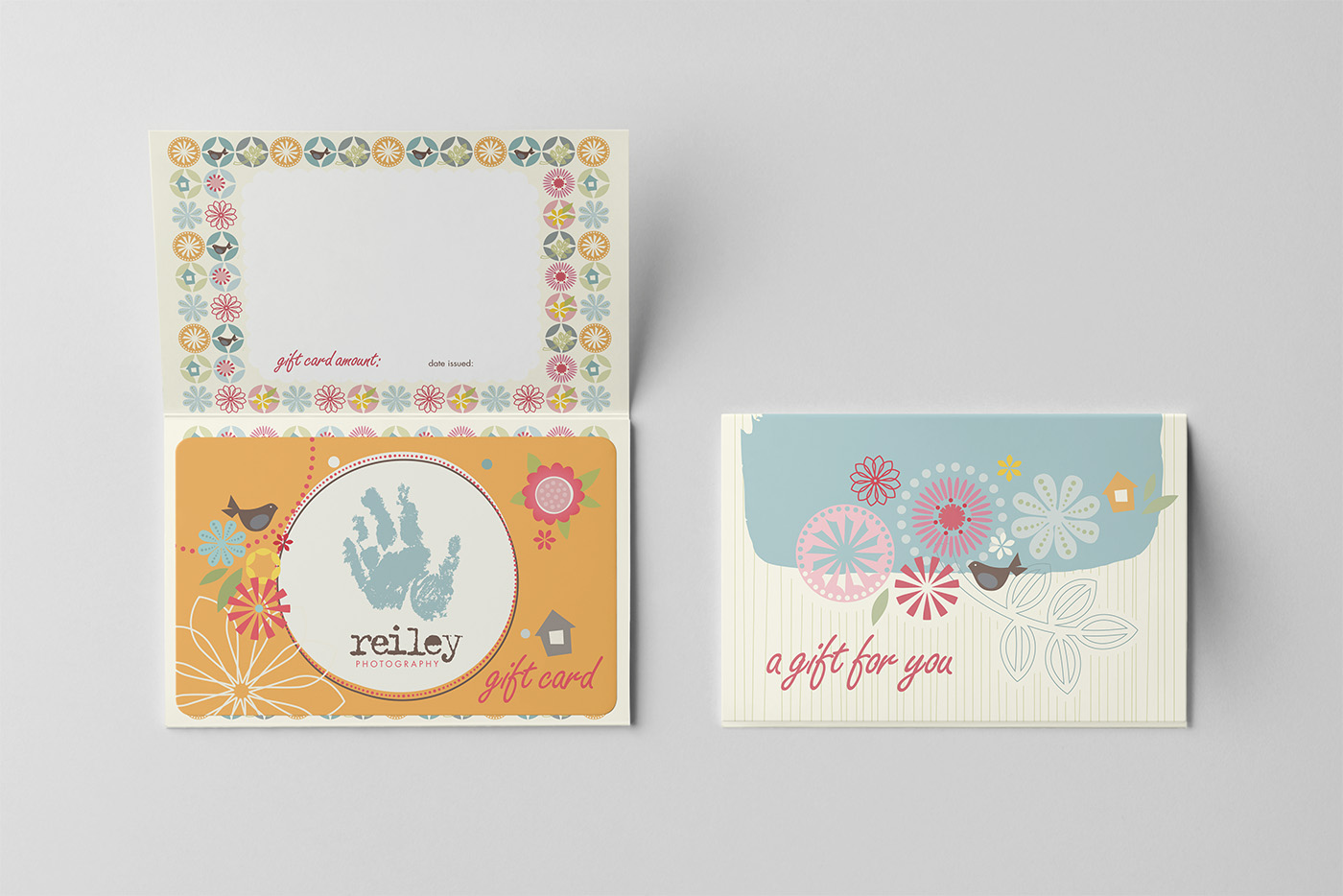
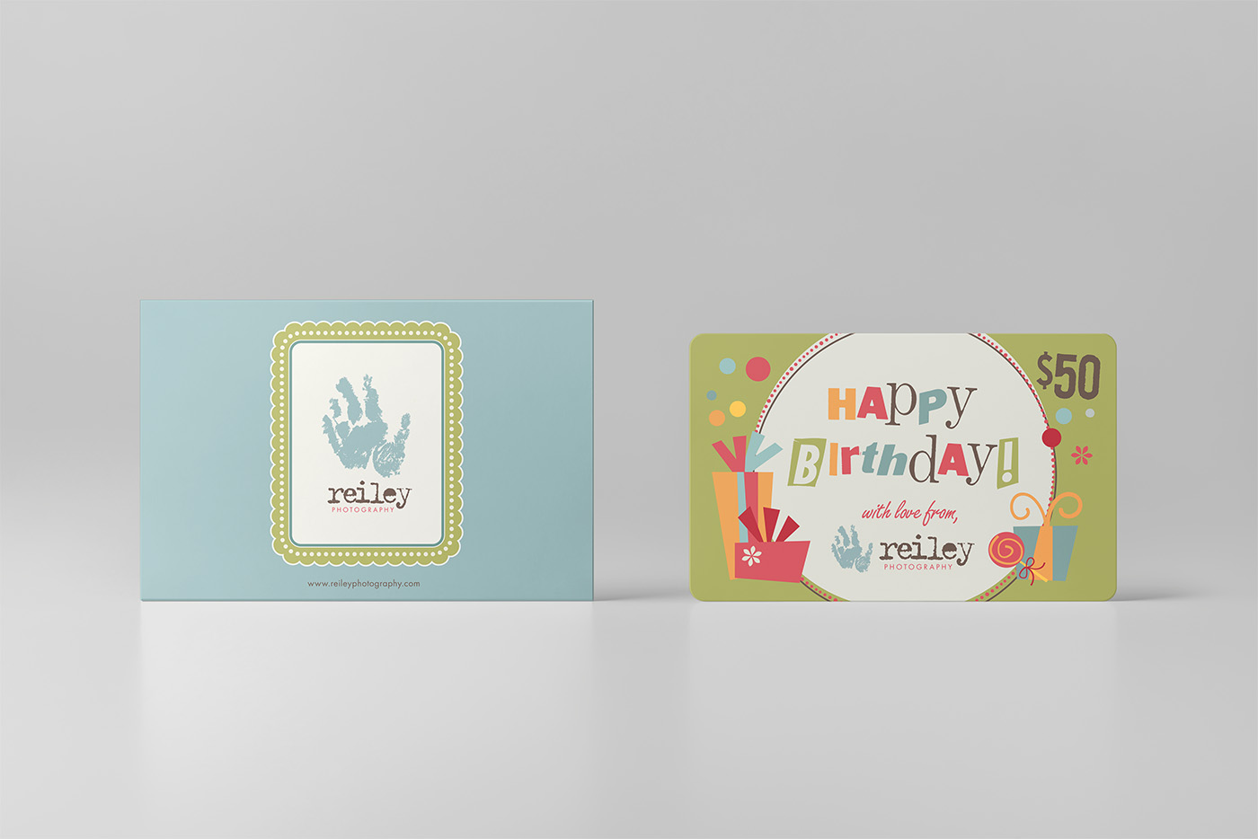
Gift Cards
Created to be meaningful gifts in themselves, these gift cards were designed with the same attention to detail and visual language as the rest of the brand. Whether welcoming a new baby or celebrating a birthday, they invited families to give the gift of memory—and to share a piece of something truly personal.
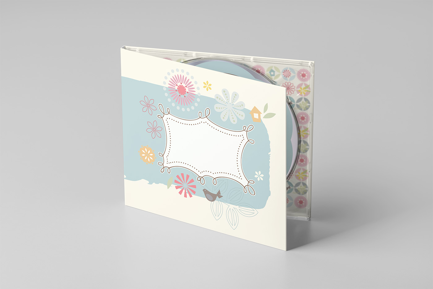
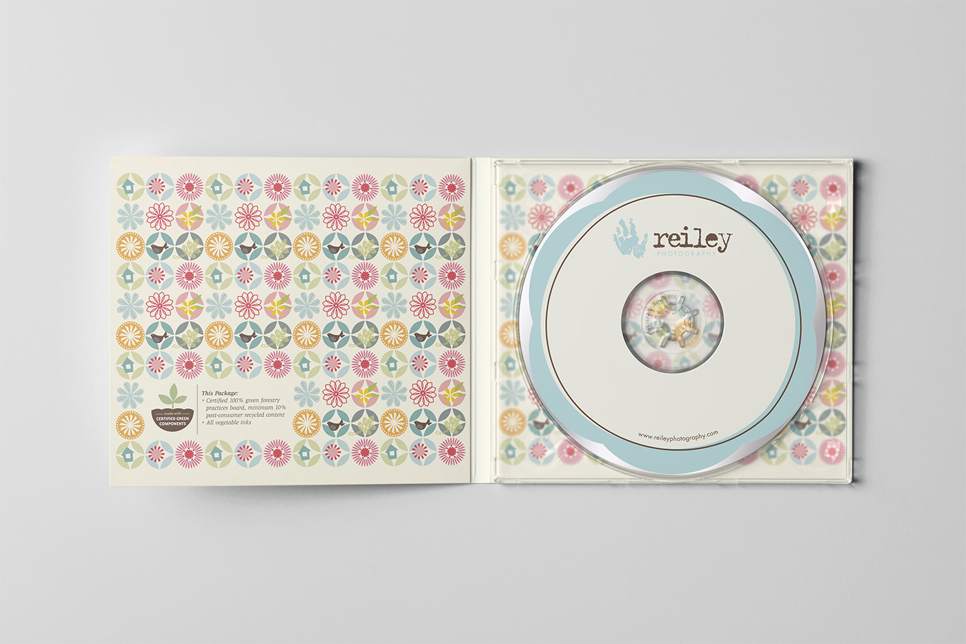
Digital Image Packaging
At a time when DVDs were the primary way to deliver digital files, I wanted even this part of the experience to feel thoughtful and on-brand. Each disc was custom-labeled and packaged with care, turning a simple delivery method into something clients would be excited to receive and keep. These small details reinforced the emotional value of the images inside—and helped ensure that even digital memories felt personal, tangible, and special.
Results:
- A brand that communicated authenticity, emotion, and purpose from the start
- Strong emotional connection with clients who value my style of photography
- Marketing materials that encouraged both new bookings and long-term client loyalty
- Awarded Best Children & Family Marketing Campaign from Professional Photographers of America


